In web design, making your site interactive is key to keeping your visitors interested. Adding a feature like a “reveal secret code” is a great way to introduce a bit of mystery and fun. This trick lets users discover hidden messages or codes by clicking or hovering over certain parts of your site. In this blog post, we’re going to show you, step by step, how to set up a reveal secret code using CSS.
Step1: HTML Structure Of Secret Code
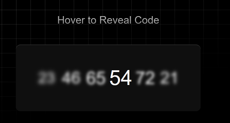
This HTML code sets up a section where users can reveal a secret code, consisting of a sequence of numbers, by pointing or focusing on each digit individually within an unordered list. Here is the Code:
<section>
<p>Hover to Reveal Code</p>
<ul class="code">
<li tabindex="0" class="digit">
<span>23</span>
</li>
<li tabindex="0" class="digit">
<span>46</span>
</li>
<li tabindex="0" class="digit">
<span>65</span>
</li>
<li tabindex="0" class="digit">
<span>54</span>
</li>
<li tabindex="0" class="digit">
<span>72</span>
</li>
<li tabindex="0" class="digit">
<span>21</span>
</li>
</ul>
</section>
Step2: Styling Code List With Animations
This CSS code creates a visually striking background and interactive secret code display on a webpage. When a user hovers or focuses on the digits of the code, they dynamically enlarge and blur based on their proximity to the hovered digit, enhancing user interaction and engagement.
* {
box-sizing: border-box;
}

body {
min-height: 100vh;
display: grid;
place-items: center;
font-family: "SF Pro Text", "SF Pro Icons", "AOS Icons", "Helvetica Neue", Helvetica, Arial, sans-serif, system-ui;
background: hsl(0 0% 0%) !important;
gap: 2rem;
}

body::before {
--line: hsl(0 0% 95% / 0.25);
content: "";
height: 100vh;
width: 100vw;
position: fixed;
background:
linear-gradient(90deg, var(--line) 1px, transparent 1px 10vmin) 0 -5vmin / 10vmin 10vmin,
linear-gradient(var(--line) 1px, transparent 1px 10vmin) 0 -5vmin / 10vmin 10vmin;
-webkit-mask: linear-gradient(-15deg, transparent 30%, white);
mask: linear-gradient(-15deg, transparent 30%, white);
top: 0;
z-index: -1;
}

section {
display: grid;
gap: 4rem;
align-items: center;
justify-content: center;
}

section p {
margin: 0;
font-size: 2.25rem;
color: hsl(0 0% 40%);
text-align: center;
background: linear-gradient(hsl(0 0% 80%), hsl(0 0% 50%));
color: transparent;
-webkit-background-clip: text;
background-clip: text;
}

.code {
font-size: 3rem;
display: flex;
flex-wrap: nowrap;
color: hsl(0 0% 100%);
border-radius: 1rem;
background: hsl(0 0% 6%);
justify-content: center;
box-shadow: 0 1px hsl(0 0% 100% / 0.25) inset;
}

.code:hover {
cursor: -webkit-grab;
cursor: grab;
}

.digit {
display: flex;
height: 100%;
padding: 5.5rem 1rem;
}

.digit:focus-visible {
outline-color: hsl(0 0% 50% / 0.25);
outline-offset: 1rem;
}

.digit span {
scale: calc(var(--active, 0) + 0.5);
filter: blur(calc((1 - var(--active, 0)) * 1rem));
transition: scale calc(((1 - var(--active, 0)) + 0.2) * 1s), filter calc(((1 - var(--active, 0)) + 0.2) * 1s);
}

ul {
padding: 0;
margin: 0;
}

.digit:first-of-type {
padding-left: 5rem;
}
.digit:last-of-type {
padding-right: 5rem;
}

:root {
--lerp-0: 1; /* === sin(90deg) */
--lerp-1: calc(sin(50deg));
--lerp-2: calc(sin(45deg));
--lerp-3: calc(sin(35deg));
--lerp-4: calc(sin(25deg));
--lerp-5: calc(sin(15deg));
}

.digit:is(:hover, :focus-visible) {
--active: var(--lerp-0);
}
.digit:is(:hover, :focus-visible) + .digit,
.digit:has(+ .digit:is(:hover, :focus-visible)) {
--active: var(--lerp-1);
}
.digit:is(:hover, :focus-visible) + .digit + .digit,
.digit:has(+ .digit + .digit:is(:hover, :focus-visible)) {
--active: var(--lerp-2);
}
.digit:is(:hover, :focus-visible) + .digit + .digit + .digit,
.digit:has(+ .digit + .digit + .digit:is(:hover, :focus-visible)) {
--active: var(--lerp-3);
}
.digit:is(:hover, :focus-visible) + .digit + .digit + .digit + .digit,
.digit:has(+ .digit + .digit + .digit + .digit:is(:hover, :focus-visible)) {
--active: var(--lerp-4);
}
.digit:is(:hover, :focus-visible) + .digit + .digit + .digit + .digit + .digit,
.digit:has(+ .digit + .digit + .digit + .digit + .digit:is(:hover, :focus-visible)) {
--active: var(--lerp-5);
}
How To Reveal Secret Code With CSS Hover Animation Demo
Congratulations! You’ve now learned how to create a reveal secret code feature using CSS. This interactive element can add a layer of engagement to your website, making it more interesting for your visitors.