Are you going to build a fullscreen homepage? And looking for a solution to add a responsive background image using CSS? Today tutorial is about to make CSS background images responsive to fit the fullscreen.
I will guide you how you can set the background-attachment so it covers all over the screen, no matter about screen size or resolution.
If you are developing a site related to photography or portfolio, It is important, It should have a great looking background. If a background will cover fullscreen, it will make your site look outstanding.
The purpose of making a background image on a website that includes the full browser window all the time. It fills the entire page with the picture in a way that no white space left. It is also important that the image should be scaled according to screen size and retains image proportions.
It is also important to make sure that, the image should be centered on the page and doesn’t cause scrollbars. It also has a cross-browser compatible as much as possible.
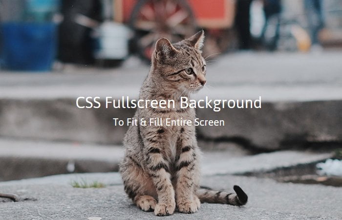
How to Make Responsive Fullscreen Background Images
To add an image as a background and to make it fit with fullscreen usually can be done by using the jQuery plugin. These plugins resize the image according to the browser window and cover the image width and height of the page.
But what about to make it without Jquery and build it with pure CSS?
Today I search out and see different solutions are available but one of them I would like to share with you, and this is, I personally use for my client while developing their websites.
1- Responsive Image Using Background Size Property
With background-size property, it’s so easy to make a responsive image. You just need to define background image with no-repeat and then define background-size value cover.
Let’s have a look example of the code below.
.main-wrapper{
   background:url(images/bg.jpg) no-repeat;
   background-size:cover;
}
This property used two types of values: contain and cover: I prefer to use cover. The answer is below. See definition of cover and contain:
- A cover is really interesting because it makes the background is entirely taken up by the image. It resized the image to the smallest size that allows covering the entire element. Cover element best used for the responsive full-screen background.
- Contain didn’t take up an entire page. Contain element only cover the page according to the size of an image.
There is another solution that I would like to recommend for you to use is provided by css-tricks.com
2- Inline Image Method
First of all, I will use an inline <img> element, which will be able to re-size in any browser.
<img src="images/bg.jpg" id="bg" alt="">
We set the position fixed so the image doesn’t change its position and take all over the place of a page. And by setting the top and left zero allow us there is no white space.
To keep it filling the browser window vertically, we set min-height to 100%. Similar we set the 100% min-width which will keep the image filling horizontally.
The purpose of making min-width to make sure that the image never gets smaller than its actual width.
#bg {
  position: fixed;
  top: 0;
  left: 0;

  /* Preserve aspet ratio */
  min-width: 100%;
  min-height: 100%;
}
3- Wrap Image into DIV
The above method works well but an issue is, it will not center the image on the page, so we need to fix that by wrapping an image with a div. This div we’ll make twice as big as the browser window.
<div id="bg">
  <img src="images/bg.jpg" alt="">
</div>
The wrapper div need to set the position fixed but the value of top and left should be -50%. Next, we will make the DIV twice as big as an image so we will set the width and height to 200%.
#bg {
  position: fixed;
  top: -50%;
  left: -50%;
  width: 200%;
  height: 200%;
}
#bg img {
  position: absolute;
  top: 0;
  left: 0;
  right: 0;
  bottom: 0;
  margin: auto;
  min-width: 50%;
  min-height: 50%;
}
To handle an image, we will set the position absolute and all of the values to zero for its all position. But the min-width and min-height It will be 50%.
That’s It. I hope you find this post useful. Which method do you like? Let me know in below comment section.