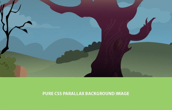
Are you looking a solution for creating CSS Parallax Background Image effect with Pure CSS only? Let’s have a look our tutorial to get started with building background images and content parallax effect which is compatible with all devices and browsers. This solution is pretty simple and easy to implement.
What we have done here to set the background image and then added a different content layer over it. Not only this but also set unique background photo layer in a way so it also gives a parallax scrolling effect.
The parallax is a new way of web designing and a lot of upcoming sites start using it. It is a way to add different layers which can be moving in different directions.
There are a lot of plugins available which make your job easy but these are overloaded with code and developed using jQuery or JavaScript.
By using such plugins means that you are offering a slow speed website to your users.
Then why not simply create such animation using CSS only? Yep with CSS, You will not only save a lot of bits but also give a smooth experience to your site visitors.
But that’s doesn’t mean that we should not use jQuery at all. Sometime, We should go with it because there is a lot of things that can’t possible with CSS only.
Also, Sometimes we can’t get maximum compatibility with the browser so we have to go with jQuery.
How to Create Parallax Background Image with Pure CSS
We will define each section separately like we will have the header, content parallax area, and footer.
The header will be a single clean top area of the web page where you can include logo and navigation etc.
<header class="codeconveyHeader">
  <h1>Parallax Background Scrolling</h1>
  <span>Effect using Background Image</span>
</header>
The next step we need to define the parallax area that will be divided into different parallax sections. We will define article HTML5 element that will hold all other div elements.
We will define the main container class name .parallax which will be our main div for handling all parallax sections.
<article>
  <div class="parallax">
  .....
  </div>
</article>
Now we will define these parallax scrolling sections that will have background images and content. We will use background-image for parallax section.
Let’s have a look at the code example. You will see that our first section pxbg__foo which is a background parallax image section.
The second one parallaxContent is also a parallax section but it’s for content. The class name green is used to define background color for a particular section.
<article>
  <div class="parallax">
     <div class="pxbg__foo">foo</div>
     <div class="parallaxContent green">
        <div class="codecontainer">
           CONTENT GOES HERE
        </div>
     </div>
     <div class="pxbg__bar">bar</div>
     <div class="parallaxContent baby">
       <div class="codecontainer">
         CONTENT GOES HERE
       </div>
     </div>
      <div class="pxbg__bazz">bazz</div>
  </div>
</article>
We define other sections similar to above mention like pxbg__bar is another section for parallax scrolling background image.
Finally, we need to define the footer, and we will use the footer element to get this done. The footer requires placing some more content and copyright info.
<footer>
   <h4>Example of Parallax Background Scrolling<br>using "background-attachment:fixed"</h4>
   <p>Copyright footer content</p>
</footer>
The CSS Style for Background Image
Let’s do styling the parallax effect, and we will do start with body and HTML that will have the height to 100%. To handle all the parallax background section we will use the class star ([class*=”pxbg__”]) This will allow us to add generally styles for each section.
We will set height for each section to 50vh which is half of the view screen. Our background-attachment will be at a fixed position. This fixed position allows making the view of parallax scrolling.
body, html {
  height: 100%;
  font-family: sans-serif;
}
.parallax [class*="pxbg__"] {
  position: relative;
  height: 50vh;
  text-indent: -9999px;
  background-attachment: fixed;
  background-position: top center;
  background-size: cover;
}
If you want to change the height of any section of the parallax effect, you can do it by defining its self. It will override the CSS of generic one which defines above ([class*="pxbg__"])
Background Images
Each scrolling section will have a background image, and we define each section like here.
.parallax [class*="pxbg__"]:nth-child(2n) {
  box-shadow: inset 0 0 1em #111;
}
.parallax .pxbg__foo, .parallax .pxbg__bazz {
  height: 100vh;
}
.parallax .pxbg__foo {
  background-image: url(https://s3-us-west-2.amazonaws.com/s.cdpn.io/30354/parallax1.jpg);
}
.parallax .pxbg__bar {
  background-image: url(https://s3-us-west-2.amazonaws.com/s.cdpn.io/30354/parallax2.jpg);
}
.parallax .pxbg__baz {
  background-image: url(https://s3-us-west-2.amazonaws.com/s.cdpn.io/30354/parallax3.jpg);
}
.parallax .pxbg__bazz {
  background-image: url(https://s3-us-west-2.amazonaws.com/s.cdpn.io/30354/parallax1.jpg);
}
.parallax .pxbg__break {
  box-shadow: inset 0 0 1em #111;
  background-image: url(https://s3-us-west-2.amazonaws.com/s.cdpn.io/30354/parallax1.jpg);
}
Parallax Content Area
Now we will see how to set the scrolling parallax section for content. Let’s take a look .parallaxContent class which has some generic styles.
Next, we will define the background color, and we have two different classes green and baby.
.parallaxContent {
  font-family: "Lato","Avenir Next",Arial,sans-serif;
  font-size: 18px;
  font-weight: 300;
  line-height: 30px;
  padding: 2em 0;
  text-align: center;
}
.parallaxContent.green{
	background:#97ce68;
}
.parallaxContent.baby{
	background:#68c8ce;
}
Footer Design
In the end, we will set the footer section where you can include some copyright info and menus. We will do basic styling to designing our footer.
footer {
	font-family: "Lato","Avenir Next",Arial,sans-serif;
  background-color: #f1f1eb;
  color: #2e2e17;
  font-size: 1em;
  font-weight: 300;
  line-height: 25px;
  padding: 1em;
  position: relative;
  text-align: center;
}
That is what we need all to get done a complete scrolling effect page using pure CSS3. I have to try to keep things straightforward and clean, so you can easily understand it.
I hope you find this tutorial as the quick guide to creating parallax effect and it may help you design your next project.