Displaying weather information on websites has become increasingly common. Whether you’re building a personal blog, a business website, or an educational platform, integrating a weather report can add value and functionality.
In this tutorial, we’ll explore how to create a dynamic weather report using Bootstrap 4, a popular front-end framework known for its simplicity and flexibility.
Step 1: Weather Report Structure with HTML
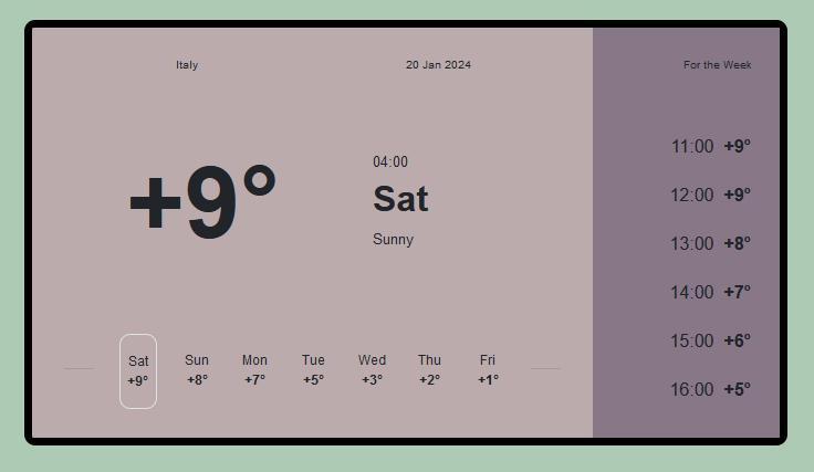
The HTML code employs Bootstrap to design a weather report interface, showcasing current weather information for Italy on January 20, 2024. The layout features a left section displaying the date, time, temperature, and weekly forecast, while the right section presents hourly temperature predictions for the week.
<div class="container"> <div class="card"> <div class="row"> <div class="col-9 left"> <div class="row top"> <div class="col">Italy</div> <div class="col">20 Jan 2024</div> </div> <div class="row"> <div class="col-7 temp">+9°</div> <div class="col-5 time"><p>04:00</p><h2><b>Sat</b></h2><p>Sunny</p></div> </div> <div class="row bottom"> <div class="col"><hr></div> <div class="col border"> <div class="row">Sat</div> <div class="row"><b>+9°</b></div> </div> <div class="col"> <div class="row">Sun</div> <div class="row"><b>+8°</b></div> </div> <div class="col"> <div class="row">Mon</div> <div class="row"><b>+7°</b></div> </div> <div class="col"> <div class="row">Tue</div> <div class="row"><b>+5°</b></div> </div> <div class="col"> <div class="row">Wed</div> <div class="row"><b>+3°</b></div> </div> <div class="col"> <div class="row">Thu</div> <div class="row"><b>+2°</b></div> </div> <div class="col"> <div class="row">Fri</div> <div class="row"><b>+1°</b></div> </div> <div class="col"><hr></div> </div> </div> <div class="col-3 right"> <div class="row top">For the Week</div> <div class="timely"> <div class="row">11:00 <b>+9°</b></div> <div class="row">12:00 <b>+9°</b></div> <div class="row">13:00 <b>+8°</b></div> <div class="row">14:00 <b>+7°</b></div> <div class="row">15:00 <b>+6°</b></div> <div class="row">16:00 <b>+5°</b></div> </div> </div> </div> </div> </div>
Step 2: Styling With CSS
This CSS stylesheet styles a weather interface with Flexbox and Media Queries for responsiveness. It sets body properties for centering content, styles containers and cards, and applies specific styles for current weather and hourly forecasts. Media queries adjust layout and font sizes for different screen sizes, ensuring a consistent display.
body{
min-height: 100vh;
display: flex;
align-items: center;
justify-content: center;
background-color: #9bbfa3d1;
font-family: sans-serif;
}
p{
margin-bottom: 1vh;
}
.container{
justify-content: center;
}
.card{
border: 1.5vh solid black;
max-width: 800px;
border-radius: 2vh;
margin: auto;
}
.col-8{
border-top-left-radius: 0.5vh;
border-bottom-left-radius: 0.5vh;
}
.left{
background-color: rgba(170, 150, 153, 0.8);
padding: 1rem;);
margin: 0;
}
.right{
padding: 1rem;
background-color: #887887;

}
.row,.col{
margin: 0;
}
.top{
text-align: center;
font-size: 0.65rem;
padding: 2vh;
}
@media(max-width:768px){
.top{
text-align: center;
font-size: 0.5rem;
padding: 1vh;
}
.top .col{
padding:0 0.5vh;
}
}
.temp{
padding: 8vh;
text-align: center;
font-size: 18vh;
font-weight: bold;
}
@media(max-width:768px)
{
.temp{
padding: 3vh 0vh;
text-align: center;
font-size: 9vh;
font-weight: bold;
}
}
@media(min-height:812px) and (min-width:769px)
{
.temp{
padding: 3vh 0vh;
text-align: center;
font-size: 9vh;
font-weight: bold;
}
}
.deg{
height: 50%;
background-color: rgb(189, 188, 188);
border-radius: 5rem;
}
.time{
align-self: center;
font-size: 0.8rem;
}
@media(max-width:768px)
{
.time{
align-self: center;
font-size: o.8rem;
}
.time h2{
font-size: 0.9rem;
}
.col-5{
padding: 1vh 0;
}
}
.bottom .row{
justify-content: center;
font-size: 0.75rem;
}
.bottom .col{
padding: 3vh 0.3vw ;
margin: 2vh;
}
@media(max-width:768px){
.bottom .col{
padding: 3vh 0.1vw;
margin: 0.03rem;
}
}
@media(min-height:812px) and (min-width:769px)
{
.bottom .col{
padding: 3vh 0.1vw;
margin: 0.03rem;
}
}
.border{
border-radius: 2vh;
}
.right .top{
justify-content: flex-end;
text-align: right;
}
.timely .row{
justify-content: flex-end;
padding: 2vh;
}
.timely{
margin-top: 25%;
}
@media(max-width:768px){
.timely .row{
justify-content: flex-end;
padding: 2vh 0;
font-size: 0.52rem;
}
}
@media(max-width:320px)
{
hr{
width: 0;
margin: 0;
}
}
Step 3: Including CDNs
https://stackpath.bootstrapcdn.com/bootstrap/4.3.1/css/bootstrap.min.css

https://cdnjs.cloudflare.com/ajax/libs/jquery/3.2.1/jquery.min.js

https://cdnjs.cloudflare.com/ajax/libs/jquery/3.2.1/jquery.min.js
How to Create Weather Report Using Bootstrap 4 Demo
We’ve explored how to create a responsive weather report using Bootstrap 4. By following these steps, you can seamlessly integrate weather information into your website, providing users with valuable insights into current and forecasted conditions.