The CSS box-shadow effects are creative things that make your site look good. In this article, You will learn how to create a shadow effect around the box with CSS.
I am going to implement the outer or inner shadow of the box. To add the shadow around the DIV, You need to use css3 property which can be defined as box-shadow. This property has the values for size, color, blur, and offset.
Just to remember that It didn’t support all browsers but support all WebKit browsers like Firefox/Chrome/Opera and the latest version of IE. The box-shadow also, support opacity with RBG color.
Let’s discuss all the elements of the box-shadow in details:
The Horizontal offset will allow moving the shadow effects on the right or left side of the box. If the value active then it will be right and if it’s valued contrary, it will on the left side. If you want the box-shadow equal to the left and right side, then it’s valued should be zero.
The Vertical offset is set to move the effects to the bottom or top of the box which depends on the negative or positive value. If the value of the vertical offset is positive, then the shadow will be the bottom of the box, and if it evaluated negatively, then it will be top of the table.
The Blur value depends on how much sharpness you want for a box-shadow. The higher Blur means more blurred, and if it set to 0, it will be sharp.
The Size value can’t set to 0 because if you do that, then the shadow box will not display so it’s mean you should be to set 1 or more value for size element according to how much size you want for the table.
The Color element used to set the color of the box-shadow; typically we used gay or black.
How to Create Box Shadow Effect in CSS
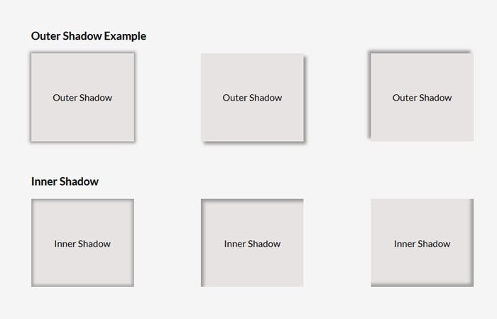
Before I will go to explain more about box-shadow, Let’s have a look at a simple example of the outer shadow box which shows the shadow around the box.
The outer shadow is easy to drop. All you have to define the box-shadow CSS property. The first two values of the property will be zero and the last two have some value. Have a look at the below example.
The -Moz-box-shadow is defined for adding support for Firefox and -WebKit-box-shadow is used for other WebKit browsers such as Chrome.
.outershadow1 {
-moz-box-shadow: 0 0 5px 3px #9d9d9d;
-webkit-box-shadow: 0 0 3px 5px #9d9d9d;
box-shadow: 0 0 5px 3px #9d9d9d;
}
If you want the shadow to be inside of the box, then you need to add CSS element inset, and code example will look like below.
.insetshadow1 {
-moz-box-shadow: inset 0 0 5px 3px #9d9d9d;
-webkit-box-shadow: inset 0 0 3px 5px #9d9d9d;
box-shadow: inset 0 0 5px 3px #9d9d9d;
}
Now, let’s see an example of the code without Blur, for this, we should need to set the Blur value 0
.nblur1 {
-moz-box-shadow: -5px -5px 0 #888;
-webkit-box-shadow: -5px -5px 0 #888;
box-shadow: -5px -5px 0 #888;
}
Shadow Effects with Opacity
We can adjust the opacity of the DIV box, but for this, you need to use the RGB color system. You can configure the value of the opacity from 0.1 to 0.9. Normally color codes are in HEX so if you don’t know RGB code of any color, you can use HEX 2 RGBA Color Calculator to convert your color code into RGB. The help of this Calculator you can’t only convert the color code into RGB, you can also set the value of Opacity
.optshadow2 {
-moz-box-shadow: -5px -5px 0 rgba(0, 0, 0, 0.4);
-webkit-box-shadow: -5px -5px 0 rgba(0, 0, 0, 0.4);
box-shadow: -5px -5px 0 rgba(0, 0, 0, 0.4);
}
Add Shadow Round Tooltip
To implement the shadow effect around the tooltip is so simple and dead easy. You just need to get the above example code and add it to your tooltip.
We have already posted an article about CSS tooltip. You can consider our previous article Pure CSS Tooltip. You simply need to add shadow-box code to .tooltipT.red class name.
Let’s have a look at the example code below. You will also find this in the demo.
.tooltipT.red{
background:#e41f1f;
-moz-box-shadow: 0 0 5px 3px #9d9d9d;
-webkit-box-shadow: 0 0 3px 5px #9d9d9d;
box-shadow: 0 0 5px 3px #9d9d9d;
}
That’s It! Hope you find this tutorial useful and it will help you to solve the shadow issue. If you like this article, please do share it with your friends and don’t forget to leave a comment.