A glitch effect distorts the text for a few seconds to indicate a problem or corrupt digital data. This animation effect is mostly used in gaming interfaces or data loading screens. Basically, there are various tools are available to create glitch animation in videos or photos. But how about applying this effect on the text on websites? Well! in this tutorial, we are going to create a simple glitch text effect using pure CSS.
Although, there are many libraries and plugins to create animated text. But, playing with only CSS is quite fun to achieve the desired output with minimal code. In order to achieve the glitch text effect, we’ll use the CSS clip property over the masked text that will be placed using the “before” pseudo-selector over the real text. Similarly, we’ll use CSS animation keyframes to apply glitch noise effects on the text.
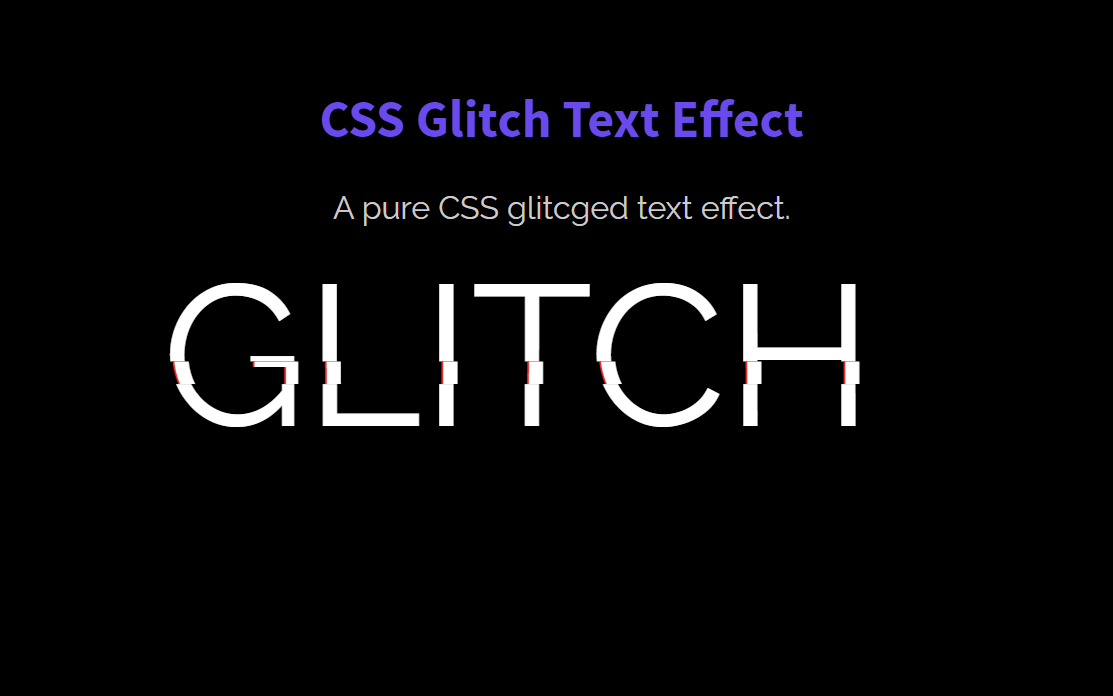
Before going further, I would suggest you check the demo page to see the glitched text. There you can experience the glitch animation that is continuously playing. Anyhow, you can change the animation behavior and colors according to your needs. So, let’s get started with HTML to create the glitch text effect.
The HTML Code
In the very first step, create a div element with a class name "glitch", place the text inside the data-text attribute on which you want to apply glitch animation. You can place this div element anywhere on the webpage where you want to display the glitched text effect.
<div class="glitch" data-text="GLITCH">GLITCH</div>
The CSS Styles for Glitch Text
After creating the HTML, now target the "glitch" class in CSS and define its relative position. Similarly, define the font size and width according to the length of the text. You may need to update the width value, as in my case I used 400px for “GLITCH” text that is enough for containing this text. The color and margin properties are optional, you can set them according to your needs.
.glitch {
  color: white;
  font-size: 100px;
  position: relative;
  width: 400px;
  margin: 0 auto;
}
Now, target the glitch class with before pseudo selector and set the data-text value for content property. This will hold the glitched version of the text and animate it with alternate-reverse order. So, define the absolute position and define the -2px value for the left property in order to shift the glitched text a little bit in a disordered direction over the actual text.
Likewise, define the color, text-shadow, and background (same as body background) property. Use the CSS clip property to shape the text and define the animation property as follows. Here the important property is the overflow that should be hidden. Otherwise, the clip property will not apply to the text.
Moreover, set the animation named with "noise-anim-2" whose keyframes we’ll define at the last step. Similarly, set the animation-iteration-count as "infinite" for continuous play of glitch effect. Likewise, use the linear value to keep the equal playing speed along with the alternate-reverse animation playing sequence.
.glitch:before {
  content: attr(data-text);
  position: absolute;
  left: -2px;
  text-shadow: 1px 0 blue;
  top: 0;
  color: white;
  background: black;
  overflow: hidden;
  clip: rect(0, 900px, 0, 0);
  animation: noise-anim-2 3s infinite linear alternate-reverse;
}
In the same way, select the after a glitch with the after pseudo selector and define the same CSS properties with different values in order to show a little bit of difference while playing glitch animation. Here, define the animation named with “noise-anim”. If you want to increase the glitch effect, you can set the custom value for the left property and text shadow. Similarly, you can set the custom value for the colors if you want to customize the glitch effect.
.glitch:after {
  content: attr(data-text);
  position: absolute;
  left: 2px;
  text-shadow: -1px 0 red;
  top: 0;
  color: white;
  background: black;
  overflow: hidden;
  clip: rect(0, 900px, 0, 0);
  animation: noise-anim 2s infinite linear alternate-reverse;
}
Glitch Animation Keyframes
After defining the basic CSS styles for the glitch text effect, now it’s time to animate the glitch text. So, define the "noise-anim" name for the animation and apply the keyframe’s values to it. Inside the keyframes, you just need to specify some random values for the CSS clip property with each 5% gap of breakpoints. Hence, it will produce a random glitch effect for the text. Similarly, do the same thing with “noise-anim-2” animation.
@keyframes noise-anim {
  0% {
    clip: rect(88px, 9999px, 98px, 0);
  }
  5% {
    clip: rect(39px, 9999px, 2px, 0);
  }
  10% {
    clip: rect(11px, 9999px, 17px, 0);
  }
  15% {
    clip: rect(37px, 9999px, 22px, 0);
  }
  20% {
    clip: rect(85px, 9999px, 2px, 0);
  }
  25% {
    clip: rect(45px, 9999px, 15px, 0);
  }
  30% {
    clip: rect(62px, 9999px, 36px, 0);
  }
  35% {
    clip: rect(77px, 9999px, 36px, 0);
  }
  40% {
    clip: rect(79px, 9999px, 81px, 0);
  }
  45% {
    clip: rect(51px, 9999px, 82px, 0);
  }
  50% {
    clip: rect(72px, 9999px, 61px, 0);
  }
  55% {
    clip: rect(49px, 9999px, 68px, 0);
  }
  60% {
    clip: rect(46px, 9999px, 19px, 0);
  }
  65% {
    clip: rect(56px, 9999px, 57px, 0);
  }
  70% {
    clip: rect(19px, 9999px, 81px, 0);
  }
  75% {
    clip: rect(48px, 9999px, 44px, 0);
  }
  80% {
    clip: rect(14px, 9999px, 93px, 0);
  }
  85% {
    clip: rect(24px, 9999px, 48px, 0);
  }
  90% {
    clip: rect(2px, 9999px, 47px, 0);
  }
  95% {
    clip: rect(87px, 9999px, 100px, 0);
  }
  100% {
    clip: rect(50px, 9999px, 59px, 0);
  }
}

@keyframes noise-anim-2 {
  0% {
    clip: rect(95px, 9999px, 2px, 0);
  }
  5% {
    clip: rect(95px, 9999px, 92px, 0);
  }
  10% {
    clip: rect(19px, 9999px, 86px, 0);
  }
  15% {
    clip: rect(3px, 9999px, 31px, 0);
  }
  20% {
    clip: rect(70px, 9999px, 4px, 0);
  }
  25% {
    clip: rect(29px, 9999px, 55px, 0);
  }
  30% {
    clip: rect(70px, 9999px, 80px, 0);
  }
  35% {
    clip: rect(1px, 9999px, 20px, 0);
  }
  40% {
    clip: rect(48px, 9999px, 52px, 0);
  }
  45% {
    clip: rect(53px, 9999px, 18px, 0);
  }
  50% {
    clip: rect(1px, 9999px, 28px, 0);
  }
  55% {
    clip: rect(40px, 9999px, 54px, 0);
  }
  60% {
    clip: rect(62px, 9999px, 60px, 0);
  }
  65% {
    clip: rect(94px, 9999px, 36px, 0);
  }
  70% {
    clip: rect(79px, 9999px, 16px, 0);
  }
  75% {
    clip: rect(66px, 9999px, 5px, 0);
  }
  80% {
    clip: rect(63px, 9999px, 22px, 0);
  }
  85% {
    clip: rect(36px, 9999px, 57px, 0);
  }
  90% {
    clip: rect(38px, 9999px, 69px, 0);
  }
  95% {
    clip: rect(38px, 9999px, 91px, 0);
  }
  100% {
    clip: rect(18px, 9999px, 48px, 0);
  }
}
That’s all! I hope you have successfully created a glitch text effect. If you have any questions or suggestions, let me know by comment below.