Do you want to add an introduction section on your website? Why not make it animated? With the help of CSS intro animation, we will build a nice looking page.
The simple text CSS animation is great fun to showcase some quick information to customers. If you are providing some services, then it’s the great thing to show who are you on the quick note.
As we know, web design is a major factor and it is important to layout elements in attractive way.
Making your website users impressive, It’s great fun to use a nice hero image scrolling effect, background color, image, and beautiful typography.
Today, I am going to show you how to make a front page which has a quick intro on your website.
I will create a fullscreen page with Smooth CSS Fade Animation and a timer bar on the top of the page.
All we do with using HTML/CSS and a bit of jquery. I will use almost the same technique which we do while making any type of jQuery slider.
Just the difference it will show you some quick text instead of images. Also, it is entirely responsive and works well on any screen sizes.
Basic Intro Animation Markup
We have simply HTML which is very easy to understand. You can have a look that, it has the main div class name intro which holds the all other divs and HTML tags.
The div class animated-bar is a loading progress bar which you will see on the top of the screen.
Next, we define each slider as a section which includes the rest of the content.
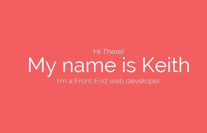
<div class="intro">
   <div class="animated-bar"></div>

   <div class="slide slide-a">
      <div class="slide-content">
         <p class="slide-a-child">Hi There!</p>
         <h1 class="slide-a-child">My name is Mohamed</h1>
         <p class="slide-a-child">I'm a Front End web developer</p>
      </div>
   </div>

</div>
That’s very simple. And it’s not hard to add a second slide. All you have to copy and past first slide code and then modify the slider class name.
Let’s have a look at the code and see we just need to change the class name slide-a into slide-b.
<div class="slide slide-b">
  <div class="slide-content">
     <h2 class="slide-b-child">what I do</h2>
     <p class="slide-b-child">I design modern, clean and creative websites</p>
     <p class="slide-b-child">And make them alive on the internet</p>
  </div>
</div>
Apply Styling
The CSS is the bit lengthy, and here I am going to explain to you few things about CSS. Don’t worry; you will get all the CSS from the download file.
To make the full screen we have a great new CSS property called VH. The VH allows users to set the size of things according to display.
.intro {
  width: 100%;
  min-height: 100vh;
  position: relative;
}
The CSS animation property makes it possible to create animation and allows to define keyframe created animation.
The size of the bar can easily achieve through height element and as for as position concern, we can use absolute position then set the top to zero to set it on the top of the screen or page.
.intro .animated-bar {
  width: 0;
  height: 3px;
  background: #fff;
  z-index: 9999;
  position: absolute;
  top: 0;
  left: 0;
  -webkit-animation: bar 5s 3 linear;
          animation: bar 5s 3 linear;
}
The Javascript
With the help of javascript, we will able to set the timeout, fade out and few other functions such as visibility. Each slide will have timeout function, and is-visible class is added through javascript to all child divs of main slider div class name slide.
Also, When the timeout function competed, it will add the class display: none; to main div of class slide but it will not add this class to the last div of the slider.
$(document).ready(function () {

    'use strict';

    var slide  = $('.slide'),
        slideAelements = $('.slide-a-child'),
        replay = $('button.replay');

    slide.each(function (i) {
        if (i < 3) {
            setTimeout(function () {
                slide.eq(i).fadeOut();
            }, 5000 * (i + 1));
        }
    });

    function animateSlideA() {
      slideAelements.each(function (i) {
          setTimeout(function () {
              slideAelements.eq(i).addClass('is-visible');
          }, 300 * (i + 1));
      });
    }

   animateSlideA();

   replay.on('click', function () {
     location.reload(true);
   });

});
That’s it! Check out CSS intro animation demo to see how its work and apply on your website to make it look nicer.
I have been searching for this effect. Thanks for your instruction and nice work.
Hi Phoebe!
Thanks for the appreciation! Keep visiting us for more CSS tutorials and code snippets.
waw Very Nice, hi can looping non-stop this effect, how .. please