One essential aspect of accessibility is creating user-friendly and accessible components, like toggle switches. In this blog post, we will guide you through the step-by-step process of creating an accessible toggle switch using JavaScript.
Step 1: Accessibility-Enhanced Toggle Button Using HTML
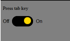
This code snippet represents an accessible toggle button that can be used on a web page. The button has three main parts: “Off,” the button element, and “On.” The button is designed to switch between an “Off” and “On” state when clicked or interacted with via keyboard navigation.
<p> Press tab key </p>
<div class="toggle-button-wrapper">
<span>Off</span>
<button role="switch" aria-checked="false" aria-label="Toggle VAT">
<span class="accessibility"></span>
<span class="toggle-button-switch"></span>
</button>
<span>On</span>
</div>
Step 2: Styling with CSS
This CSS code for styling an accessible toggle button component. It defines the visual aspects of the button, making it both user-friendly and inclusive. The code sets background colors, border styles, fonts, and layout properties to create a cohesive and appealing design.
* {
box-sizing: border-box;
background-color: grey;
}

.accessibility {
border: 0;
clip: rect(0 0 0 0);
height: 1px;
margin: -1px;
overflow: hidden;
padding: 0;
position: absolute;
width: 1px;
background-color: red;
}

.toggle-button-wrapper {
font-family: sans-serif;
font-size: 1em;
font-weight: normal;
line-height: 35px;
}

.toggle-button-wrapper * {
display: inline-block;
vertical-align: middle;
}

[role="switch"] {
background-color: #000;
border: 0.062em solid #000;
border-radius: 25px;
color: #fff;
cursor: pointer;
display: inline-block;
height: 35px;
margin: 0 5px;
overflow: visible;
position: relative;
width: 70px;
}

[role="switch"] .toggle-button-text {
background-color: #ffd800; /* Background color for text */
padding: 0 10px; /* Adjust padding to control the background size */
border-radius: 10px; /* Adjust border-radius for rounded corners */
}

[role="switch"]:focus {
outline: 3px dashed darkolivegreen; /* Temp style to show focus state in POC */
}

.toggle-button-switch {
background: #ffd800;
border-color: #ffd800;
color: #000;
border: 1px solid #000;
border-radius: 50%;
display: inline-block;
height: 25px;
right: 5px;
line-height: 25px;
position: absolute;
top: 2.5px;
width: 25px;
}

[role="switch"][aria-checked="true"] .toggle-button-switch {
left: 5px;
}
Step 3:Interactive Toggle Switch Functionality
This JavaScript code is designed to handle the behavior of a toggle switch element.
const toggle = document.querySelector('[aria-checked]');

toggle.addEventListener('click', function () {
const pressed = this.getAttribute('aria-checked') === 'true';
this.setAttribute('aria-checked', !pressed);

const label = this.textContent.trim();
this.setAttribute('aria-label', label + (pressed ? ' off' : ' on'));
});
Designing Accessible Toggle Switches for the Modern Web With Javascript Demo
Accessibility is an ongoing commitment, and it’s essential to stay informed about best practices and guidelines to ensure your web projects are as inclusive as possible.