Today we will create unique CSS3 Image Hover Effects with Caption that are easy to implement. You simply need to copy & paste the code on your webpage and you are done.
If you are a web designer or front-end developer then you surely love with Image hover effects. These effects have awesome design and included 8 different effects that show captions title and description when user mouse over the image.
Any kind of web animation always funs because it creates flair to a different component of a website. When we talk about hover effects, They developed by using CSS3 animation, transition and 3G translator.
In order to create a beautiful, subtle effect or reveal text when hover, we need to play with these CSS properties.
There is no doubt that they enhance the overlook and feel of your website and make it easy for the user to navigate throughout the site.
There are many ways to develop HTML & CSS Image Hover Effects. You can create them using Javascript, jQuery, and CSS3. Also, you can combine the jQuery with CSS3 to develop an interesting effect.
Due to their much popularity in the world of web design, I thought to share with you some unique hover effects which show hidden captions in a neat and clean way.
How to Create CSS3 Image Hover Effects with Caption
The markup is clean and organizes way. It starts with a grid div with a unique class for each effect. There are about 8 different effects and each one has its own class.
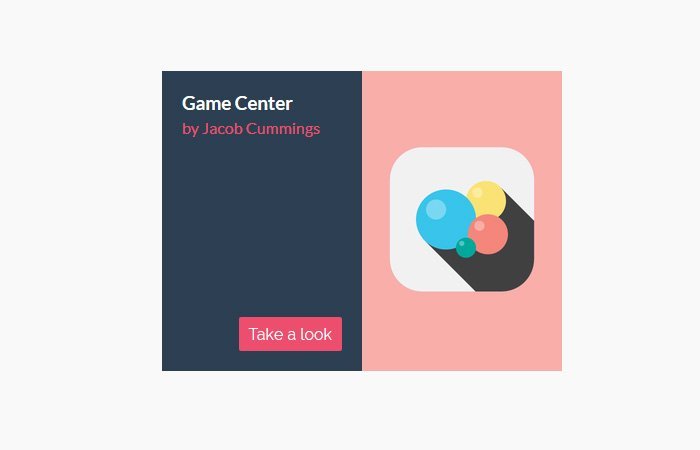
Each item contains a figure an element which included an imgtag. The figure element also contain a figcaption with heading, text, and link.
<ul class="grid cs-style-1">
<li>
    <figure>
        <img src="images/1.png" alt="img01">
        <figcaption>
            <h3>Camera</h3>
            <span>Jacob Cummings</span>
            <a href="http://dribbble.com/shots/1115632-Camera">Take a look</a>
        </figcaption>
    </figure>
</li>
</ul>
Apply CSS3 Styling
Let’s start with the grid and apply some common styles including text-align, margin, and padding, etc. The list items also need some styling to handle the elements of the figure.
With the help of inline-blocks, We able to center the list items by applying a text-align to the parent.
.grid {
	padding: 20px 20px 100px 20px;
	max-width: 1300px;
	margin: 0 auto;
	list-style: none;
	text-align: center;
}
.grid li {
	display: inline-block;
	width: 440px;
	margin: 0;
	padding: 20px;
	text-align: left;
	position: relative;
}
Now we will reset the margins of figure element and set it’s a position to relative.
.grid figure {
	margin: 0;
	position: relative;
}
To make work the image on mobile, We will add a width 100% which help to resize the image when we define a media query for list items
.grid figure img {
	max-width: 100%;
	display: block;
	position: relative;
}
For figure We already have position relative so for figcaption we will set positioned absolutely.
.grid figcaption {
	position: absolute;
	top: 0;
	left: 0;
	padding: 20px;
	background: #2c3f52;
	color: #ed4e6e;
}
And finally, We will style for heading, text, and link:
.grid figcaption h3 {
	margin: 0;
	padding: 0;
	color: #fff;
}
.grid figcaption span:before {
	content: 'by ';
}
.grid figcaption a {
	text-align: center;
	padding: 5px 10px;
	border-radius: 2px;
	display: inline-block;
	background: #ed4e6e;
	color: #fff;
}
To make it work well on mobile and tablet, We will apply a media query.
@media screen and (max-width: 31.5em) {
	.grid {
		padding: 10px 10px 100px 10px;
	}
	.grid li {
		width: 100%;
		min-width: 300px;
	}
}
That’s it! Find all effects in the source file and check out the demo.