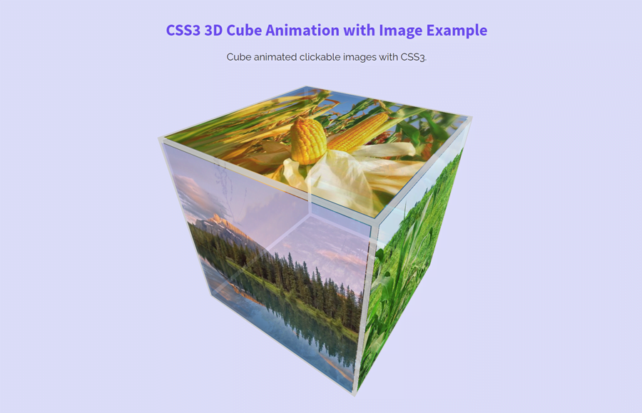
This tutorial explains how to create a 3D cube with the image using CSS3 animation. You may have tried to create a cube using CSS but stuck in coding. Here, you can simply download the source code for this 3D cube, place your images inside the HTML structure and your cube animation will be ready.
A few months ago, we created a 3D cube image rotator that rotates 6 images at a time. But we used background images for each side of the cube in that cube image rotator. Here, we are going to place the images inside the cube’s card and make each image clickable. So, you can easily attach a link to each side of the cube for a specific purpose.
Moreover, we’ll pause the cube animation on hover. Besides this, you are not limited to add only images inside this 3D cube. You can also place any HTML element inside each side of the cube. So, let’s get started to create the HTML structure for the 3D cube.
Create HTML for 3D Cube with Image
In the very first step, create a container for the cube and place six div elements with the class name "card" inside it. The "card" class will represent each side of the cube. Place your image wrapping with a hyperlink in each card. So, the basic HTML structure for the cube with images looks like below:
<div class="contenedor">
   <div class="cube">
      <div class="card">
         <a href="#">
         <img src="img/image-1.jpg" title="Soto y Caldevilla de Valdeón" alt="Soto y Caldevilla de Valdeón" height="290px" width="290px" >
         </a>
      </div>
      <div class="card">
         <a href="#">
         <img src="img/image-2.jpg" title="Un poco de nieve en agosto" alt="Un poco de nieve en agosto" width="290px" height="290px">
         </a>
      </div>
      <div class="card">
         <a href="#">
         <img src="img/image-3.jpg" title="Un rebeco" alt="Un rebeco" width="290px" height="290px">
         </a>
      </div>
      <div class="card">
         <a href="#">
         <img src="img/image-4.webp" title="Posada de Valdeón" alt="Posada de Valdeón" width="290px" height="290px">
         </a>
      </div>
      <div class="card">
         <a href="#">
         <img src="img/image-5.jpg" title="Refugio de Pantivalles" alt="Refugio de Pantivalles" width="290px" height="290px">
         </a>
      </div>
      <div class="card">
         <a href="#">
         <img src="img/image-6.jpg" title="Unas montañas" alt="Unas montañas" width="290px" height="290px">
         </a>
      </div>
   </div>
</div>
You can also add any extra element to the "card" class like text for captions. Similarly, if you don’t wanna make your images clickable then you can remove the link tag.
The CSS Styles
The "contenedor" class defines the container for the cube. Define 500px value for the CSS perspective property along with the 50% 50% origin.
.contenedor {
  -webkit-perspective: 500px;
  perspective: 500px;
  perspective-origin: 50% 50%;
}
The "cube" class is the wrapper element of all six sides of the cube. Each side has a class name "card". So, target these classes and define the height and width according to your needs.
.cube, .cube .card{
  height: 290px;
  width: 290px;
}
Now, target the "cube" class and set the preserve-3d style for transformation. Likewise, define the margin value and animation-name with 20s duration.
.cube {
  -webkit-transform-style: preserve-3d;
  transform-style: preserve-3d;

  -webkit-transform: rotateX(-30deg) rotateY(30deg);
  transform: rotateX(-30deg) rotateY(-30deg);

  margin: 150px auto;

  -webkit-animation: giro 20s infinite linear;
  animation: giro 20s infinite linear;
}
After that, target the "card" class to style the sides of the cube. Define the "absolute" position, opacity, border, and transition property as described below:
.cube .card {
  position: absolute;
  border: 5px solid #ccc;
  opacity: 0.85;
  transition: 0.2s;
}
In order to shape the cube, we need to transform each side of the cube. For this purpose, select each side class using the nth-child selector and use the CSS transform translate property with the following values:
/*card frontal*/
.cube .card:nth-child(1) {
  -webkit-transform: translateZ(150px);
  transform: translateZ(150px);
}
/*card posterior*/
.cube .card:nth-child(2) {
  -webkit-transform: rotateY(180deg) translateZ(150px);
  transform: rotateY(180deg) translateZ(150px);
}
/*card izquierda*/
.cube .card:nth-child(3) {
  -webkit-transform: rotateY(-90deg) translateZ(150px);
  transform: rotateY(-90deg) translateZ(150px);
}
/*card derecha*/
.cube .card:nth-child(4) {
  -webkit-transform: rotateY(90deg) translateZ(150px);
  transform: rotateY(90deg) translateZ(150px);
}
/*card superior*/
.cube .card:nth-child(5) {
  -webkit-transform: rotateX(90deg) translateZ(150px);
  transform: rotateX(90deg) translateZ(150px);
}
/*card inferior*/
.cube .card:nth-child(6) {
  -webkit-transform: rotateX(-90deg) translateZ(150px);
  transform: rotateX(-90deg) translateZ(150px);
}
Specify CSS animation keyframes for the rotation of the cube. You can set the custom rotate values if you want to rotate the cube differently.
@-webkit-keyframes giro {
    0% { -webkit-transform: rotateX(-45deg) rotateY(0deg); }
    50% { -webkit-transform: rotateX(45deg) rotateY(360deg); }
    100% { -webkit-transform: rotateX(-45deg) rotateY(720deg); }
}

@keyframes giro {
    0% { transform: rotateX(-45deg) rotateY(0deg); }
    50% { transform: rotateX(45deg) rotateY(360deg); }
    100% { transform: rotateX(-45deg) rotateY(720deg); }
}

@-webkit-keyframes giro360 {
    0% { -webkit-transform: rotateX(  0deg) rotateY(  0deg); }
  100% { -webkit-transform: rotateX(360deg) rotateY(360deg); }
}

@keyframes giro360 {
    0% { transform: rotateX(  0deg) rotateY(  0deg); }
  100% { transform: rotateX(360deg) rotateY(360deg); }
}
Finally, target the cube class with hover pseudo-selector and define the "paused" value for animation-play-state property in order to pause the cube on hover.
/* Pause animation on hover */
.cube:hover{
    animation-play-state: paused;
}
.cube:hover .card{
   opacity: 1;
   transition: 0.2s;
}
That’s all! I hope this tutorial was helpful to create a 3D cube animation with image using CSS3. If you have any questions or suggestions, let me know by comment below.