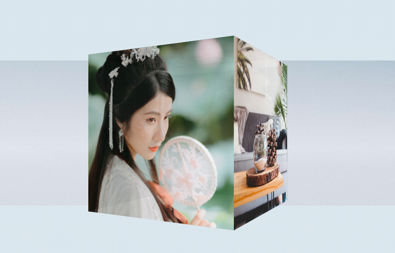
A 3D cube shape is one of the attractive elements for rotating 6 images at a time. Thus, it takes a limited space, unlike a traditional image slideshow. Basically, a CSS3 designed cube can be used for various purposes on a webpage. One of these purposes is a 3D cube image rotator to display images in an attractive way.
The coding concept for this project is that we’ll create a cube using HTML and place images as background for each side of the cube. In order to rotate it, we’ll apply CSS3 animation. That’s it! the final output can be browsed on the demo page.
HTML Structure for 3D Cube Image Rotator
We need to create an animated scene of the three-dimensional cube. To do so, create a container with a class name "scene" and place a child div with a class name "cube". Define 6 div elements inside the cube wrapper for back, left, right, top, bottom, and the front side of the cube. So, the complete HTML structure for a cube looks like follows:
<div class="scene">
   <div class="cube">
      <div class="side back"></div>
      <div class="side left"></div>
      <div class="side right"></div>
      <div class="side top"></div>
      <div class="side bottom"></div>
      <div class="side front"></div>
   </div>
</div>
You can place any HTML elements (like text, buttons, links, etc.) inside the cube’s side. Anyhow, it’s your choice to further customize it according to your needs.
The CSS Styles
In CSS, the very first element is the “scene” container that we need to display as a CSS flexbox. Therefore, create CSS styles for this container as described below:
.scene {
  -webkit-perspective: 800px;
          perspective: 800px;
  display: -webkit-box;
  display: flex;
  -webkit-box-align: center;
          align-items: center;
  -webkit-box-pack: center;
          justify-content: center;
  height: 100%;
  width: 100%;
  background: url("https://i.imgur.com/2WQui47.jpg");
  background-size: 100% 100%;
  background-position: center;
  background-repeat: no-repeat;
}
After that, zoom the cube scene on hover by transforming the scale. It looks pretty to apply the zoom effect on hover to show some creativity to your users.
.scene:hover {
  -webkit-transform: scale(1.5);
          transform: scale(1.5);
}
Also, make the side of the cube fully visible on hover using CSS opacity property.
.scene:hover .side {
  opacity: 1;
}
Now, define CSS styles for the cube. Keep its position as relative, define the width and height values. Here the important property is “transform-style” that should be preserve-3d. If you want to increase/decrease the size of the cube, set the custom values for width and height.
.cube {
  -webkit-transform-style: preserve-3d;
          transform-style: preserve-3d;
  position: relative;
  width: 300px;
  height: 300px;
  -webkit-animation: rotate 10s ease-in-out infinite;
          animation: rotate 10s ease-in-out infinite;
  -webkit-transform-origin: center center;
          transform-origin: center center;
}
The “side” is the common class for all sides of the cube. Set its width and height values the same to the cube and keep its position absolute. Similarly, define the other properties as mentioned below:
.side {
  position: absolute;
  width: 300px;
  height: 300px;
  background-color: #333;
  opacity: .95;
  background-size: cover;
  background-repeat: no-repeat;
}
Transform the backside of the cube and set a background image for this side.
.back {
  -webkit-transform: translateZ(-150px) rotateX(180deg);
          transform: translateZ(-150px) rotateX(180deg);
  background-image: url(https://source.unsplash.com/featured/?nature);
}
Likewise, define CSS styles for the left, right, top, bottom, and the front side of the cube. Place your images as background for each side of the cube.
.left {
  -webkit-transform: translateX(-150px) rotateY(90deg);
          transform: translateX(-150px) rotateY(90deg);
  background-image: url(https://source.unsplash.com/featured/?tree);
}

.right {
  -webkit-transform: translateX(150px) rotateY(90deg);
          transform: translateX(150px) rotateY(90deg);
  background-image: url(https://source.unsplash.com/featured/?home);
}
.top {
  -webkit-transform: translateY(-150px) rotateX(90deg);
          transform: translateY(-150px) rotateX(90deg);
  background-image: url(https://source.unsplash.com/featured/?car);
}

.bottom {
  -webkit-transform: translateY(150px) rotateX(270deg);
          transform: translateY(150px) rotateX(270deg);
  background-image: url(https://source.unsplash.com/featured/?work);
}
.front {
  -webkit-transform: translateZ(150px);
          transform: translateZ(150px);
  background-image: url(https://source.unsplash.com/featured/?);
}
Finally, create CSS3 keyframes for cube rotate animation.
@-webkit-keyframes rotate {
  0% {
    -webkit-transform: rotateX(0);
            transform: rotateX(0);
  }
  12.5% {
    -webkit-transform: rotateY(90deg);
            transform: rotateY(90deg);
  }
  25% {
    -webkit-transform: rotateY(270deg);
            transform: rotateY(270deg);
  }
  37.5% {
    -webkit-transform: rotateY(270deg);
            transform: rotateY(270deg);
  }
  50% {
    -webkit-transform: rotateY(360deg);
            transform: rotateY(360deg);
  }
  62.5% {
    -webkit-transform: rotateX(90deg);
            transform: rotateX(90deg);
  }
  75% {
    -webkit-transform: rotateX(180deg);
            transform: rotateX(180deg);
  }
  87.5% {
    -webkit-transform: rotateX(270deg);
            transform: rotateX(270deg);
  }
  100% {
    -webkit-transform: rotateX(360deg);
            transform: rotateX(360deg);
  }
}

@keyframes rotate {
  0% {
    -webkit-transform: rotateX(0);
            transform: rotateX(0);
  }
  12.5% {
    -webkit-transform: rotateY(90deg);
            transform: rotateY(90deg);
  }
  25% {
    -webkit-transform: rotateY(270deg);
            transform: rotateY(270deg);
  }
  37.5% {
    -webkit-transform: rotateY(270deg);
            transform: rotateY(270deg);
  }
  50% {
    -webkit-transform: rotateY(360deg);
            transform: rotateY(360deg);
  }
  62.5% {
    -webkit-transform: rotateX(90deg);
            transform: rotateX(90deg);
  }
  75% {
    -webkit-transform: rotateX(180deg);
            transform: rotateX(180deg);
  }
  87.5% {
    -webkit-transform: rotateX(270deg);
            transform: rotateX(270deg);
  }
  100% {
    -webkit-transform: rotateX(360deg);
            transform: rotateX(360deg);
  }
}
You have completed it! I hope you’ve successfully implemented this cube image rotator into your project. If you need any further help related to CSS3 animations, let me know by comment below.