Sometimes, we need to apply an effect on the background image while creating something attractive. Whether it is a parallax effect on the scroll event or scale-up effect on hover, we need to do some additional steps rather than using only CSS hover pseudo-selector. Well! in this tutorial, you’ll learn how to create a CSS zoom effect on hover for the background image.
Basically, CSS zoom property or scale transformation not works for background images to zoom them directly. But, it’s quite possible to zoom a container that has a background image. Similarly, another way to zoom the background image is by changing the background-size. So, here we’ll use the background-size method to zoom the image on hover.
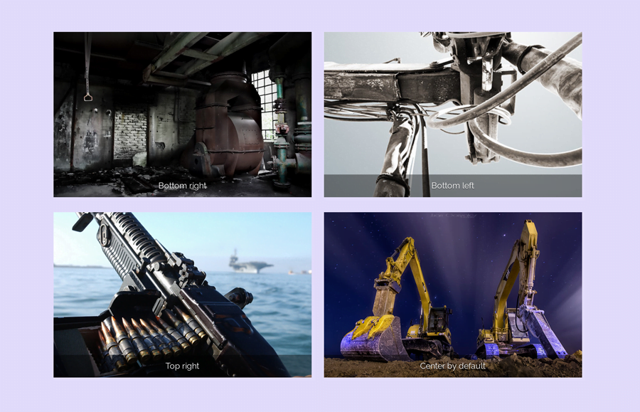
Maybe you’re thinking, why are we going to use the background-size property to zoom a background image? Well! we can get some additional zooming effect by doing so, like zoom image from a specific position. You can check the output of different zoom effects on the demo page before getting started with coding.
How to Zoom Background Image on Hover
In order to create a zoomable background image, you need to create a div container with a class name "hover-zoom". Place your background image for this div using the style attribute. You can place any HTML element inside this container, like image caption, link, or anything you want. So, a very basic markup structure for zoomable background image looks like the following code:
<div class="hover-zoom" style="background-image: url("https://c4.staticflickr.com/8/7114/13963940252_cfa9c53e9a_c.jpg")">
  <p>
    Caption text goes here...
  </p>
</div>
As you have seen three other image zooming (bottom right, bottom left, top right) style on the demo page, you can define the CSS background-position property to get your desired result. So, the HTML for zooming image from various positions is as follows:
<div class="hover-zoom" style="background-position: bottom right; background-image: url("https://c1.staticflickr.com/1/70/222707421_346dd12c17_z.jpg")">
  <p>
    Bottom right
  </p>
</div>
<div class="hover-zoom" style="background-position: bottom left; background-image: url("https://c4.staticflickr.com/4/3428/3901063146_21ebee43a1.jpg")">
  <p>
    Bottom left
  </p>
</div>
<div class="hover-zoom" style="background-position: top right; background-image: url("https://c2.staticflickr.com/8/7152/6784083185_3f575e5bdb_b.jpg")">
  <p>
    Top right
  </p>
</div>
The CSS Styles
After creating an HTML structure, now its time to style the ".hover-zoom" container with CSS. Here, we are going to style it like a box with a fixed height and width value. However, you can make it a responsive or full-width box according to your needs. The important style properties for this selector are background-size that should be 100%, and position that should be relative.
Similarly, the other properties, like background-repeat should be no-repeat, and keep some margin for this element. To zoom your background image smoothly, use the CSS transition property. So, a complete CSS code snippet for the ".hover-zoom" selector is as follows:
.hover-zoom {
  display: inline-block;
  margin: 10px;
  height: 320px;
  width: 500px;
  -webkit-transition: all 0.3s ease-in-out;
  transition: all 0.3s ease-in-out;
  background-size: 100%;
  background-position: center;
  background-repeat: no-repeat;
  background-color: gray;
  position: relative;
}
Now, define the background-size for CSS hover pseudo-selector to zoom background image on hover. You can set the maximum zoom limit (like 120%) according to your needs. If you want to zoom out your image on hover, just decrease the background-size.
.hover-zoom:hover {
  background-size: 120%;
}
Finally, define some styles for caption text (it’s optional, you can skip this step if you don’t want to add captions). Keep its absolute position with 100% width and define its bottom and left position 0 respectively. Define a transparent background using HTML RGBA color, set text color, padding, and keep the margin value as 0. So, the complete code snippet for caption bar is as follows:
.hover-zoom p {
  position: absolute;
  bottom: 0;
  left: 0;
  width: 100%;
  color: white;
  text-shadow: 0 1px 1px rgba(0, 0, 0, 0.5);
  background: rgba(0, 0, 0, 0.4);
  padding: 0.5em;
  margin: 0;
  box-sizing: border-box;
}
Also read: CSS Background Image Color Overlay
That’s all! I hope you are able to zoom the background image on hover. If you have any questions or suggestions let me know by comment below.