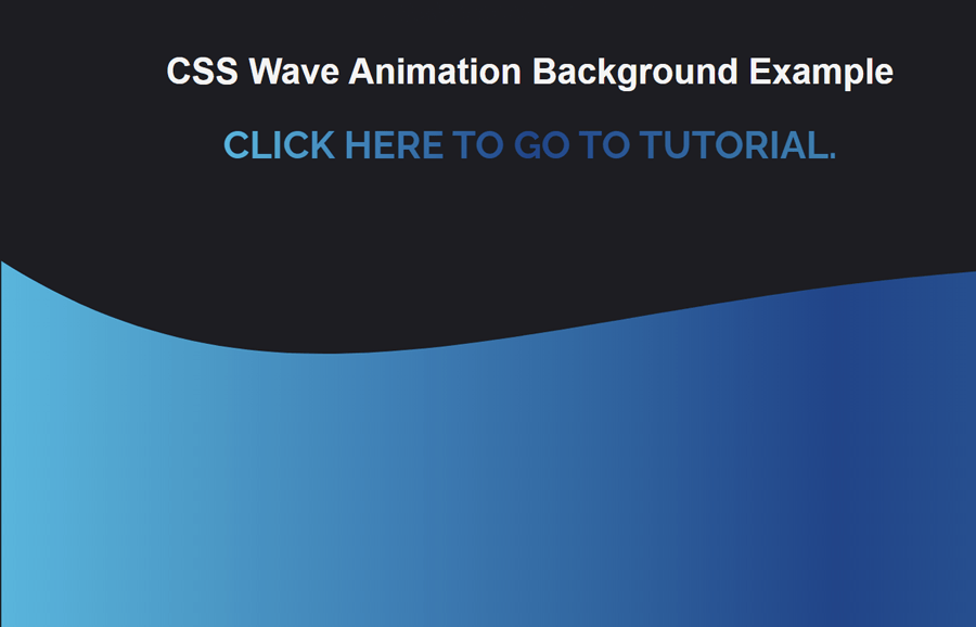
You may have seen wave animation in the headers of many websites. If I’m not wrong, you may have tried to create such a dynamic header using CSS. Don’t worry if you don’t find the actual wave animation you were trying to create. Here, you will learn how to create a wave animation background using SVG and CSS.
Basically, you can place this wave animation anywhere on your webpage whether it is a header or container. You can check on the demo page, the dynamic wave moving at the bottom of the header. Basically, the wave is drawn using SVG with an absolute position. So, other elements can be placed over it, in order to use it as a background.
The wave styles (width, height, fill, offset) and animation handled in SVG tags. So, it can be used and customized without defining any extra CSS values. You can set the custom wave size and background color according to your needs.
The HTML Structure
First of all, create a div element with a class name "header" and place your header content inside it. After that, create a div element with a class name "waves-container" and place the following SVG code inside it.
<div class="header">
    <h1>Your Header content goes here</h1>

  </div>
<div class="waves-container">
  <div class="waves">
   <svg width="100%" height="200px" fill="none" version="1.1"
      xmlns="http://www.w3.org/2000/svg">
      <linearGradient id="grad1" x1="0%" y1="0%" x2="100%" y2="0%">
         <stop offset="0%" stop-color="#00B4DB" />
         <stop offset="50%" stop-color="#224488" />
         <stop offset="100%" stop-color="#0083B0" />
      </linearGradient>
      <path fill="url(#grad1)" d="M0 67 C 273,183 822,-40 1920.00,106 V 359 H 0  V 67 Z">
         <animate repeatCount="indefinite" fill="url(#grad1)" attributeName="d" dur="15s" attributeType="XML" values="M0 77  C 473,283 822,-40 1920,116  V 359 H 0  V 67 Z; M0 77 C 473,-40 1222,283 1920,136  V 359 H 0 V 67 Z; M0 77 C 973,260 1722,-53 1920,120  V 359  H 0  V 67  Z; M0 77 C 473,283 822,-40 1920,116 V 359 H 0 V 67 Z">
         </animate>
      </path>
   </svg>
</div>
</div>
If you already have a hero/header section on your website, and integrate this wave animation. Then just copy the "waves-container" code and paste it into your header.
CSS for Wave Animation Background
Basically, the wave is already animated in SVG code, in CSS we can define some basic styles for it. So, select the very first element of wave animation "waves-container" and define its top margin with a 200px value. You can set the custom margin value for the extra spacing that you want to have between content and wave animation.
.waves-container{
    margin-top: 200px;
}
After that, target the div element that has a class name "waves" that contains the wave SVG. Define its width property with a hundred percent value along with the absolute position. Similarly, define z-index and 0 value for bottom in order to set it to the bottom of the waves container.
div.waves{
  width: 100%;
  bottom: 0;
  /*height: 100%;*/
  position: absolute;
  z-index: 99;
}
Now, define some basic styles for the header element and header’s heading, and links, etc. If you have already a header element then you can skip this step.
.header{
  font-family: sans-serif;
  text-align: center;
  color: #f3f3f3;
}
.header h2{
  background: linear-gradient(90deg, #00b4db 0%, #224488 50%, #0083b0 100%);
  background-clip: text;
  -webkit-background-clip: text;
  color: transparent;

}
.header a{
  text-decoration: none;
  background: linear-gradient(90deg, #00b4db 0%, #224488 50%, #0083b0 100%);
  background-clip: text;
  -webkit-background-clip: text;
  color: transparent;

}
Finally, define the absolute position for the SVG element width 100% width. Likewise, define the 0 value for the left and bottom property and done.
div.waves svg{
  position: absolute;
  width: 100%;
  bottom: 0;
  left: 0;
}
That’s all! Hopefully, you have successfully implemented this wave animation into your project. If you have any questions or need further help, let me know by comment below.