The CSS animations are one of the most important elements of a creative UI design. These animations attract users and enhance the user experience while browsing the site’s content. This tutorial explains how you can create a wave animation using pure CSS.
This wave animation can be implemented anywhere on the webpage. Whether you are going to create a hero section or page footer, you can use this wave animation in the background to show some creativity. Besides this, you can also use this wave animation in your preloader screen.
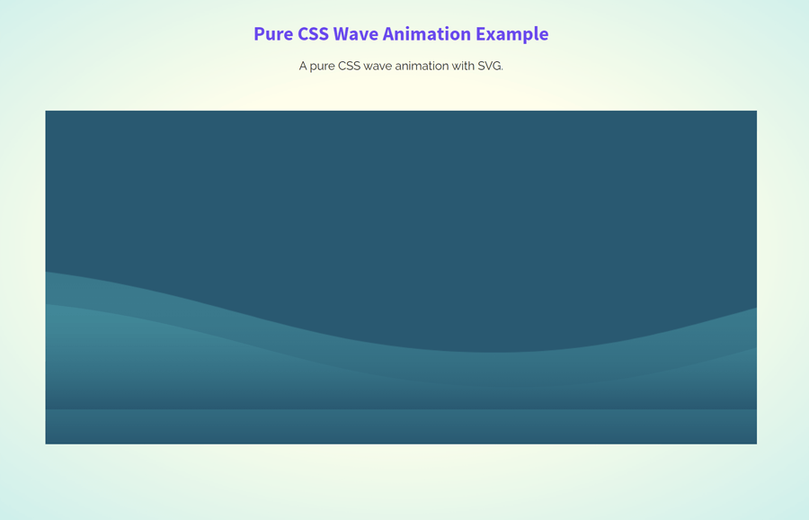
The trick behind the wave animation is that there is a div element that contains a wave SVG image in the background. Then this div element animate from right to left using CSS3 keyframes. The final output shows the realistic wave effect that you can view on the demo page.
The HTML Structure
The HTML structure for the wave animation is really simple. You just need to create two div elements with the class name "wave"and place inside a container "ocean". So, the complete HTML structure for the wave animation looks like below:
<div class="ocean">
  <div class="wave"></div>
  <div class="wave"></div>
</div>
Furthermore, you can place additional HTML elements inside the "ocean" container that you want to show along with the waves.
CSS Styles for Wave Animation
The "ocean" class is the main wrapper of both waves. The important CSS styles for this element is position and overflow property. So, define its relative position and keep the overflow hidden. The other CSS styles like width, height, and background can be defined according to your needs.
.ocean {
  min-height: 450px;
  width: 100%;
  margin: 0 auto;
  max-width: 960px;
  overflow: hidden;
  position: relative;
  background: #015871;
}
After styling the wave wrapper, now it’s time to specify CSS styles for the "wave" class. Keep its absolute position and set the bottom value as 0. Similarly, define the width, height, and animation as described in the below snippet.
.wave {
  background: url(https://cdn.kcak11.com/codepen_assets/wave_animation/wave.svg) repeat-x;
  position: absolute;
  bottom: 0;
  width: 6400px;
  height: 198px;
  animation: wave 7s cubic-bezier(0.36, 0.45, 0.63, 0.53) infinite;
  transform: translate3d(0, 0, 0);
}
Now, target the second wave using CSS nth-0f-type selector and set its bottom value as 25px. Define 1 value for the opacity property. Likewise, define the animation with the following mentioned attributes. If you want to change the speed of the waves, set the custom values for animation duration that is 7s by default.
.wave:nth-of-type(2) {
  bottom: 25px;
  animation: wave 7s cubic-bezier(0.36, 0.45, 0.63, 0.53) -0.125s infinite, swell 7s ease -1.25s infinite;
  opacity: 1;
}
Finally, specify CSS keyframes for the wave animation.
@keyframes wave {
  0% {
    margin-left: 0;
  }
  100% {
    margin-left: -1600px;
  }
}
@keyframes swell {
  0%,
	100% {
    transform: translate3d(0, -25px, 0);
  }
  50% {
    transform: translate3d(0, 5px, 0);
  }
}
-webkit-@keyframes wave {
  0% {
    margin-left: 0;
  }
  100% {
    margin-left: -1600px;
  }
}
-webkit-@keyframes swell {
  0%,
	100% {
    transform: translate3d(0, -25px, 0);
  }
  50% {
    transform: translate3d(0, 5px, 0);
  }
}
If you want to control (play/pause) the wave animation in JavaScript, you can define a class "endWave" with display none property. Then you can toggle this class to play or pause the wave animation.
.endWave{
	display:none;
}
That’s all! Hopefully, you have successfully implemented this pure CSS wave animation into your project. If you have any questions and suggestions, let me know by comment below.
Nice I really love it