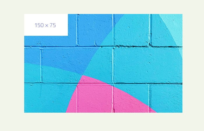
By using CSS, We can easily overlay an image over another image. Adding an image to another bigger image, Just like you have seen on YouTube video thumbs — A play button is displayed on the top of the video thumbnail.
In this tutorial, I will guide you through two different methods to place an image over another image. Placing one photo with another is very easy with the help of the position CSS element.
Both of these methods use almost the same technique but have different markups.
You can easily position the top image by changing the position element values. Also, You can add a play button or any other image to over another.
Also see: Add Background Image Gradient Overlay
If you want to add a play button over the image, It’s better to use a semi-transparent PNG graphic with size (e.g. 64 x 64).
Method 1: Overlay Image Over Image using Background
The first method of overlay an image over another is by defining it as a background in CSS. Let’s first take a look the HTML code.
We have a wrapper div which have an image and empty span tag. This image is our first image and we added a span tag to add a second image through CSS. This will a video play button.
<div class="thumb-wrapper">
    <img src="img/1.jpg" alt="My Video Thumb" /><span></span>
</div>
Now the CSS is also simple like HTML. We have positioned the wrapper to display correctly.
Then place the background image first as relative so that the div knows how big it should be.
.thumb-wrapper {
	position:relative;
}
For image, We set width 100% and height auto so it is responsive and should resize properly.
.thumb-wrapper img{
	width:100%;
	height:auto;
}
Here is a game of the second image. First, We place the overlay image as absolutes to the upper left of the first image. We set all it’s element value to zero to align it properly.
Again, We added width and height but this time, We set both element values to 100% to make work on mobile.
We also need to add z-index to this second image show above the first one.
We did add a background image with two rules. The first, It should not repeat and the second, It should position center.
.thumb-wrapper span {
	position:absolute;
	top: 0;
	bottom:0;
	left: 0;
	right:0;
	width: 100%;
	height: 100%;
	z-index: 100;
	background: transparent url(img/play-button.png) no-repeat;
	background-position:center;
}
Method 1: Place an image Over an image
In the second method, We will not define a second image as a background in the CSS. But we will place both images side by side on the HTML page.
Just like this, We place both images inside a container. Both have unique classes but remember, The parent-img-responsive class only use to make sure, Image work on mobile.
<div class="parent-img">
    <img src="img/3.jpg" class="parent-img-responsive" />
    <img src="https://dummyimage.com/150x75/ffffff/3e48d4" class="child-img"/>
</div>
This method has less CSS code as compare to method one. All we need to position the parent image. To display good on mobile, We set width 100% and height auto.
.parent-img{
    position: relative;
}
.parent-img-responsive{
	width:100%;
	height:auto;
}
For the child image (Second Image) We will use position absolute and set its all rules to value 0 to align it top right side of the parent image.
If you want to move the child image, You need to play with position rules.
.child-img{
    position: absolute;
    top: 0;
    left: 0;
    right: 0;
}
Let’s say, You want to align it on the right side. The code will be like this:
.child-img{
    position: absolute;
    top: 0;
    right: 0;
}
If you want to move it on the bottom right.
.child-img{
    position: absolute;
    bottom: 0;
    right: 0;
}
To move it bottom left, You need to add left:0 and bottom:0
.child-img{
    position: absolute;
    bottom: 0;
    left: 0;
    right: 0;
}
You can choose any method and implement on your website. Both work well and it depends on you which one you easily understand and can customize it as per your need.
