If you wanted to add a semi-opaque or semi-transparent color gradient that goes on top of the background image, You might need to overlay another div (or use the position absolutely element).
However, the simplest way to do it is to just use the :after CSS selector. You can also do it by adding another parameter to the background-image CSS rule.
I will also add some other rules on the div element to set the background image to full fill the whole div by using the background-size: cover. The width is set 100%, You can resize your browser to see how this background size work.
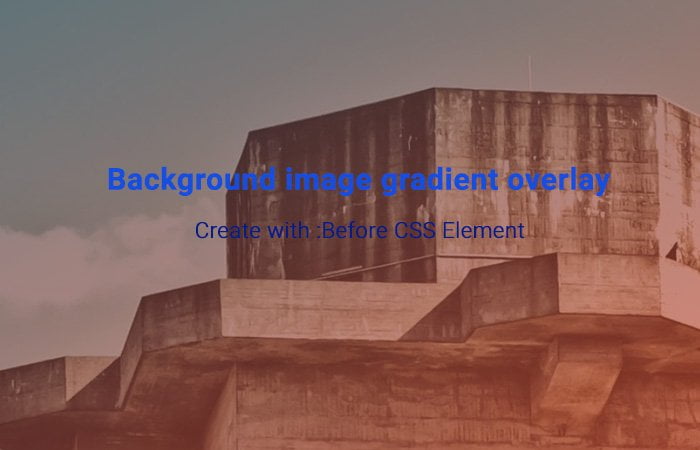
You are also allow to add Overlay Text over image by just adding inside the div. You don’t need to add any extra style but may need some basic style like color etc.
How to add a Gradient Background to a div Using CSS
To add a background image to a div or any other tag is easy by using CSS background property. We added a class bg-img to our div element.
<div class="bg-img"></div>
We want the background image to take all the space over the body. So, We have set the width and height of 100%. You don’t need to do that if you don’t want a fullscreen background.
html, body {
  width: 100%;
  height: 100%;
}
Again We added the width and height of 100% for div but this time, We want to resize it perfectly when resize the browser window.
We added a background image with a center and no-repeat rules.
To make it work on mobile, We use the background-size property.
.bg-img {
  position: relative;
  width: 100%;
  height: 100%;
  background: url("https://unsplash.it/1200x800") center center no-repeat;
  background-size: cover;
}
Now we will use :before the element with div. To take all over space over the background image, We will set the position absolute.
All the rules of the position will be 0 so all four sides will not have any space.
Finally, We will add gradient color and for this, We have added background-image and define gradient colors.
.bg-img:before {
  content: '';
  position: absolute;
  top: 0;
  right: 0;
  bottom: 0;
  left: 0;
  background-image: linear-gradient(to bottom right, #002f4b, #dc4225);
  opacity: .6;
}
Nothing else. That’s It. It’s a simple and easy solution to create a background image gradient overlay using CSS. If you have any question or suggestion let me by comment below.