In this article, we are featuring a great Image hover effect which builds with pure CSS slide-out title effect initialize when mouseover an image.
The basic idea to show text on an image but when hovering, the text/title will go with nice slide-out animation. Also, the image will little Zoom-in to provide a better user experience.
Therefore, it is a beautiful example of effect which will add extra beauty on your website. It will help and add extra energy to your blog photos. It will also enhance the overall user experience.
It’s really simple and cool image caption hover effect which makes the images grids look great.
The demo included three different versions. All of them have the same animation but different in design. Also, each one has a unique color scheme.
This effect is attractive and looking good. You can easily understand the markup and implement on your webpage.
Hope you will enjoy this useful animation and will implement your website. Let’s start with the tutorial.
How to Create Slide Out Title Hover Effect
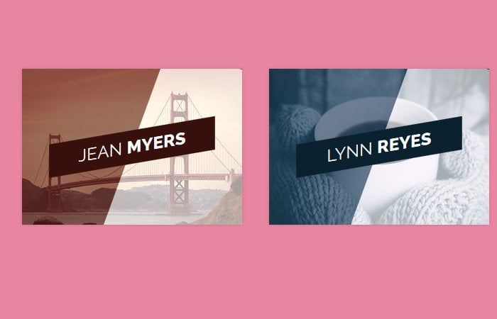
To create CSS based image hover slide out title, we’ll start with basic HTML structure. We created an effect by defining a figure element. There are three different classes for the unique color red, blue and yellow.
We place an image tag instead of a figure element. To add different text and heading, We add a figcaption.
This is the best markup to create an effect on images.
<figure class="snip1104 red">
    <img src="path/sample.jpg" alt="sample" />
    <figcaption>
    <h2>Jean  <span> Myers</span></h2>
    </figcaption>
    <a href="#"></a>
</figure>
The CSS Style for Hover
To style the effect, We will first add some basic styling. We will add a font-family, background color, and some box-shadow. If you want to add custom shadow, you can use this tool to generate CSS code for shadow.
But the important thing to be noted is to define min and max-width to make it work on mobile.
figure.snip1104 {
  font-family: 'Raleway', Arial, sans-serif;
  position: relative;
  overflow: hidden;
  margin: 10px;
  min-width: 220px;
  max-width: 310px;
  max-height: 220px;
  width: 100%;
  background: #000000;
  color: #ffffff;
  text-align: center;
  box-shadow: 0 0 5px rgba(0, 0, 0, 0.15);
}
Next, We will apply the transition to the figure element.
figure.snip1104 * {
  -webkit-box-sizing: border-box;
  box-sizing: border-box;
  -webkit-transition: all 0.4s ease-in-out;
  transition: all 0.4s ease-in-out;
}
Make sure an image resize properly on mobile. We will set max-width 100%.
figure.snip1104 img {
  max-width: 100%;
  position: relative;
  opacity: 0.4;
}
It’s time to overlay text on an image. For this, We use the positioning element and set zero value for all it’s property to cover all space over an image.
figure.snip1104 figcaption {
  position: absolute;
  top: 0;
  left: 0;
  bottom: 0;
  right: 0;
}
We will style the heading and will make background color skew.
figure.snip1104 h2 {
  position: absolute;
  left: 40px;
  right: 40px;
  display: inline-block;
  background: #000000;
  -webkit-transform: skew(-10deg) rotate(-10deg) translate(0, -50%);
  transform: skew(-10deg) rotate(-10deg) translate(0, -50%);
  padding: 12px 5px;
  margin: 0;
  top: 50%;
  text-transform: uppercase;
  font-weight: 400;
}
To add some nice background color over an image, We will use :before element.
figure.snip1104:before {
  height: 100%;
  width: 100%;
  top: 0;
  left: 0;
  content: '';
  background: #ffffff;
  position: absolute;
  -webkit-transition: all 0.3s ease-in-out;
  transition: all 0.3s ease-in-out;
  -webkit-transform: rotate(110deg) translateY(-50%);
  transform: rotate(110deg) translateY(-50%);
}
On hover image element, We will use transform property with different values for figure and heading element.
figure.snip1104:hover img,
figure.snip1104.hover img {
  opacity: 1;
  -webkit-transform: scale(1.1);
  transform: scale(1.1);
}
figure.snip1104:hover h2,
figure.snip1104.hover h2 {
  -webkit-transform: skew(-10deg) rotate(-10deg) translate(-150%, -50%);
  transform: skew(-10deg) rotate(-10deg) translate(-150%, -50%);
}
figure.snip1104:hover:before,
figure.snip1104.hover:before {
  -webkit-transform: rotate(110deg) translateY(-150%);
  transform: rotate(110deg) translateY(-150%);
}
That’s It. There are few more general styles like for color scheme etc. You can download the source file and see a demo.