Are you going to build a portfolio website? Why not try out these CSS image hover effects with text animation on hover. These mouse over effects build with pure CSS and plain HTML.
We know that the CSS3 is a powerful technology and with the help, We can create truly amazing web elements. By using this power, You can create visual effects on any HTML element.
So today, We will share you another set Pure CSS Cool Image Hover Effects which are easy to implement. We will keep the markup simple and easy to understand.
Mostly, You have seen hover effects on buttons and links but they are not limited to this only. They can be used on any kind of element and have wide-range of uses.
One of the area we can apply hover effects on the image where they produce a powerful and amazing effect.
The images effects outcomes are continually a greater subject matter to discover. In the beyond, We’ve built some outstanding examples of effects that are smooth to copy and paste right into your code.
Back to old days, We needed to depend on upon JavaScript for this sort of impact. But now we have CSS3 it’s now feasible to set up results like those without any scripting in any respect.
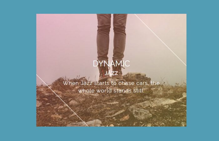
How to Create Image Hover Effects
There are few browsers (IE9 and underneath) that don’t support CSS3. So you’ll both need a fallback for legacy browsers or to treat the effect as a progressive enhancement.
We can easily apply the image hovering effect to any picture on your blog. Simply need to add several lines of CSS and few lines of HTML code.
If you don’t like to copy & paste a long CSS then you can simply add a hovereffect.css which you can find in the download source file.
We try to keep the markup simple so you can easily copy & paste.
<div class="grid">
    <figure class="effect-julia">
        <img src="img/21.jpg" alt="img21"/>
        <figcaption>
            <h2>Passionate <span>Julia</span></h2>
            <div>
                <p>Julia dances in the deep dark</p>
                <p>She loves the smell of the ocean</p>
                <p>And dives into the morning light</p>
            </div>
            <a href="#">View more</a>
        </figcaption>
    </figure>
</div>
CSS for Image Hover
The stylesheet is quite long so it’s not possible for me to explain all. But you don’t need to worry, it’s properly coded with inline comment.
If you want to implement only one or two effects, you can copy and paste CSS for specific effect. But just make sure to add general style.
Have a look at the general style.
/* Common style */
.grid figure {
	position: relative;
	float: left;
	overflow: hidden;
	margin: 10px 1%;
	min-width: 320px;
	max-width: 480px;
	max-height: 360px;
	width: 48%;
	height: auto;
	background: #3085a3;
	text-align: center;
	cursor: pointer;
}
.grid figure img {
	position: relative;
	display: block;
	min-height: 100%;
	max-width: 100%;
	opacity: 0.8;
}
.grid figure figcaption {
	padding: 2em;
	color: #fff;
	text-transform: uppercase;
	font-size: 1.25em;
	-webkit-backface-visibility: hidden;
	backface-visibility: hidden;
}
.grid figure figcaption::before,
.grid figure figcaption::after {
	pointer-events: none;
}
.grid figure figcaption,
.grid figure figcaption > a {
	position: absolute;
	top: 0;
	left: 0;
	width: 100%;
	height: 100%;
}
Another important thing, some of the effects shows icons and buttons. For this, you can add the following CSS for image hover effects with text.
/* For some effects it will show as a button */
.grid figure figcaption > a {
	z-index: 1000;
	text-indent: 200%;
	white-space: nowrap;
	font-size: 0;
	opacity: 0;
}
.grid figure h2 {
	word-spacing: -0.15em;
	font-weight: 300;
}
.grid figure h2 span {
	font-weight: 800;
}
.grid figure h2,
.grid figure p {
	margin: 0;
}

.grid figure p {
	letter-spacing: 1px;
	font-size: 68.5%;
}
OK, Now Let’s say you want to add “Selena” effect.
figure.effect-selena {
	background: #fff;
}
figure.effect-selena img {
	opacity: 0.95;
	-webkit-transition: -webkit-transform 0.35s;
	transition: transform 0.35s;
	-webkit-transform-origin: 50% 50%;
	transform-origin: 50% 50%;
}
figure.effect-selena:hover img {
	-webkit-transform: scale3d(0.95,0.95,1);
	transform: scale3d(0.95,0.95,1);
}
figure.effect-selena h2 {
	-webkit-transition: -webkit-transform 0.35s;
	transition: transform 0.35s;
	-webkit-transform: translate3d(0,20px,0);
	transform: translate3d(0,20px,0);
}
figure.effect-selena p {
	opacity: 0;
	-webkit-transition: opacity 0.35s, -webkit-transform 0.35s;
	transition: opacity 0.35s, transform 0.35s;
	-webkit-transform: perspective(1000px) rotate3d(1,0,0,90deg);
	transform: perspective(1000px) rotate3d(1,0,0,90deg);
	-webkit-transform-origin: 50% 0%;
	transform-origin: 50% 0%;
}
figure.effect-selena:hover h2 {
	-webkit-transform: translate3d(0,0,0);
	transform: translate3d(0,0,0);
}
figure.effect-selena:hover p {
	opacity: 1;
	-webkit-transform: perspective(1000px) rotate3d(1,0,0,0);
	transform: perspective(1000px) rotate3d(1,0,0,0);
}