Do you want to draw a hexagon-shaped border around your image? If yes then you are absolutely in the right place. This tutorial explains how to create a hexagon shape border using CSS and set an image inside it.
Basically, there is no direct option in CSS to draw a hexagon border around an element (an image in our case). But how can we do so? well, the answer is very simple. We’ll create a div element and style it like a hexagon shape using CSS clip-path property (that allows to make complex shapes). After that, we’ll create a container for the image and style it the same as hexagon shape, and place it over the parent hexagon. That’s would look like a hexagon border around the image.
Don’t worry about the border thickness, we have control over the parent hexagon shape to leave extra space. You can set the custom size for that to increase/decrease the thickness of the hexagon around the image. Similarly, you can set custom background color and margin in the case of multiple hexagon shapes grid. So, let’s get started with HTML to shape an image as a hexagon.
The HTML Code
In HTML, create a div element and define its class name "hex". This div element will be used as a parent hexagon shape. Similarly, create another div element and define its class name "hex-background". This div element is the container for the image. So, place your image inside it, we’ll style it as a child hexagon. The complete HTML code for the hexagon-shaped image is as follows:
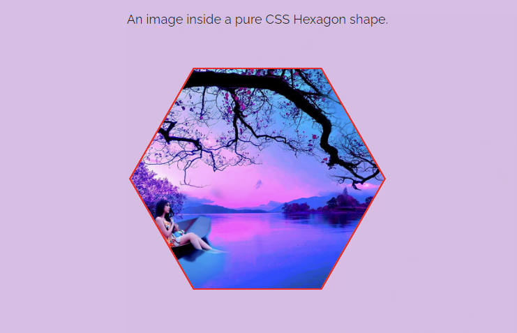
<div class="hex">
  <div class="hex-background">
    <img src="path/to/your-image.jpg">
  </div>
</div>
Update the image path URL and place the above HTML code where you want to place your hexagon image on your webpage.
The CSS Styles for Hexagon Shaped Image
After creating HTML, now it’s time to draw the hexagon using CSS. So, select the "hex" class and display it as a block element. Define its relative position and background color according to your choice. This background color is the border color around the image. Use the CSS box-sizing property and define its value "border-box".
Here the important thing is the width and height property that defines the size of the hexagon shape. In order to draw a perfect hexagon shape, you need to use width and height properties cleverly. You can set the width according to your needs but the height values rely on the width value. You can get the height value by multiplying the width value by 0.866. That’s will make a perfect hexagon.
The second important thing is the clip-path property, don’t worry if you don’t know enough about it. You can generate hexagon vertices and edges values using this tool. So, the following is the complete snippet for the parent hexagon shape:
.hex {
  display: block;
  margin: 0 auto;
  position: relative;
  width: 320px;
  height: 277.12px; /* width * 0.866 */
  background: red;
  box-sizing: border-box;
  -webkit-clip-path: polygon(0% 50%, 25% 0%, 75% 0%, 100% 50%, 75% 100%, 25% 100%);
  -moz-clip-path: polygon(0% 50%, 25% 0%, 75% 0%, 100% 50%, 75% 100%, 25% 100%);
}
After that, select the "hex-background" that is the container of image and child element of hex div. As we are going to place it over the parent hexagon, we need to make it an absolute element. So, define the absolute position and background color the same as the parent hexagon.
Here this important thing to consider is the border you want to set around the image. Actually, we are leaving some space around the parent hexagon that space will make the border. So, define the size of the child hexagon shape by subtracting the value of the border. In my case, I used 2px for the border, multiply this value by 2, and subtract it from the parent width. So, set the top and left value the same as the border size value and width and height value that got from subtraction.
.hex-background {
  position: absolute;
  background-color: orange; /*color of the main-background*/
  top: 2px; /* equal to border thickness */
  left: 2px; /* equal to border thickness */
  width: 316px; /* container height - (border thickness * 2) */
  height: 273.12px; /* container height - (border thickness * 2) */
  -webkit-clip-path: polygon(0% 50%, 25% 0%, 75% 0%, 100% 50%, 75% 100%, 25% 100%);
  -moz-clip-path: polygon(0% 50%, 25% 0%, 75% 0%, 100% 50%, 75% 100%, 25% 100%);
}
Finally, target the img element of the "hex" class and define its absolute position. Similarly, define its 100% dimension (width and height) in order to fit inside the hexagon shape. Use the CSS object-fit property with the "cover" value in order to fill inside the shape. Moreover, use the same clip-path value as the image container "hex-background" has. So, the complete CSS styles for the hexagon image is as follows:
.hex img {
  position: absolute;
  width: 100%;
  height: 100%;
  object-fit: cover;
  -webkit-clip-path: polygon(0% 50%, 25% 0%, 75% 0%, 100% 50%, 75% 100%, 25% 100%);
  -moz-clip-path: polygon(0% 50%, 25% 0%, 75% 0%, 100% 50%, 75% 100%, 25% 100%);
}
That’s all! I hope, this tutorial was helpful to create hexagon image with border using CSS. If you have any questions or suggestions, let me know by comment below.
ReTEST you DEMO…
On my Screen it shows a Square Image… ???
Hi Kim!
The CSS clip-path property is not compatible with the older versions of Firefox, IE, and Safari browser. This project is quite fine on Chrome, Edge and Opera Browser.
Thanks for your feedback, I’ll update the tutorial for cross-browser support.
CSS ‘clip-path’ property is working in almost every browser
Nah, I’ve got the newes version of Firefox (101.0/64-Bit) and still only see a square.
It may work in chrome but what good is it if I want to include it in a cross-browser compatible website? Still more than enough people using Firefox…
Try this:
Change -moz-clip-path to clip-path.
(Remove -moz).
-moz-clip-path —> clip-path.
Here is the solution. And I have used “rem” instead of pixels:
https://codepen.io/user1112/pen/PoQXppm