The CSS flip animation is great fun to show more information on the same DIV element by just flipping it on hover. The beauty of CSS3 is that It allows you to create unlimited effects without touching JavaScript.
You can make any complicated effect with pure CSS with maximum browsers and device compatibility.
The one of CSS transition result is the Flip Animation on Hover, whereby there’s content on both front and backside given to container.
This tutorial will demonstrate to generate that effect in a simple way as possible.
That isn’t the first article about making CSS Flip Card Animation, but There are other over-complicated methods are available. These many other methods add additional styles to code which may not require code and make it complex in functionality.
This tutorial avoids that concern, offering you only the basic style, you can take very up each aspect of the flip in any manner you’d like by doing customization.
The CSS flip effect can be very helpful nowadays, It provides users with somewhat of interactivity, keeping them engaged, and nowadays engagement is essential.
The most frequent use-case for flipping cards that I could think of would be including some type of imagery on leading(Front Side), and some information on the comparative rear(Back Side). We will need two different aspects of wrappers container.
However, the elements you select is your decision. About this tutorial, I’m going to be using two divs and make them flip horizontal.
The front side will show you an icon (You can add photo or text) and then when user mouse over the div element, I will flip and show you the second part of the content.
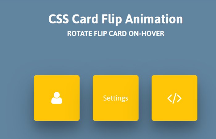
First, let’s go through the results we’ll use:
Flipping Card Markup
As I tell you above, the HTML markup will have two wrappers container, and then we will have a child divs. Each child will represent the front and back of the card.
In our case, we have card-container is the main wrapper and next, we will have a div class name card. You can notice that there are two child divs, one for front and a second one for the backside.
Here is markup we will use for each card:
<div class="card-container">
    <div class="card">
        <div class="front">
          <span class="fa fa-user"></span>
        </div>
        <div class="back">User</div>
    </div>
</div>
Now for instance, if you want to add more than one card then you simply repeat the card-container
<div class="card-container">
    <div class="card">
        <div class="front">
          <span class="fa fa-user"></span>
        </div>
        <div class="back">User</div>
    </div>
</div>
<div class="card-container">
  <div class="card">
    <div class="front">
      <span class="fa fa-cogs"></span>
    </div>
    <div class="back">Settings</div>
  </div>
</div>
Flip Animation style
The CSS is also not quite large, and it’s dead simple. First of all, we have to do some basic stuff with .card-container.
But we make sure that the main container should set the animation area’s perspective. As for as our second main container wrapper .card, We need to set position to relative and then should set width and height according to what we will do with front and back.
Here we will also do some transition and transform-style.
.card-container {
    display: inline-block;
    margin: 0 auto;
    padding: 0 12px;
    perspective: 900px;
    text-align: center;
}
.card {
  position: relative;
  width: 100px;
  height: 100px;
  transition: all 0.6s ease;
  transform-style: preserve-3d;
}
Next, we need to play with front, and back so I have to make its position to absolute and make sure it’s top, and left value should be zero.
The width and height should be the same as an above second main container .card. The important thing here, we need to add backface-visibility: hidden;
.front, .back {
  position: absolute;
  background: #FEC606;
  top: 0;
  left: 0;
  width: 100px;
  height: 100px;
  border-radius: 5px;
  color: white;
  box-shadow: 0 27px 55px 0 rgba(0, 0, 0, 0.3), 0 17px 17px 0 rgba(0, 0, 0, 0.15);
  backface-visibility: hidden;
}
.front {
  display: flex;
  align-items: center;
  justify-content: center;
  font-size: 30px;
}
.back {
  display: flex;
  align-items: center;
  justify-content: center;
  font-size: 18px;
}

.card-container:hover .card {
  transform: rotateY(180deg);
}
.back {
  transform: rotateY(180deg);
}
On hover, we only need to rotateY to 180deg of our most important card container, and we did it.
That’s all! We are done with the flipping card and you can customize it as you want. You can give a try by changing it’s front and back color, size and vertical animation, etc.