The idea of creating this 3D flip card animation is quite similar to what we have done in our previous CSS tutorial CSS Flip Animation on Hover.
But here we will make them vertical & add a nice 3D effect. We have created two different types of 3D flip hover effect.
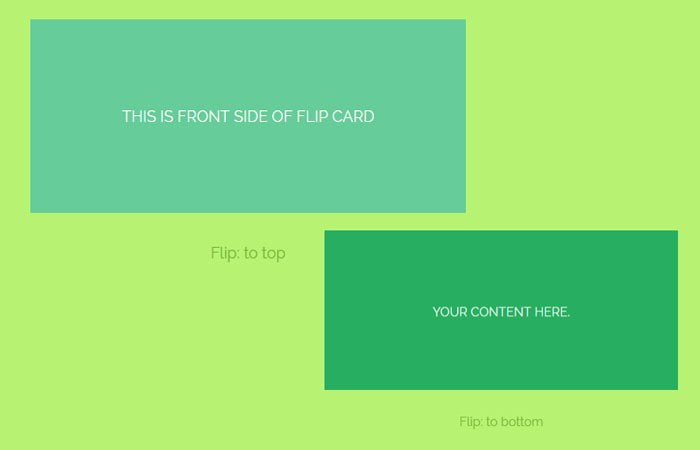
The first one flipping the box top to bottom, whereas another, will flip out the bottom to top when mouse over the div box.
When you hover the boxes, you will find the look of 3D animation effect. Both boxes have the front and back face for adding content, links, and images, etc.
To build a flip card effect, we are going to use CSS transform and transition elements.
The Flip cards are a great way of showing information to your site users. It takes less space and very effect in the modern day of web development.
It also provides some interactivity and engaging the user. The flip cards are some imagery thing on the front side and some content on the backside of the card.
We need two different divs inside the main wrapper, but the content or elements you decide is all up to you. Let’s have a look at both CSS flip effects.
HTML Structure for Flip Card
Our markup for creating the flip effect is so easy to understand. As I said above, we have one primary container and two of child’s divs.
Each div will be for front side and backside respectively.
<div class="flipbox flipTop">
    <div class="FrontSide">
        <span>This is Front Side of Flip Card</span>
    </div>
    <div class="BackSide">
      <span>Your content here.</span>
    </div>
</div>
The Only thing you should need to remember to change the class flipTop into flipBottom for getting a flip-bottom effect.
<div class="flipbox flipBottom">
    <div class="FrontSide">
        <span>This is Front Side of Flip Card</span>
    </div>
    <div class="BackSide">
      <span>Your content here.</span>
    </div>
</div>
CSS Styles for Flip Card Animation
First of all, we need to do work on the main wrapper of a flip box. We set the width and height of our box as per our need.
Remember if you change the height here, you should also need to play with some other class for transforms property.
We used to transition and transform-style: preserve-3d;
.flipbox {
  width: 450px;
  height: 200px;
  text-align: center;
  margin: 0 auto;
  -webkit-transition: all 350ms ease;
  -moz-transition: all 350ms ease;
  -o-transition: all 350ms ease;
  transition: all 350ms ease;
  -webkit-transform-style: preserve-3d;
  -moz-transform-style: preserve-3d;
  -o-transform-style: preserve-3d;
  -ms-transform-style: preserve-3d;
  transform-style: preserve-3d;
}
The next thing to take a look at both the front & backside, so we added some transition here too. We also do some general style like adding some background color etc.
/* Front - Back */
.flipbox .FrontSide,
.flipbox .BackSide {
  background: #66CC99;
  font-size: 16px;
  text-transform: uppercase;
  color: #fff;
  line-height: 200px;
  -webkit-transition: background 350ms ease;
  -moz-transition: background 350ms ease;
  -o-transition: background 350ms ease;
  transition: background 350ms ease;
}
The Frontside should have transform: translateZ(100px); and on-hover we added background color.
/* Front Side Face */
.FrontSide {
  -webkit-transform: translateZ(100px);
  -moz-transform: translateZ(100px);
  -o-transform: translateZ(100px);
  -ms-transform: translateZ(100px);
  transform: translateZ(100px);
}
.flipbox:hover .FrontSide {
  background: #27AE60;
}
But for the backside, we don’t need to add transform because we only need to transform the front side of the flip card.
/* Back Side */
.flipbox .BackSide {
  background: #27AE60;
}
Now we are done with all basic and general styling of the flip card. We only need to add CSS for getting the result. Here is an example code of Flip to top effect.
/* flip to top*/
.flipTop .BackSide {
  -webkit-transform: rotateX(90deg) translateZ(250px);
  -moz-transform: rotateX(90deg) translateZ(250px);
  -o-transform: rotateX(90deg) translateZ(250px);
  -ms-transform: rotateX(90deg) translateZ(250px);
  transform: rotateX(90deg) translateZ(250px);
}
.flipbox.flipTop:hover {
  -webkit-transform: rotateX(-89deg);
  -moz-transform: rotateX(-89deg);
  -o-transform: rotateX(-89deg);
  -ms-transform: rotateX(-89deg);
  transform: rotateX(-89deg);
}
if you want to get the bottom 3d effect, then you have following CSS.
/* flip to bottom*/
.flipBottom .BackSide {
  -webkit-transform: rotateX(-90deg) translateZ(-100px);
  -moz-transform: rotateX(-90deg) translateZ(-100px);
  -o-transform: rotateX(-90deg) translateZ(-100px);
  -ms-transform: rotateX(-90deg) translateZ(-100px);
  transform: rotateX(-90deg) translateZ(-100px);
}
.flipbox.flipBottom:hover {
  -webkit-transform: rotateX(89deg);
  -moz-transform: rotateX(89deg);
  -o-transform: rotateX(89deg);
  -ms-transform: rotateX(89deg);
  transform: rotateX(89deg);
}
And that’s ended! We try to cover some nice features of CSS3 transforms and transitions. You can view the demo of flip animation and download the source by clicking on the links above.
If you have any questions, comments or want to share your feedback then you are most welcome. You can leave them in below comment section.