Creating web elements can significantly improve the user experience on your website. One such element that can add a touch of whimsy and movement to your page is a dashing blob ball created purely with CSS. This tutorial will guide you through the process of crafting this animated blob ball, step by step, using basic CSS animations and shapes.
Step1: HTML Structure of Dashing Blob Ball
This HTML code creates a layered structure with a “scene” as the backdrop, a “cage” as an intermediary container, and a “ball” as the central element, potentially for the purpose of animating the ball within the confines of the cage against the scene’s backdrop.
<div class="scene">
<div class="cage">
<div class="ball">
</div>
</div>
</div>
Step2: Styling Bouncing Ball in Cage with CSS
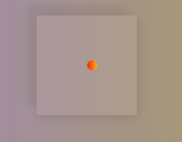
This code creates a scene with a bouncing ball trapped within a cage. The ball animates with a stretching and squashing motion, while the cage subtly rotates and has a faint inner outline.
*{
margin:0px;
padding:0px;
}
.scene{
position:relative;
width:100vw;
height:100vh;
display:flex;
justify-content:center;
align-items:center;
background: linear-gradient(to left, #AA9E5B, #9E86BB);
}
.cage{
position:relative;
display:flex;
justify-content:center;
align-items:center;
width:200px;
height:200px;
}
.cage::before{
content:"";
position:absolute;
top:0px;
left:0px;
width:100%;
height:100%;
background:rgba(251,251,251,0.08);
animation: rotate 1.5s infinite;
box-shadow: -20px -20px 10px 0px rgba(0, 0, 0, 0.05),5px 5px 20px 0px rgba(0, 0, 0, 0.1);
}
.cage::after{
content:"";
position:absolute;
bottom:10px;
width:100%;
}
.ball{
position:relative;
width:20px;
height:20px;
border-radius:50%;
background: linear-gradient(to left, #f5af19, #f12711);
animation: dash 1.5s infinite;
}
@keyframes dash {
0% {left:0px}
10% {left:25px;height:22px;width:17px;border-radius:25px;}
15% {height:20px;width:20px}
30% {border-radius:25px;height:17px;width:60px;}
45% {left:-90px;height:22px;width:17px;border-radius:25px;}
70% {border-radius:50%}
80% {height:20px;width:20px}
100% {left:0px;}
}
@keyframes rotate {
0% {left:0px;transform:rotate(0deg)}
33% {left:0px;transform:rotate(0deg)}
36% {left:-60px;transform:rotate(0deg);border-bottom-left-radius: 0%;border-top-left-radius: 0%;}
45% {transform:rotate(-45deg);border-bottom-left-radius: 50%;border-top-left-radius: 20%;}
100% {left:0px;transform:rotate(0deg);border-bottom-left-radius: 0%;border-top-left-radius: 0%;}
}
CSS Dashing Blob Ball: Source Code Inside Demo
Adding dynamic elements like a dashing blob ball can make your website more interactive and engaging. With just a few lines of CSS and HTML, you can introduce movement and personality into your web design. This tutorial showed you how to create a simple yet captivating animation effect without the need for complex frameworks or libraries.