Traditionally, styling select dropdowns has been a challenge due to their inherent limitations. Dropdown menus play a significant role in providing intuitive navigation and interaction. While the default styling options for select dropdowns often fall short of meeting design expectations, CSS offers a versatile solution to transform them into customized, visually appealing components without the need for cumbersome wrapper elements.
In this guide, we’ll explore how to leverage the power of CSS to create bespoke select dropdowns that elevate the functionality of your web applications, all without the clutter of additional wrappers.
Step 1: HTML for Custom Styled Dropdown Menu
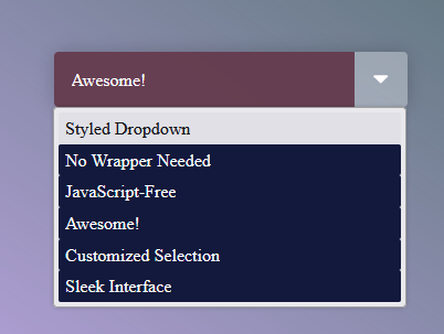
This HTML code includes a <select> element, forming a dropdown menu. Each <option> within it represents a selectable choice, with the selected attribute ensuring the initial selection. The value attribute holds the value sent to the server upon selection, while the text content describes each option presented to the user.
<select>
<option selected value="0">Styled Dropdown</option>
<option value="1">No Wrapper Needed</option>
<option value="2">JavaScript-Free</option>
<option value="3">Awesome!</option>
<option value="4">Customized Selection</option>
<option value="5">Sleek Interface</option>
</select>
Step 2: Styling CSS for Custom Dropdowns
The given CSS code utilizes custom variables to control the appearance of a dropdown menu. By defining variables for backgrounds and icons, it enables precise styling, including gradient backgrounds and custom arrow icons. This approach allows for flexible and visually appealing dropdown menus, enhancing the overall user experience on websites.
:root {
--arrow-bg: rgba(255, 255, 255, 0.3);
--arrow-icon: url(https://upload.wikimedia.org/wikipedia/commons/9/9d/Caret_down_font_awesome_whitevariation.svg);
--option-bg: #12193c; /* Modified option background color */
--select-bg: rgba(100, 58, 76, 0.94);
}

* {
box-sizing: border-box;
}

body {
display: grid;
place-items: center;
min-height: 100vh;
background: linear-gradient(35deg, #7538ce6e, #3b6456) !important /* Modified main background color */
}

/* <select> styles */
select {
/* Reset */
-webkit-appearance: none;
-moz-appearance: none;
appearance: none;
border: 0;
outline: 0;
font: inherit;
/* Personalize */
width: 20rem;
padding: 1rem 4rem 1rem 1rem;
background: var(--arrow-icon) no-repeat right 0.8em center/1.4em, linear-gradient(to left, var(--arrow-bg) 3em, var(--select-bg) 3em);
color: white;
border-radius: 0.25em;
box-shadow: 0 0 1em 0 rgba(0, 0, 0, 0.2);
cursor: pointer;
/* Remove IE arrow */
/* Remove focus outline */
}
select::-ms-expand {
display: none;
}
select:focus {
outline: none;
}
select option {
color: inherit;
background-color: var(--option-bg);
}
CSS Custom Select Dropdown Example Without Wrapper Demo
In this guide, we’ve demonstrated how to create custom select dropdowns using pure CSS, eliminating the need for wrapper elements. By understanding the limitations of traditional styling methods and leveraging the flexibility of CSS, you can enhance the appearance of select dropdowns on your website with ease.