Today, we are going to create a continuous flip animation using CSS. Mostly, a flip animation triggers on mouse hovers in order to show the backside of a card. But sometimes we need a flip animation that plays continuously while creating attractive text boxes, or CSS based loaders.
In this tutorial, you will come to know how to continuously flip a div element. We’ll design this element as a card and apply (both horizontal and vertical) flip animation on it. You can further transform this element into a loader, box, or any other object on that you want to apply continuous flip animation.
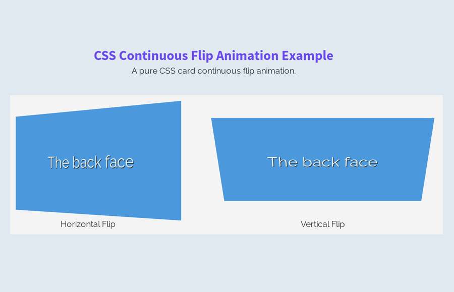
The coding concept for this flip animation is really simple and straightforward. You just need to create a card (with front and backside) a flipper container and CSS animation keyframes to flip the card. Before getting started with coding, check out the final output of this project on the demo page.
HTML for Continuous Flip Animation
In HTML, create a div element with a class name "flipper". Define the front and backside of the card inside this element. Create another div element with the class name “clear” just after the flipper tag. Wrap all these elements into a container and specifies its class name "flip-container". A basic HTML structure for the horizontal flipping card is as follows:
<div class="flip-container">
   <div class="flipper">
      <div class="front">
         The front face
      </div>
      <div class="back">
         The back face
      </div>
      <div class="clear"></div>
   </div>
   <p>Horizontal Flip</p>
</div>
If you want to flip the card vertically, just add a "vertical-flip-container" class inside the flip container. Keep the other elements as the above HTML.
<div class="vertical-flip-container flip-container">
   <div class="flipper">
      <div class="front">
         The front face
      </div>
      <div class="back">
         The back face
      </div>
      <div class="clear"></div>
   </div>
   <p>Vertical Flip</p>
</div>
You can also add other HTML elements like text, an image, or hyperlink inside the flip container just after the flipper tag.
The CSS Styles
In CSS, first of all, define the styles for the flip container. You need to set its width and perspective property.
.flip-container {
	-webkit-perspective: 1000;
	width: 400px;
}
The “flipper” class is a container for the front and backside of the card. In fact, this is the main selector for the card. Keep its relative position and define the height as 200px. Similarly, define transition for smoothness and transform style.
.flipper {
	transition: 0.6s;
	-webkit-transform-style: preserve-3d;
	position: relative;
	height: 200px;
}
After that, define the front and backside of the card. The following are the common styles for both the front and backside of the card. Here, the important properties are position (that should be absolute) and backface-visibility that should be hidden. The other values for width, height, and font-size, etc can be set according to your needs.
.front,
.back {
	width: 400px;
	height: 200px;
	position: absolute;
	left: 0;
	top: 0;
	-webkit-backface-visibility: hidden;
	color: #fff;
	text-shadow: 1px 1px #000;
	font-size: 2em;
	line-height: 200px;
	text-align: center;
}
Make the backside different from the front side of the card by defining background color. When the card will be flipped, the text will be rotated, define the rotate transformation in order to fix this.
.back {
	-webkit-transform: rotateY(180deg);
	background: #3498db;
}
Similarly, define CSS styles for the front side of the card. Keep it z-index 2 and set a background color according to your needs.
.front {
	z-index: 2;
	background: #2ecc71;
}
If you added text inside your flip container, don’t forget to set styles for paragraphs.
.flip-container p {
	margin: 10px 0;
	text-align: center;
}
Now, define the CSS keyframes for flip animation.
/* Flip Animation */
@keyframes flipX{
    from {
        -webkit-transform: rotateX(180deg);
    }

    to {
        -webkit-transform: rotateX(-180deg);
    }

}
@keyframes flipY{
    from {
        -webkit-transform: rotateY(180deg);
    }

    to {
        -webkit-transform: rotateY(-180deg);
    }

}
Apply flip animation on the horizontal flip container. Use the “infinite” value for the animation-iteration-count property in order to continuously flip the card.
.flip-container .flipper {
	animation: flipY 3s infinite;
}
Likewise, apply animation for a vertical flip container.
.vertical-flip-container .flipper{
	animation: flipX 4s infinite;
}
That’s all! I hope, now you are able to create CSS continuous flip animation. If you need any further help related to flip animation, let me know by comment below.