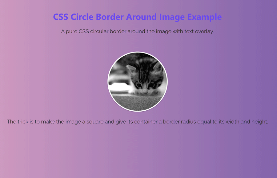
The circular border around the image is commonly used for profile pictures. The circular border gives a modern look to the display picture. Basically, we can make an image circular using the CSS border-radius property. Here we are not only going to make a circle border around the image but also make a text overlay over the image using CSS.
As you have seen in the above preview, there is a circular image with a white border. The actual source file is not cropped in a circle shape but this is placed in a circular container with overflow hidden. As a result, the circular image is shown. You can visit the demo page to see the circular image with text overlay animation.
The HTML Code
In HTML, create a hyperlink with a class "image" and place your image inside it. Similarly, create a span element inside it for the overlay text.
<a href="#" class="image">
  <img alt="The alt text of your image" src="path/to/your-image.jpg">
  <span>Here is some content for the link that show as overlay on hover.</span>
</a>
You can also wrap the image inside the div element if you don’t want to place the link behind the circular bordered image. The span element is optional for overlay. If you don’t want to show the overlay, you can exclude it.
The CSS for Circular Border Around Image
After creating the HTML, now it’s time to style the image with CSS. So, select the "image" class and display it as a block element. We need equal height and width for this container to make a perfect circle around the image. Therefore, define 180px value for both height and width. Now, define the overflow property with the hidden value to avoid the overlapping of the image.
Use the CSS border-radius property with the same value to its dimension (or 50%) to make the circle shape. Likewise, define this property with a browser prefix for cross-browser support. Furthermore, we want to show overlay text content on hover. For this purpose, we’ll use the relative position and text-align property with the center value. In the same way, use the border property and define its thickness and color.
The border color and thickness can be defined according to your needs. Similarly, you can specify the box shadow as per your requirements. So, the complete CSS code for the "image" container is as follows:
.image {
  /* the magic */
  display: block;
  width: 180px;
  height: 180px;
  overflow: hidden;
  -webkit-border-radius: 180px;
  -moz-border-radius: 180px;
  -ms-border-radius: 180px;
  -o-border-radius: 180px;
  border-radius: 180px;
  /* the rest */
  position: relative; /* for the overlay later */
  margin: 0px auto;
  text-align: center;
  margin-bottom: 10px;
  border: 3px solid #FFF;
  -webkit-box-shadow: 0px 1px 2px rgba(0, 0, 0, 0.3),inset 0px 3px 8px rgba(0, 0, 0, 0.3);
  -moz-box-shadow: 0px 1px 2px rgba(0,0,0,0.3),inset 0px 3px 8px rgba(0,0,0,0.3);
  box-shadow: 0px 1px 2px rgba(0, 0, 0, 0.3),inset 0px 3px 8px rgba(0, 0, 0, 0.3);
}
Now, target the img element of the .image class and define its 100% maximum width. Set the auto value for the height property in order to maintain the aspect ratio of the image. Similarly, define the vertical-align property with the middle value to align the image vertically center with respect to its container.
.image  img {
  max-width: 100%;
  height: auto;
  vertical-align: middle;
  border: 0;
  /* make resized images look good in IE */
  -ms-interpolation-mode: bicubic;
}
In the same way, select the span element of the image class and define its absolute position. Define the 0 value for the top, right, bottom, and left in order to set this element to the center of its parent (image class). Specify the background color and padding value as mentioned below. Here, the important property to keep in mind is the "display" property. As we want to show this overlay on the hover event, we must hide it in the normal condition. So, define the “none” value for the display property.
/* here's a hover overlay, in case you want that */
.image span {
  display: none;
  position: absolute;
  top: 0;
  right: 0;
  bottom: 0;
  left: 0;
  background: #888;
  background: rgba(0,0,0,.5);
  color: #fff;
  padding: 3em 1em 0;
}
Finally, again select the span element with the image :hover pseudo-selector and display it as a block. It will show the overlay when you hover over the circular bordered image.
.image:hover span {
  display: block;
}
That’s all! I hope, you have successfully created a circle border around the image using CSS. If you have any questions or suggestions, let me know by comment below. Happy coding 😊