In this post, We will show you how to add Animated CSS Overlay Image with Text while hover the image. The overlay allows showing content over the picture and this technique work when the user hovers an image.
By default the text will be hidden and on hover, it will be accessible. I will also show the text in nice way with a nice looking design
We are going to use CSS Transition similar what we done for building effects for image hover but with few of additional settings.
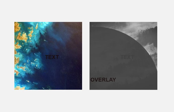
It’s an animated overlay which fills from the corner while hovering the image. Let’s start with HTML. It’s better to keep each and everything in the container as we have done in below example code.
HTML for Overlay Image
We have set the section and give a unique ID. Inside the section, first we have the overlay, second, we set the image, and finally, we have defined the div for text or content.
<div class="container">
	<section id="section-1">
		<div class="overlay">
			<div class="inner">
				<h1>Overlay</h1>
			</div>
		</div>
		<img src="https://unsplash.it/300?image=1002" alt="" />
		<div class="text">
			<h1>Text</h1>
		</div>
	</section>
</div>
CSS Styles for Animated Overlay Image
We had the width of 1000 pixels for container and used the display property for alignment.
.container {
  width: 1000px;
  height: 95vh;
  margin: 0 auto;
  display: -webkit-box;
  display: -ms-flexbox;
  display: flex;
  -webkit-box-pack: justify;
      -ms-flex-pack: justify;
          justify-content: space-between;
  -webkit-box-align: center;
      -ms-flex-align: center;
          align-items: center;
}
Whenever we need to overlay one div to another, it’s required to used the position relative for the main wrapper, In our case, we have defined the section HTML element.
section {
  position: relative;
  overflow: hidden;
  font-size: 0;
}
For overly, we do use the position absolute.
.text, .overlay {
  width: 100%;
  height: 100%;
  position: absolute;
  top: 0;
  left: 0;
  bottom: 0;
  right: 0;
  margin: auto;
  text-align: center;
  display: -webkit-box;
  display: -ms-flexbox;
  display: flex;
  -webkit-box-pack: center;
      -ms-flex-pack: center;
          justify-content: center;
  -webkit-box-align: center;
      -ms-flex-align: center;
          align-items: center;
}
For animation and effect, we have used the transform property and border-radius.
.overlay {
  background-color: #a458c7;
  z-index: 1;
  opacity: 0.8;
  border-radius: 50%;
  -webkit-transform: translate3d(-62%, 62%, 0);
          transform: translate3d(-62%, 62%, 0);
  -webkit-transition: all .6s ease-out;
  transition: all .6s ease-out;
  width: 200%;
  height: 200%;
  left: -50%;
}

section:hover .overlay {
  opacity: 1;
  border-radius: 40%;
  -webkit-transform: translate3d(-12.5%, 12.5%, 0);
          transform: translate3d(-12.5%, 12.5%, 0);
}
.inner {
  position: absolute;
  width: 50%;
  height: 50%;
  top: 12.5%;
  right: 12.5%;
  display: -webkit-box;
  display: -ms-flexbox;
  display: flex;
  -webkit-box-pack: center;
      -ms-flex-pack: center;
          justify-content: center;
  -webkit-box-align: center;
      -ms-flex-align: center;
          align-items: center;
}

#section-1 .overlay {
  background-color: #233758;
}