Creating a CSS card with two columns and scrollable content can enhance the layout and usability of your website, especially when dealing with extensive information that needs to be presented in a compact, user-friendly manner.
This tutorial will guide you through the process step by step, enabling you to implement this design element efficiently and effectively.
Step1: Web Content Structuring
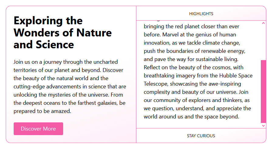
This code outlines an HTML structure for a web article focused on the exploration of nature and scientific discoveries, featuring a captivating introduction and a detailed section with highlights on various topics like biodiversity, space exploration, and sustainability.
<article class="container">
<section class="intro flow">
<h2>Exploring the Wonders of Nature and Science</h2>
<p>Join us on a journey through the uncharted territories of our planet and beyond. Discover the beauty of the natural world and the cutting-edge advancements in science that are unlocking the mysteries of the universe. From the deepest oceans to the farthest galaxies, be prepared to be amazed.</p>
<button>Discover More</button>
</section>
<section class="details">
<header>Highlights</header>
<div class="scroll-container">
Dive into the heart of the Amazon Rainforest, where biodiversity thrives and nature reveals its most intricate secrets. Wander through the vast landscapes of Mars, captured through the lenses of our latest rovers, bringing the red planet closer than ever before. Marvel at the genius of human innovation, as we tackle climate change, push the boundaries of renewable energy, and pave the way for sustainable living. Reflect on the beauty of the cosmos, with breathtaking imagery from the Hubble Space Telescope, showcasing the awe-inspiring complexity and beauty of our universe. Join our community of explorers and thinkers, as we question, understand, and appreciate the world around us and the space beyond.
</div>
<footer>Stay Curious</footer>
</section>
</article>
Step2: Styling With CSS
This code establishes a foundation for a visually appealing content block. It sets global styles, defines elements like the container, introduction, and scrollable highlights, and includes media queries for responsive adjustments.
* {
box-sizing: border-box;
}
:root {
color-scheme: light dark;
--h: 330;
--s: 88%;
--l: 66%;
--brand-color-bg: hsl(var(--h) var(--s) var(--l));
--brand-color-fg: hsl(0 0% 99%);
--border: 1px solid var(--brand-color-bg);
--shadow-blur: 1.5rem;
--shadow-color: hsla(var(--h) var(--s) var(--l) / 0.6);
--shadow-y: 1rem;
---shadow-y: calc(var(--shadow-y) * -1);
--space: clamp(1.125rem, 0.8rem + 1.3cqi, 1.875rem);
--gradient: linear-gradient(
165deg,
transparent 50%,
hsla(var(--h) var(--s) var(--l) / 0.15) 125%
);
}
@media (prefers-color-scheme: dark) {
:root {
--l: 46%;
}
}
html {
height: 100%;
}
body {
display: grid;
place-items: center;
font-family: system-ui, sans-serif;
font-size: clamp(1rem, 0.6rem + 1.125cqi, 1.125rem);
line-height: 1.5;
padding: 2rem;
min-height: 100%;
}
h2 {
font-size: 2em;
font-weight: 700;
line-height: 1.1;
text-wrap: balance;
}
button {
font: inherit;
line-height: normal;
padding: 0.5rem 1.5rem 0.6rem;
background: var(--brand-color-bg);
color: var(--brand-color-fg);
border: unset;
border-radius: 0.25rem;
}
button:active {
translate: 0 1px;
}
.flow > * + * {
-webkit-margin-before: var(--space);
margin-block-start: var(--space);
}
.container {
background: #fff;
display: grid;
grid-auto-rows: 1fr;
border: var(--border);
border-radius: 1rem;
inline-size: min(55rem, 100%);
}
.intro {
padding: var(--space);
background-image: var(--gradient);
}
.details {
display: grid;
grid-template-rows: auto 1fr auto;
-webkit-border-before: var(--border);
border-block-start: var(--border);
}
.details :where(header, footer) {
padding: calc(var(--space) / 2) var(--space);
text-align: center;
font-size: 0.8em;
font-weight: 500;
text-transform: uppercase;
background-image: var(--gradient);
}
.scroll-container {
contain: size;
overflow-y: auto;
-ms-scroll-chaining: none;
overscroll-behavior: contain;
scrollbar-color: var(--brand-color-bg) transparent;
padding: var(--space);
border-block: var(--border);
-webkit-animation: scroll-shadow-inset linear;
animation: scroll-shadow-inset linear;
animation-timeline: scroll(self);
}
@-webkit-keyframes scroll-shadow-inset {
from {
box-shadow: inset 0 var(---shadow-y) var(--shadow-blur) var(---shadow-y)
var(--shadow-color);
}
to {
box-shadow: inset 0 var(--shadow-y) var(--shadow-blur) var(---shadow-y)
var(--shadow-color);
}
}
@keyframes scroll-shadow-inset {
from {
box-shadow: inset 0 var(---shadow-y) var(--shadow-blur) var(---shadow-y)
var(--shadow-color);
}
to {
box-shadow: inset 0 var(--shadow-y) var(--shadow-blur) var(---shadow-y)
var(--shadow-color);
}
}
@media (min-width: 40rem) {
.container {
grid-template-columns: 1fr 1fr;
}
.details {
-webkit-border-before: unset;
border-block-start: unset;
-webkit-border-start: var(--border);
border-inline-start: var(--border);
}
}
Creating Scrollable Content CSS Card with 2 Columns: Code Example Demo
By following these steps, you’ve learned how to create a CSS card with two columns and scrollable content. This layout can significantly enhance the presentation of information on your website, making it more engaging and accessible to your users.