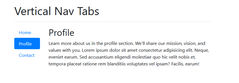
This code sets up a web page with vertical navigation tabs (Home, Profile, Contact) that, when clicked, display corresponding content sections dynamically, providing a user-friendly interface for navigating through different sections of the page.
<div class="container">
<h1>Vertical Nav Tabs</h1>
<hr>
<div class="row">
<div class="col-md-2 mb-3">
<ul class="nav nav-pills flex-column" id="myTab" role="tablist">
<li class="nav-item">
<a class="nav-link active" id="home-tab" data-toggle="tab" href="#home" role="tab" aria-controls="home" aria-selected="true">Home</a>
</li>
<li class="nav-item">
<a class="nav-link" id="profile-tab" data-toggle="tab" href="#profile" role="tab" aria-controls="profile" aria-selected="false">Profile</a>
</li>
<li class="nav-item">
<a class="nav-link" id="contact-tab" data-toggle="tab" href="#contact" role="tab" aria-controls="contact" aria-selected="false">Contact</a>
</li>
</ul>
</div>
<!-- /.col-md-4 -->
<div class="col-md-10">
<div class="tab-content" id="myTabContent">
<div class="tab-pane fade show active" id="home" role="tabpanel" aria-labelledby="home-tab">
<h2>Home</h2>
<p>Welcome to our home section. Here, you'll find all the latest updates and news about our organization. Lorem ipsum dolor sit amet consectetur adipisicing elit. Neque, eveniet earum. Sed accusantium eligendi molestiae quo hic velit nobis et, tempora placeat ratione rem blanditiis voluptates vel ipsam? Facilis, earum!</p>
</div>
<div class="tab-pane fade" id="profile" role="tabpanel" aria-labelledby="profile-tab">
<h2>Profile</h2>
<p>Learn more about us in the profile section. We'll share our mission, vision, and values with you. Lorem ipsum dolor sit amet consectetur adipisicing elit. Neque, eveniet earum. Sed accusantium eligendi molestiae quo hic velit nobis et, tempora placeat ratione rem blanditiis voluptates vel ipsam? Facilis, earum!</p>
</div>
<div class="tab-pane fade" id="contact" role="tabpanel" aria-labelledby="contact-tab">
<h2>Contact</h2>
<p>Got any questions or inquiries? Feel free to reach out to us through the contact section. Lorem ipsum dolor sit amet consectetur adipisicing elit. Neque, eveniet earum. Sed accusantium eligendi molestiae quo hic velit nobis et, tempora placeat ratione rem blanditiis voluptates vel ipsam? Facilis, earum!</p>

</div>
</div>
</div>
<!-- /.col-md-8 -->
</div>
</div>
<!-- /.container -->
Step 2: Including CDNs
https://jacoblett.github.io/bootstrap4-latest/bootstrap-4-latest.min.css

https://code.jquery.com/jquery-3.2.1.slim.min.js

https://jacoblett.github.io/bootstrap4-latest/bootstrap-4-latest.min.js
Vertical Tabs With Bootstrap 4: Source Code Example Demo
Creating responsive vertical tabs with Bootstrap 4 is a straightforward process that enhances the user experience on your website. By following the steps outlined in this guide, you can easily implement tabs that look great on any device. Whether you’re building a personal blog or a business website, incorporating vertical tabs can help organize and present your content effectively.