In this tutorial, we’re going to walk through the process of making an interactive input field for SMS verification codes. This feature, commonly used in two-factor authentication systems, can be a great addition to your web projects. We’ll keep things straightforward and use basic HTML and CSS.
Step 1: Setting Up the HTML Structure
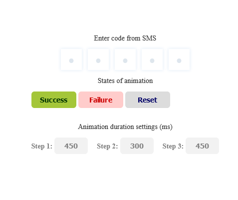
Start by laying out the basic HTML structure. This includes a container for your input fields and necessary buttons for animation control. Make sure to keep the class names consistent for the CSS to work correctly.
<div>
<div class="main">
<p class="label">Enter code from SMS</p>
<!-- SMS Code input -->
<div class="fieldset">
<! –– container should be fieldset element but there is bug in Chromium https://bugs.chromium.org/p/chromium/issues/detail?id=262679 ––>
<label class="box"><input class="field" type="text" placeholder="•" /></label>
<label class="box"><input class="field" type="text" placeholder="•" /></label>
<label class="box"><input class="field" type="text" placeholder="•" /></label>
<label class="box"><input class="field" type="text" placeholder="•" /></label>
<label class="box"><input class="field" type="text" placeholder="•" /></label>
</div>
<!-- End SMS Code input -->
</div>
<div class="animation-controls">
<p class="label is-muted">States of animation</p>
<div class="animation-controls__content">
<button class="btn success-btn" type="button">Success</button>
<button class="btn failure-btn" type="button">Failure</button>
<button class="btn reset-btn" type="button">Reset</button>
</div>
</div>
<div class="settings-controls">
<p class="label is-muted">Animation duration settings (ms)</p>
<div class="settings-controls__content">
<div>
<label class="settings-controls__label" for="step-1">Step 1:</label>
<input id="step-1" name="step-1" class="settings-controls__input" data-step="1" type="text" placeholder="Value" value="450">
</div>
<div>
<label class="settings-controls__label" for="step-2">Step 2:</label>
<input id="step-2" name="step-2" class="settings-controls__input" data-step="2" type="text" placeholder="Value" value="300">
</div>
<div>
<label class="settings-controls__label" for="step-3">Step 3:</label>
<input id="step-3" name="step-3" class="settings-controls__input" data-step="3" type="text" placeholder="Value" value="450">
</div>
</div>
</div>
</div>
Step2: Styling with CSS
Next, incorporate the CSS to style your input field. This will include definitions for colors, border-radius, and other visual elements. The CSS code will also handle the responsiveness of the input field, ensuring it looks good on any device.
:root {
/* colors palette */
--placeholder-color: hsl(240, 54%, 87%);
--bg-color: hsl(240, 54%, 97%);
--focus-color: hsla(240, 54%, 61%, 0.6);
--shadow-color: hsla(240, 54%, 61%, 0.2);
--text-color: hsl(0, 0%, 20%);
--text-color-inversed: hsl(0, 0%, 95%);
--success-color: hsl(145, 63%, 42%);
--success-color-desaturated: hsl(145, 0%, 42%);
--failure-color: hsl(0, 79%, 63%);

/* border-radius */
--border-radius: 6px;

/* z-index */
--z-index-xs: 1;
--z-index-sm: 10;
--z-index-md: 100;

/* easing */
--easing: cubic-bezier(0.25, 0.01, 0.25, 1);

/* transition durations */
--transition-duration-step-1: 450ms;
--transition-duration-step-2: 300ms;
--transition-duration-step-3: 300ms;

/* transition delays */
--transition-delay-step-2: calc(var(--transition-duration-step-1));
--transition-delay-step-3: calc(
var(--transition-duration-step-1) + var(--transition-duration-step-2)
);

/* transition properties */
--transition-step-1: var(--transition-duration-step-1) var(--easing);
--transition-step-2: var(--transition-duration-step-2) var(--easing)
var(--transition-delay-step-2);
--transition-step-3: var(--transition-duration-step-3) var(--easing)
var(--transition-delay-step-3);
}

/* General styles */
*,
*::after,
*::before {
box-sizing: border-box;
font-family: Helvetica Neue;
}
body {
display: flex;
justify-content: center;
align-items: center;
height: 100vh;
width: 100vw;
margin: 0;
}
.main {
display: grid;
justify-content: center;
}
.label {
font-size: 14px;
line-height: 15px;
text-align: center;
letter-spacing: 0.01em;
color: var(--text-color);
}
.label.is-muted {
color: #828282;
}
.animation-controls {
margin-top: 55px;
}
.animation-controls__content {
display: grid;
grid-auto-flow: column;
justify-content: center;
gap: 6px;
}
.btn {
min-width: 90px;
padding: 9px 0;
border: 0;
border-radius: 6px;
font-size: 14px;
line-height: 15px;
letter-spacing: 0.01em;
font-weight: bold;
cursor: pointer;
transition: opacity 150ms ease-in;
}
.btn:hover,
.btn:focus {
opacity: 0.7;
}
.btn:active {
position: relative;
top: 1px;
}
.btn.success-btn {
color: #219653;
background-color: #d3eadd;
}
.btn.failure-btn {
color: #eb5757;
background-color: #ffe9e0;
}
.btn.reset-btn {
color: #6666d1;
background-color: #f2f2f2;
}
.settings-controls {
margin-top: 130px;
}
.settings-controls__content {
display: grid;
justify-content: center;
gap: 18px;
}
.settings-controls__input {
width: 67px;
height: 33px;
border: 0;
border-radius: 6px;
font-size: 14px;
line-height: 15px;
font-weight: bold;
letter-spacing: 0.01em;
color: #828282;
background-color: #f2f2f2;
text-align: center;
}
.settings-controls__label {
font-size: 14px;
line-height: 15px;
letter-spacing: 0.01em;
font-weight: bold;
color: #828282;
}

@media (min-width: 768px) {
.settings-controls__content {
grid-auto-flow: column;
}
}

/* SMS Code input styles */
/* base styles */

.fieldset {
position: relative;
display: grid;
grid-auto-flow: column;
justify-content: center;
column-gap: 12px;
border-radius: 6px;
overflow: hidden;
will-change: transform;
/* make shadows of inner elements visible */
padding: 6px;
margin: -6px;
}
.fieldset::before {
content: "";
position: absolute;
top: 0;
left: 0;
height: 100%;
width: 100%;
transform: translateX(-100%);
}


.box {
position: relative;
display: flex;
align-items: center;
justify-content: center;
height: 42px;
width: 42px;
border-radius: var(--border-radius);
box-shadow: 0 0 6px 1px var(--shadow-color);
overflow: hidden;
will-change: transform;
}
.box:focus-within {
box-shadow: 0 0 6px 1px var(--shadow-color), 0 0 0 2px var(--focus-color);
}
.box::before,
.box::after {
content: "";
position: absolute;
height: 100%;
width: 100%;
top: 0;
left: 0;
border-radius: var(--border-radius);
overflow: hidden;
}
.box::before {
background: var(--bg-color);
z-index: var(--z-index-xs);
transition: background-color var(--transition-step-1);
}
.box::after {
transform: translateY(100%);
background-color: var(--success-color-desaturated);
opacity: 0;
z-index: var(--z-index-sm);
transition: transform var(--transition-step-1),
opacity var(--transition-step-1), background-color var(--transition-step-1);
}

.field {
position: relative;
border: 0;
outline: 0;
font-size: 25.21px;
line-height: 42px;
color: var(--text-color);
background-color: transparent;
text-align: center;
z-index: var(--z-index-md);
}
.field::placeholder {
color: var(--placeholder-color);
}

/* animate-success styles */

.animate-success.fieldset {
padding: 0;
margin: 0;
}
.animate-success.fieldset::before {
background-color: var(--success-color);
transform: translateX(0);
transition: transform var(--transition-step-2);
}

.animate-success > .box {
box-shadow: none;
transition: transform var(--transition-step-3);
}
.animate-success > .box:nth-child(1) {
transform: translateX(24px);
}
.animate-success > .box:nth-child(2) {
transform: translateX(12px);
}
.animate-success > .box:nth-child(4) {
transform: translateX(-12px);
}
.animate-success > .box:nth-child(5) {
transform: translateX(-24px);
}

.animate-success > .box::before {
background-color: transparent;
}
.animate-success > .box::after {
background-color: var(--success-color);
transform: translateY(0);
opacity: 1;
}

.animate-success > .box > .field,
.animate-success > .box > .field::placeholder {
color: var(--text-color-inversed);
transition: color var(--transition-step-1);
}

/* animate-failure styles */

.animate-failure.fieldset {
animation-name: shaking;
animation-duration: var(--transition-duration-step-2);
animation-timing-function: var(--easing);
animation-delay: var(--transition-delay-step-2);
}

.animate-failure > .box::before {
background-color: transparent;
}
.animate-failure > .box::after {
background-color: var(--failure-color);
transform: translateY(0);
opacity: 1;
}

.animate-failure > .box > .field,
.animate-failure > .box > .field::placeholder {
color: var(--text-color-inversed);
transition: color var(--transition-step-1);
}

@keyframes shaking {
0%,
100% {
transform: translateX(0);
}

25%,
75% {
transform: translateX(10px);
}

50% {
transform: translateX(-10px);
}
}
/* End SMS Code input styles */
Step3: JavaScript for Interaction:
Although our focus is on HTML and CSS, a small amount of JavaScript is necessary to manage the input behavior and animation triggers. This script will handle user inputs and activate the success or failure animations accordingly.
const root = document.documentElement;
function getCustomPropertyValue(name) {
const styles = getComputedStyle(root);
return styles.getPropertyValue(name);
}
/*
SMS Code input logic
primitive implementation of multi-input
Disclaimer: this «pen» was made for presentational pruposes.
It's not a production-ready solution, because it lacks of many best UX and a11y
practices. Let it inspire you and I hope you will enjoy it :)
*/
const fieldset = document.querySelector(".fieldset");
const fields = document.querySelectorAll(".field");
const boxes = document.querySelectorAll(".box");
function handleInputField({ target }) {
const value = target.value.slice(0, 1);
target.value = value;
const step = value ? 1 : -1;
const fieldIndex = [...fields].findIndex((field) => field === target);
const focusToIndex = fieldIndex + step;
if (focusToIndex < 0 || focusToIndex >= fields.length) return;
fields[focusToIndex].focus();
}
fields.forEach((field) => {
field.addEventListener("input", handleInputField);
});
/* End SMS Code input logic */
// Controls
const successBtn = document.querySelector(".success-btn");
const failureBtn = document.querySelector(".failure-btn");
const resetBtn = document.querySelector(".reset-btn");
successBtn.addEventListener("click", (event) => {
fieldset.classList.add("animate-success");
});
resetBtn.addEventListener("click", (event) => {
fieldset.classList.remove("animate-failure");
fieldset.classList.remove("animate-success");
});
failureBtn.addEventListener("click", (event) => {
function getDelay() {
const firstStepDuration = getCustomPropertyValue(
"--transition-duration-step-1"
);
const secondStepDuration = getCustomPropertyValue(
"--transition-duration-step-2"
);
return parseInt(firstStepDuration) + parseInt(secondStepDuration);
}
function animateFailure() {
fieldset.classList.add("animate-failure");
const delay = getDelay();
setTimeout(() => {
fieldset.classList.remove("animate-failure");
}, delay);
}
if (fieldset.classList.contains("animate-success")) {
fieldset.classList.remove("animate-success");
const delay = parseInt(getCustomPropertyValue("--transition-duration-step-1"))
setTimeout(() => {
animateFailure();
}, delay)
return;
}
animateFailure();
});
const inputs = document.querySelectorAll(".settings-controls__input");
function setAnimationDuration({ target }) {
const {
value,
dataset: { step }
} = target;
const safeValue = parseInt(value);
const propertyValue = Number.isNaN(safeValue) ? null : safeValue + "ms";

root.style.setProperty(`--transition-duration-step-${step}`, propertyValue);
}
inputs.forEach((node) => {
node.addEventListener("input", setAnimationDuration);
});
Creating a Dynamic SMS Verification Code Input Field Using HTML CSS DEMO
With these steps, you’ve added a visually engaging SMS OTP input field to your web page. This feature not only enhances the user experience but also provides an added layer of interaction to your site.