Adding elements to your website can make a significant difference in user experience. One such element that can catch the eye and leave a lasting impression is a 3D card flip animation. This effect allows you to create visually appealing card flips that can be used for showcasing products, portfolio items, or any other content you want to highlight.
In this blog post, we’ll walk you through the process of creating a 3D card flip CSS animation step by step.
Step 1: HTML Structure For 3D Card Flip Animation
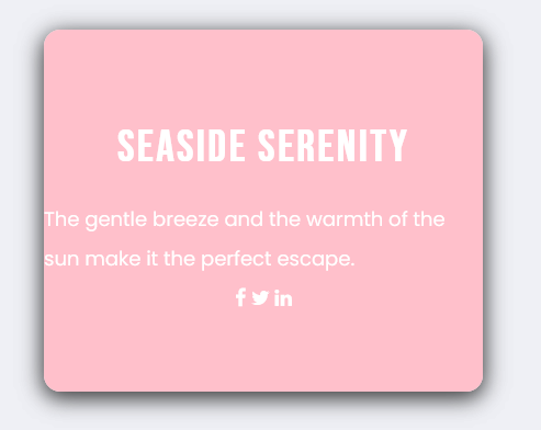
This HTML code sets up a webpage with a 3D card flip animation. It features a front card face and a back card face with content along with social media icons. The code includes necessary links to fonts and CSS styles to achieve the desired design. Here is the code example:
<!DOCTYPE html>
<html lang="en">
<!-- codingflicks.com -->
<head>
<meta charset="UTF-8">
<meta name="viewport" content="width=device-width, initial-scale=1.0">
<title>3D Card Flip CSS Animation</title>
<link href="https://fonts.googleapis.com/css2?family=Poppins:wght@400;500&display=swap" rel="stylesheet">
<link href="https://fonts.googleapis.com/css2?family=Bebas+Neue&display=swap" rel="stylesheet">
<link rel="stylesheet" href="https://cdnjs.cloudflare.com/ajax/libs/font-awesome/4.7.0/css/font-awesome.min.css">
<link rel="stylesheet" href="style.css">
</head>
<body>
<div class="wrapper">
<div class="flip-card">
<div class="front card"></div>
<div class="back card">
<h2>Seaside Serenity</h2>
<p> The gentle breeze and the warmth of the sun make it the perfect escape.</p>
<p class="socials">
<i class="fa fa-facebook"></i>
<i class="fa fa-twitter"></i>
<i class="fa fa-linkedin"></i>
</p>
</div>
</div>
</div>
</body>
</html>
Creating a 3D card flip CSS animation may seem complex, but by following these straightforward steps, you can easily incorporate this eye-catching element into your website. By setting up your HTML structure, styling your card, and adding the flip animation, you’ll be able to showcase your content in a dynamic and engaging way, enhancing the overall user experience on your site.