Looking for a unique solution for your site navigation? Today, we are building a slide out menu using CSS3 and JavaScript only for a little purpose.
It’s a very useful menu if you want to add menu only for mobile users or want to give quick access to important links on your desktop website.
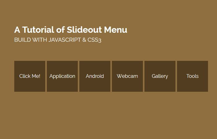
When a user clicks on the toggle button, It slideout the list of boxes on the right side with the menu text.
There are few plugins available which allow making such kind of quick navigation but I don’t think, You need a plugin for such a small functionality. You can easily build this type of menu with a few lines of CSS and JavaScript code.
Just to mention here, It does not slide out from sidebar but or something like that. It’s a simple menu which shows off with boxes when a toggle button click.
The slide out box menu is another great way of showing extra links when clicking on a simple button. This menu is simple and can be used to show more submenu items. It is perfect if you already have the main navigation bar and still wants to add another quick nav without adding another long nav bar.
We mainly use CSS and HTML to build this menu but need to add a few lines of JavaScript code. The JavaScript will allow us to add active class and make possible to set the margin left.
We will simply use the toggle function and then animate the li list items. Also, we will add CSS transition property but this can be done using pure CSS3.
Building HTML Structure for Slide Out Menu
The HTML markup is pretty much simple, and we will structure a regular menu using ul li and anchor link. We will define the main class name SlideOutMenu and then simply list the menu items.
We will use SlideoutActive class for the first menu as for active menu. Don’t you think, that’s dead simple?
<div class="SlideOutMenu">
    <ul>
        <li class="SlideoutActive"><a href="#">Menu</a></li>
        <li class="hover"><a href="#">Application</a></li>
        <li class="hover"><a href="#">Android</a></li>
        <li class="hover"><a href="#">Webcam</a></li>
        <li class="hover"><a href="#">Gallery</a></li>
        <li class="hover"><a href="#">Tools</a></li>
    </ul>
</div>
The CSS Style for Menu
The CSS also state forward, we just do some basic styling. But for list menu and current menu, we have to set position absolute and then make sure we set z-index for the current menu only.
.SlideOutMenu {
    height: 140px;
    overflow: hidden;
}
.SlideoutActive {
    z-index: 9;
}
.SlideOutMenu ul {
	margin:0;
    padding: 0;
}
.SlideOutMenu li,
.SlideOutMenu .SlideoutActive {
    background: #523d1f none repeat scroll 0 0;
    cursor: pointer;
    display: block;
    float: left;
	width: 100px;
    height: 100px;
    line-height: 100px;
    margin: 10px;
    position: absolute;
    text-align: center;

}
.SlideOutMenu li a{
	color: #fff;
	font-size: 16px;
	color:#fff;
	text-decoration:none;
}
.SlideOutMenu li.hover:hover{
	background:#6F532A;
}
The JavaScript
After building HTML & CSS for slide out menu, now its time to make sliding functionality using only JavaScript. That’s the few lines of JS, all we need to add an active class for the toggle button. Then next, we will animate the unorder list li and ul.
$(document).ready(function(e) {
    $(".SlideoutActive").toggle(function(){
    $("ul li").each(function(index, element) {
            $(this).animate({
                "margin-left":index*105
            });
            $(this).css("transition","all .5s ease-in-out")
        });
            },function(){
                $(".SlideOutMenu ul li").each(function(index, element) {
                    $(this).animate({
                "margin-left":0
            });
        });
    });
//

});
And that’s is all about! I hope you like this very short tutorial on building another cool and unique sliding menu and find this small trick useful.