Step 2: Create the Sidebar Structure
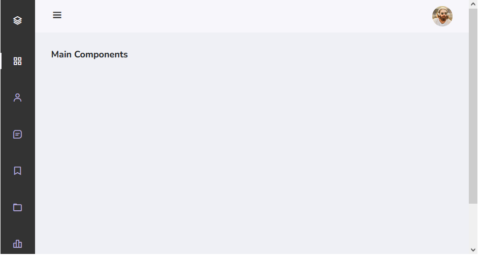
This HTML code sets up a web page with a header featuring a toggle button and an image. It also includes a sidebar navigation menu with links and a logout option. The main content area is ready to accommodate your website’s content, and you can integrate JavaScript for additional functionality.
<!DOCTYPE html>
<html lang="en">
<head>
<meta charset="UTF-8">
<meta name="viewport" content="width=device-width, initial-scale=1.0">
<title>Your Page Title</title>
<!-- Add your CSS and JavaScript links here -->
</head>
<body id="body-pd">
<!-- Header Section -->
<header class="header" id="header">
<div class="header_toggle">
<i class='bx bx-menu' id="header-toggle"></i>
</div>
<div class="header_img">
<img src="https://i.imgur.com/hczKIze.jpg" alt="">
</div>
</header>

<!-- Sidebar Section -->
<div class="l-navbar" id="nav-bar">
<nav class="nav">
<div>
<a href="#" class="nav_logo">
<i class='bx bx-layer nav_logo-icon'></i>
<span class="nav_logo-name">BBBootstrap</span>
</a>
<!-- Navigation Links -->
<div class="nav_list">
<a href="#" class="nav_link active">
<i class='bx bx-grid-alt nav_icon'></i>
<span class="nav_name">Dashboard</span>
</a>
<a href="#" class="nav_link">
<i class='bx bx-user nav_icon'></i>
<span class="nav_name">Users</span>
</a>
<a href="#" class="nav_link">
<i class='bx bx-message-square-detail nav_icon'></i>
<span class="nav_name">Messages</span>
</a>
<a href="#" class="nav_link">
<i class='bx bx-bookmark nav_icon'></i>
<span class="nav_name">Bookmark</span>
</a>
<a href="#" class="nav_link">
<i class='bx bx-folder nav_icon'></i>
<span class="nav_name">Files</span>
</a>
<a href="#" class="nav_link">
<i class='bx bx-bar-chart-alt-2 nav_icon'></i>
<span class="nav_name">Stats</span>
</a>
</div>
<!-- Logout Link -->
<a href="#" class="nav_link">
<i class='bx bx-log-out nav_icon'></i>
<span class="nav_name">SignOut</span>
</a>
</div>
</nav>
</div>

<!-- Main Content Container -->
<div class="height-100 bg-light">
<h4>Main Components</h4>
<!-- Your content goes here -->
</div>

</body>
</html>
Step 2: Styling Toggle Button Using CSS
This CSS code defines the styling for a responsive web page layout. It sets the header’s appearance with a toggle button and an image, along with the sidebar navigation menu. The variables control color schemes, fonts, and layout dimensions. Media queries ensure the layout adapts for different screen sizes, adjusting padding, font sizes, and positioning. It creates a clean and visually appealing user interface.
@import url("https://fonts.googleapis.com/css2?family=Nunito:wght@400;600;700&display=swap");

:root {
--header-height: 3rem;
--nav-width: 68px;
--first-color: #333; /* Updated background color to dark gray */
--first-color-light: #AFA5D9;
--white-color: #F7F6FB;
--body-font: 'Nunito', sans-serif;
--normal-font-size: 1rem;
--z-fixed: 100;
}
*,
::before,
::after {
box-sizing: border-box;
}
body {
position: relative;
margin: var(--header-height) 0 0 0;
padding: 0;
font-family: var(--body-font);
font-size: var(--normal-font-size);
transition: 0.5s;
}

a {
text-decoration: none;
}
.header {
width: 100%;
height: var(--header-height);
position: fixed;
top: 0;
left: 0;
display: flex;
align-items: center;
justify-content: space-between;
padding: 0 1rem;
background-color: var(--white-color);
z-index: var(--z-fixed);
transition: 0.5s;
}

.header_toggle {
color: var(--first-color);
font-size: 1.5rem;
cursor: pointer;
}

.header_img {
width: 35px;
height: 35px;
display: flex;
justify-content: center;
border-radius: 50%;
overflow: hidden;
}

.header_img img {
width: 40px;
}
.l-navbar {
position: fixed;
top: 0;
left: -30%;
width: var(--nav-width);
height: 100vh;
background-color: var(--first-color);
padding: 0.5rem 1rem 0 0;
transition: 0.5s;
z-index: var(--z-fixed);
}
.nav {
height: 100%;
display: flex;
flex-direction: column;
justify-content: space-between;
overflow: hidden;
}
.nav_logo,
.nav_link {
display: grid;
grid-template-columns: max-content max-content;
align-items: center;
column-gap: 1rem;
padding: 0.5rem 0 0.5rem 1.5rem;
}

.nav_logo {
margin-bottom: 2rem;
}

.nav_logo-icon {
font-size: 1.25rem;
color: var(--white-color);
}

.nav_logo-name {
color: var(--white-color);
font-weight: 700;
}

.nav_link {
position: relative;
color: var(--first-color-light);
margin-bottom: 1.5rem;
transition: 0.3s;
}

.nav_link:hover {
color: var(--white-color);
}

.nav_icon {
font-size: 1.25rem;
}

.show {
left: 0;
}

.body-pd {
padding-left: calc(var(--nav-width) + 1rem);
}

.active {
color: var(--white-color);
}

.active::before {
content: '';
position: absolute;
left: 0;
width: 2px;
height: 32px;
background-color: var(--white-color);
}

.height-100 {
height: 100vh;
}

@media screen and (min-width: 768px) {
body {
margin: calc(var(--header-height) + 1rem) 0 0 0;
padding-left: calc(var(--nav-width) + 2rem);
}

.header {
height: calc(var(--header-height) + 1rem);
padding: 0 2rem 0 calc(var(--nav-width) + 2rem);
}

.header_img {
width: 40px;
height: 40px;
}

.header_img img {
width: 45px;
}

.l-navbar {
left: 0;
padding: 1rem 1rem 0 0;
}

.show {
width: calc(var(--nav-width) + 156px);
}

.body-pd {
padding-left: calc(var(--nav-width) + 188px);
}
}
Step 3: JavaScript for Toggle Functionality
This JavaScript code optimizes user navigation on a website by introducing a responsive sidebar menu with a toggle button. It’s triggered when the document is fully loaded. The code effectively manages the toggle functionality, toggling the sidebar’s visibility, updating the toggle button icon, and adjusting padding on the body for an improved user interface.
document.addEventListener("DOMContentLoaded", function (event) {
const showNavbar = (toggleId, navId, bodyId) => {
const toggle = document.getElementById(toggleId),
nav = document.getElementById(navId),
bodypd = document.getElementById(bodyId);

// Validate that all variables exist
if (toggle && nav && bodypd) {
toggle.addEventListener('click', () => {
// show/hide navbar
nav.classList.toggle('show');
// change icon
toggle.classList.toggle('bx-x');
// add/remove padding to body
bodypd.classList.toggle('body-pd');
});
}
}

showNavbar('header-toggle', 'nav-bar', 'body-pd');

/*===== LINK ACTIVE =====*/
const linkColor = document.querySelectorAll('.nav_link');

function colorLink() {
if (linkColor) {
linkColor.forEach(l => l.classList.remove('active'));
this.classList.add('active');
}
}

linkColor.forEach(l => l.addEventListener('click', colorLink));
});
Step 4: Including CDNs For Resources
https://cdn.jsdelivr.net/npm/[email protected]/css/boxicons.min.css

https://cdn.jsdelivr.net/npm/[email protected]/dist/css/bootstrap.min.css

https://code.jquery.com/jquery-3.6.0.min.js

https://cdn.jsdelivr.net/npm/[email protected]/dist/js/bootstrap.bundle.min.js
Building a Sidebar Menu with Toggle Button using Bootstrap 5 DEMO
Creating a Bootstrap 5 sidebar menu with a toggle button is a fantastic way to improve navigation on your website. With the power of Bootstrap and a little bit of custom CSS and JavaScript, you can provide users with an engaging and user-friendly browsing experience.