n today’s web development world, providing immediate feedback to users is critical for a smooth and engaging experience. Whether it’s a success message after form submission or an error alert during data entry, modals play a vital role in communicating with users. This blog post guides you through creating Bootstrap 5 success and error modal popups using HTML and CSS, ensuring your web applications communicate effectively with your audience.
Step1: HTML Structure for Success and Error Messages
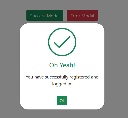
The provided HTML code employs Bootstrap 5 to construct interactive modals for displaying success and error notifications within a web application. These modals are activated by buttons; one styled green for success and the other red for errors, each triggering its respective modal that contains a custom SVG icon— a checkmark for success, and a cross for errors.
<!--[if lte IE 9]> <style>
.path {stroke-dasharray: 0 !important;}
</style> <![endif]-->
<div class="container p-5">
<div class="row">
<div class="col-12 text-center">
<button type="button" class="btn btn-success m-1" data-bs-toggle="modal" data-bs-target="#statusSuccessModal">Success Modal</button>
<button type="button" class="btn btn-danger m-1" data-bs-toggle="modal" data-bs-target="#statusErrorsModal">Error Modal</button>
</div>
<div class="modal fade" id="statusErrorsModal" tabindex="-1" role="dialog" data-bs-backdrop="static" data-bs-keyboard="false">
<div class="modal-dialog modal-dialog-centered modal-sm" role="document">
<div class="modal-content">
<div class="modal-body text-center p-lg-4">
<svg version="1.1" xmlns="http://www.w3.org/2000/svg" viewBox="0 0 130.2 130.2">
<circle class="path circle" fill="none" stroke="#db3646" stroke-width="6" stroke-miterlimit="10" cx="65.1" cy="65.1" r="62.1" />
<line class="path line" fill="none" stroke="#db3646" stroke-width="6" stroke-linecap="round" stroke-miterlimit="10" x1="34.4" y1="37.9" x2="95.8" y2="92.3" />
<line class="path line" fill="none" stroke="#db3646" stroke-width="6" stroke-linecap="round" stroke-miterlimit="10" x1="95.8" y1="38" X2="34.4" y2="92.2" />
</svg>
<h4 class="text-danger mt-3">Invalid email!</h4>
<p class="mt-3">This email is already registered, please login.</p>
<button type="button" class="btn btn-sm mt-3 btn-danger" data-bs-dismiss="modal">Ok</button>
</div>
</div>
</div>
</div>
<div class="modal fade" id="statusSuccessModal" tabindex="-1" role="dialog" data-bs-backdrop="static" data-bs-keyboard="false">
<div class="modal-dialog modal-dialog-centered modal-sm" role="document">
<div class="modal-content">
<div class="modal-body text-center p-lg-4">
<svg version="1.1" xmlns="http://www.w3.org/2000/svg" viewBox="0 0 130.2 130.2">
<circle class="path circle" fill="none" stroke="#198754" stroke-width="6" stroke-miterlimit="10" cx="65.1" cy="65.1" r="62.1" />
<polyline class="path check" fill="none" stroke="#198754" stroke-width="6" stroke-linecap="round" stroke-miterlimit="10" points="100.2,40.2 51.5,88.8 29.8,67.5 " />
</svg>
<h4 class="text-success mt-3">Oh Yeah!</h4>
<p class="mt-3">You have successfully registered and logged in.</p>
<button type="button" class="btn btn-sm mt-3 btn-success" data-bs-dismiss="modal">Ok</button>
</div>
</div>
</div>
</div>
</div>
</div>
Step2: Styling Modal With CSS Animations
This CSS code applies styling and animations to the modal content and SVG icons within the success and error modals, creating visually engaging feedback for the user. Specifically, it rounds the modal edges, adjusts the SVG size and positioning, and animates the SVG paths to simulate drawing the icons dynamically.
.modal#statusSuccessModal .modal-content,
.modal#statusErrorsModal .modal-content {
border-radius: 30px;
}
.modal#statusSuccessModal .modal-content svg,
.modal#statusErrorsModal .modal-content svg {
width: 100px;
display: block;
margin: 0 auto;
}
.modal#statusSuccessModal .modal-content .path,
.modal#statusErrorsModal .modal-content .path {
stroke-dasharray: 1000;
stroke-dashoffset: 0;
}
.modal#statusSuccessModal .modal-content .path.circle,
.modal#statusErrorsModal .modal-content .path.circle {
-webkit-animation: dash 0.9s ease-in-out;
animation: dash 0.9s ease-in-out;
}
.modal#statusSuccessModal .modal-content .path.line,
.modal#statusErrorsModal .modal-content .path.line {
stroke-dashoffset: 1000;
-webkit-animation: dash 0.95s 0.35s ease-in-out forwards;
animation: dash 0.95s 0.35s ease-in-out forwards;
}
.modal#statusSuccessModal .modal-content .path.check,
.modal#statusErrorsModal .modal-content .path.check {
stroke-dashoffset: -100;
-webkit-animation: dash-check 0.95s 0.35s ease-in-out forwards;
animation: dash-check 0.95s 0.35s ease-in-out forwards;
}

@-webkit-keyframes dash {
0% {
stroke-dashoffset: 1000;
}
100% {
stroke-dashoffset: 0;
}
}
@keyframes dash {
0% {
stroke-dashoffset: 1000;
}
100%{
stroke-dashoffset: 0;
}
}
@-webkit-keyframes dash {
0% {
stroke-dashoffset: 1000;
}
100% {
stroke-dashoffset: 0;
}
}
@keyframes dash {
0% {
stroke-dashoffset: 1000;}
100% {
stroke-dashoffset: 0;
}
}
@-webkit-keyframes dash-check {
0% {
stroke-dashoffset: -100;
}
100% {
stroke-dashoffset: 900;
}
}
@keyframes dash-check {
0% {
stroke-dashoffset: -100;
}
100% {
stroke-dashoffset: 900;
}
}
.box00{
width: 100px;
height: 100px;
border-radius: 50%;
}
Step3: Including CDNs
https://cdnjs.cloudflare.com/ajax/libs/bootstrap/5.0.2/css/bootstrap.min.css
https://cdnjs.cloudflare.com/ajax/libs/jquery/3.6.0/jquery.min.js
https://cdnjs.cloudflare.com/ajax/libs/twitter-bootstrap/5.2.0/js/bootstrap.min.js
Bootstrap 5 Modal Popup Tutorial: Creating Success & Error Messages Demo
Creating success and error modals with Bootstrap 5 is a straightforward process that significantly enhances user experience by providing immediate feedback in a visually appealing way.