Today, I’m going to share a CSS code snippet to create a book page flip animation. It’s a pure CSS single page flip animation to reveal content on mouseover event.
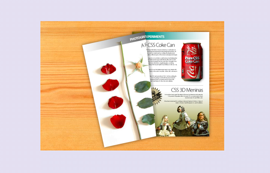
This project is useful to display some hidden contents inside a virtual book. You can place anything inside the page that will reveal on hover with an almost realistic book page turning effect. Before going further, I’ll suggest you check the final output on the demo page.
Although, the page contents and background desk can be customized with your own images or text. But this page flip animation is limited for a single page only. Therefore, if you want to create a continue images slideshow, check out the slideshow category.
HTML for Book Page Flip Animation
The HTML consists of main three parts that are page 1, page 2, and the main container. Besides this, there are some supportive div elements that help to turn the book page. The images for both pages are defined in CSS using background-image property. You can also place any HTML elements like text, button, links, etc in the pages divs. A complete HTML structure for page flip animation is as follows:
<div id="all">
   <div id="page-flip">
      <div id="r1">
         <div id="p1">
            <div>
               <div></div>
            </div>
         </div>
      </div>
      <div id="p2">
         <div></div>
      </div>
      <div id="r3">
         <div id="p3">
            <div>
               <div></div>
            </div>
         </div>
      </div>
      <div class="s">
         <div id="s3">
            <div id="sp3"></div>
         </div>
      </div>
      <div class="s" id="s4">
         <div id="s2">
            <div id="sp2"></div>
         </div>
      </div>
      <a id="coke" href="#" title="Pure CSS Coke Can"></a>
      <a id="meninas" href="#" title="CSS 3D Meninas"></a>
   </div>
</div>
The CSS Styles
First of all, specify the CSS styles for page flip container. Keep its absolute position and set hidden overflow. The height and width values can be defined according to your needs. Similarly, The desk background image can be replaced with your own background image.
#page-flip {
    background-image: url(https://cssdeck.com/uploads/media/items/6/6h4pDpK.jpg);
    position: absolute;
    padding: 40px 40px 40px 340px;
    width: 300px;
    height: 400px;
    overflow: hidden;
}
After that, define the CSS styles for the page that you want to flip/turn. The #p1 id selector is the outer wrapper of this page that should be wider to handle the flip animation. So, along with the overflow hidden, keep its width and height values 1285px and 1388px respectively. On the other hand, its child div is the actual page that will be flipped. You just need to update the URL of the background image in child div.
#p1 {
    width: 1285px;
    height: 1388px;
    overflow: hidden;
}
#p1 > div {
    -webkit-transform-origin: 285px 0;
    -webkit-transform: translate(1030px, 500px) rotate(32deg);
    -webkit-transition-property: -webkit-transform, -webkit-transform-origin;
    -webkit-transition-duration: 1s;
    width: 285px;
    height: 388px;
    background-image: url(https://cssdeck.com/uploads/media/items/8/87WOlJH.jpg);
}
#p1 > div > div {
    width: 10px;
    height: 388px;
    background: -webkit-gradient(linear, left top, right top, from(rgba(0, 0, 0, .25)), to(rgba(0,0,0,0)));
}
Now, specify styles for the second page that’s static. Keep its absolute position, define the width, and height values as same to the first page. In the background-image property, place your image URL that will be displayed on the second page.
#p2 > div {
    width: 285px;
    height: 388px;
    -webkit-box-shadow: 0 0 11px rgba(0, 0, 0, .5);
    position: absolute;
    z-index: 1;
    background-image: url(https://cssdeck.com/uploads/media/items/4/4FpEEbu.jpg);
}
We have some supportive div elements that help to give a realistic look while turning the book page. Define their CSS styles as described below:
#all {
    width: 680px;
    margin-left: auto;
    margin-right: auto;
}
#r1 {
    position: absolute;
    z-index: 2;
    -webkit-transform-origin: 1315px 500px;
    -webkit-transform: translate(-1030px, -500px) rotate(-32deg);
    -webkit-transition-property: -webkit-transform, -webkit-transform-origin;
    -webkit-transition-duration: 1s;
}
#r3 {
    -webkit-transform-origin: 1315px 500px;
    -webkit-transform: translate(-1030px, -500px) rotate(-32deg);
    -webkit-transition-property: -webkit-transform, -webkit-transform-origin;
    -webkit-transition-duration: 1s;
    position: absolute;
    z-index: 2;
}

#s3 {
    -webkit-transform-origin: 70px 500px;
    -webkit-transform: translate(215px, -500px) rotate(-32deg) translate(40px, 0);
    -webkit-transition-property: -webkit-transform, -webkit-transform-origin;
    -webkit-transition-duration: 1s;
    position: absolute;
    z-index: 1;
}
#p3 {
    width: 1285px;
    height: 1388px;
    overflow: hidden;
}

#p3 > div {
    -webkit-transform-origin: 0 0;
    -webkit-transform: translate(1255px, 500px) rotate(-32deg);
    -webkit-transition-property: -webkit-transform, -webkit-transform-origin;
    -webkit-transition-duration: 1s;
    -webkit-box-shadow: 0 0 11px rgba(0, 0, 0, .5);
    width: 285px;
    height: 388px;
    background-image: url(https://cssdeck.com/uploads/media/items/6/6S8oF28.jpg);
    overflow: hidden;
}

#p3 > div > div {
    width: 9px;
    height: 500px;
    float: right;
    background: -webkit-gradient(linear, left top, right top, from(rgba(0, 0, 0, 0)), to(rgba(0,0,0,.20)));
}
Apply shadow, transform-origin, and transition-duration on hover for supportive divs.
#page-flip:hover #s3 {
    -webkit-transform-origin: 325px 500px;
    -webkit-transform: translate(-40px, -500px) rotate(0deg) translate(40px, 0);
}

#sp3 {
    width: 25px;
    height: 1000px;
    background: -webkit-gradient(linear, left top, right top, from(rgba(0, 0, 0, .25)), to(rgba(0,0,0,0)));
    -webkit-transition-property: width;
    -webkit-transition-duration: 1s;
    overflow: hidden;
}

#page-flip:hover #sp3 { width: 11px }

.s {
    width: 285px;
    height: 388px;
    position: absolute;
    overflow: hidden;
    z-index: 3;
}

#s2 {
    -webkit-transform-origin: 45px 500px;
    -webkit-transform: translate(240px, -500px) rotate(-32deg);
    -webkit-transition-property: -webkit-transform, -webkit-transform-origin;
    -webkit-transition-duration: 1s;
    position: absolute;
}

#sp2 {
    width: 15px;
    height: 1000px;
    background: -webkit-gradient(linear, right top, left top, from(rgba(0, 0, 0, .18)), to(rgba(0,0,0,0)));
    overflow: hidden;
}

#s4 {
    opacity: 1;
    -webkit-transition-duration: 0.5s;
}

#page-flip:hover #s4 { opacity: 0 }

#page-flip:hover #s2 {
    -webkit-transform-origin: 300px 500px;
    -webkit-transform: translate(-15px, -500px) rotate(0deg);
}
The final part of the CSS coding is enabling flip animation. So, add the following CSS styles in order to activate the page flip animation on hover.
#page-flip:hover #r1 {
    -webkit-transform-origin: 1570px 500px;
    -webkit-transform: translate(-1285px, -500px) rotate(0deg);
}

#page-flip:hover #p1 > div {
    -webkit-transform-origin: 285px 0;
    -webkit-transform: translate(1285px, 500px) rotate(0deg);
}

#page-flip:hover #r3 {
    -webkit-transform-origin: 1570px 500px;
    -webkit-transform: translate(-1285px, -500px) rotate(0deg);
}

#page-flip:hover #p3 > div {
    -webkit-transform-origin: 0 0;
    -webkit-transform: translate(1000px, 500px) rotate(0deg);
}


#coke {
    width: 253px;
    height: 158px;
}


#page-flip:hover #coke {
    -webkit-transition-delay: .8s;
    margin: 33px 0 0 14px;
}

#meninas {
    width: 253px;
    height: 167px;
}

#page-flip:hover #meninas {
    -webkit-transition-delay: .8s;
    margin: 203px 0 0 14px;
}
You have done all! I hope you liked this CSS code snippet to create a book page flip animation. If you have any questions related to CSS animations, let me know by comment below.
hello, I was trying to replicate this design but I wanna make many page and in a bigger area can you suggest me what elements I should change cause while changing the widths animation is also getting affected.