Nowadays, the trend of creating and using text animation is growing like wildfire. Every designer tries to design something amazing by applying different effects and animations to text. I have already covered many text animations and today I again come back with a new animation idea to make the fill text animated using CSS.
The idea for fill text animation came from an animated progress bar in which tilted lines move from one direction to another. Though the idea is simple, but the completion of the project was a little bit challenging. Thanks to CSS webkit-text-fill-color property which simplified the trick to make fill text.
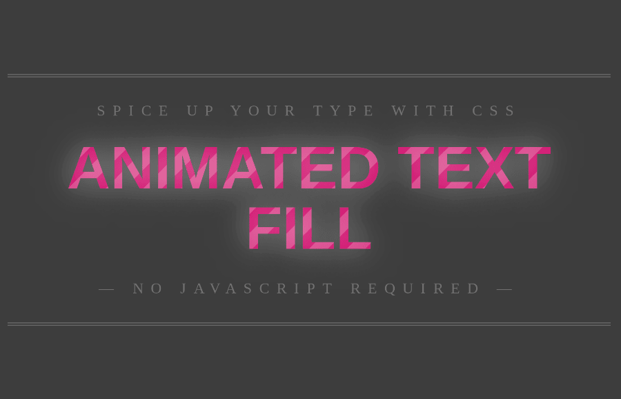
Before getting started with coding, I would suggest you check out the demo page to see how animation works. There you can see the movement of linear-gradient colors filled inside the text. The text background, shadow, and size can be customized according to your needs. So, let’s get started with HTML to create this awesome text animation.
The HTML Structure
In HTML, create a div element with a class name "animated-txt" and place your text inside the p tag wrapping with a span element. So, the complete HTML code for the animated fill text is as follows:
<div class="animated-txt">
<p><span>You Text Goes Here...</span></p>
</div>
You can place the above HTML anywhere on your webpage where you wanted to create animated text.
CSS Styles for Animated Fill Text
The "animated-txt" is the wrapper element for the animated text. Define its background, font, color, and margin as mentioned below. Here the important property is min-height which you need to define according to the height of the text. In my case, I used a 400px minimum height of the wrapper element. You can increase or decrease it as per your requirements.
.animated-txt {
  background: #414141;  /* fallback for old browsers */
  font: 400 1em/1.5 "Neuton";
  color: rgba(255,255,255,.25); text-align: center;
  margin: 0 auto;
  min-height: 400px;
  }
After that, target the p element which holds the text outside the fill text. Basically, the following styles for the p element are optional. It’s upon you if you wanna take up these styles. You can also change these CSS values to get the desired result for the p element.
.animated-txt p{
	text-transform: uppercase;
	letter-spacing: .5em;
	display: inline-block;
	border: 4px double rgba(255,255,255,.25);
	border-width: 4px 0;
	padding: 1.5em 0em;
	position: absolute;
	top: 20%;
	left: 50%;
	width: 40em;
	margin: 0 0 0 -20em;
}
Now, select the span element of the animated-txt wrapper in order to style the fill text. Define the font, letter-spacing, padding, and text-shadow property as described below. Use the margin property with 0 auto value to make the text alignment to the center of its parent element.
You can use a background image or gradient color to fill the text. To do so, we’ll use the CSS clip background technique to fill the characters. Similarly, we’ll transfer the text into 3d translation to activate hardware acceleration for smoother animation. So, the following are the styles for the fill text.
.animated-txt p span {
	font: 700 4em/1 "Oswald", sans-serif;
	letter-spacing: 0;
	padding: .25em 0 .325em;
	display: block;
	margin: 0 auto;
	text-shadow: 0 0 80px rgba(255,255,255,.5);

/* Clip Background Image */

	/*background: url(https://f.cl.ly/items/010q3E1u3p2Q0j1L1S1o/animated_text_fill.png) repeat-y;*/
  background-size: 50px 50px;
background-color: #c16;
background-image: -webkit-linear-gradient(-45deg, rgba(255, 255, 255, .2) 25%, transparent 25%,
                  transparent 50%, rgba(255, 255, 255, .2) 50%, rgba(255, 255, 255, .2) 75%,
                  transparent 75%, transparent);
background-image: -moz-linear-gradient(-45deg, rgba(255, 255, 255, .2) 25%, transparent 25%,
                  transparent 50%, rgba(255, 255, 255, .2) 50%, rgba(255, 255, 255, .2) 75%,
                  transparent 75%, transparent);
background-image: linear-gradient(135deg, rgba(255, 255, 255, .2) 25%, transparent 25%,
                  transparent 50%, rgba(255, 255, 255, .2) 50%, rgba(255, 255, 255, .2) 75%,
                  transparent 75%, transparent);
	-webkit-background-clip: text;

/* Animate Background Image */

	-webkit-text-fill-color: transparent;
	-webkit-animation: aitf 10s linear infinite;

/* Activate hardware acceleration for smoother animations */

	-webkit-transform: translate3d(0,0,0);
	-webkit-backface-visibility: hidden;
}
Finally, define the CSS keyframes for moving tilted lines inside the text. You can also specify other keyframes to bring change in the text according to your needs.
/* Animate Background Image */

@-webkit-keyframes aitf {
	0% { background-position: 0% 50%; }
	100% { background-position: 100% 50%; }
}
That’s all! I hope you have successfully created animated fill text animation. If you have any questions or suggestions, let me know by comment below.