This tutorial is about creating a smooth and animated slide up and down the menu with the help of CSS and JavaScript. You can use this sliding box to show some quick information.
The sliding menu will work as toggle function of jQuery. It will perform two different functions with the same button. It will Slide Down and Up while clicking. We are also going to build some nice looking animated menu inside the toggle.
This slide down panel included an excellent animated menu. We make these menus with CSS @keyframes animation with nice hover effect. I will guide you how I did that.
It isn’t purely CSS but we added a bit of JavaScript to handle toggle panel function. So this is our JavaScript slide down menu. If you need pure CSS solution then you can refer our previous CSS3 tutorial about creating CSS Transition Slide Down effect.
Let’s go ahead and start building.
Build an Animated CSS Slide Up and Slide Down Menu
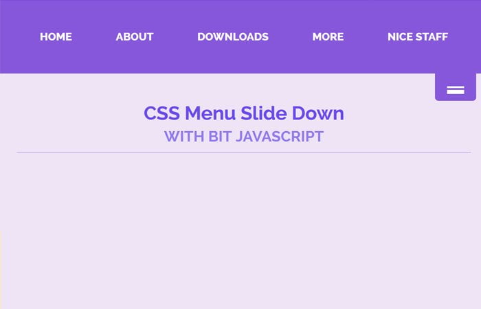
Our HTML markup if so easy to understand. We don’t need to write much of HTML code. We try to keep it as simple as possible. First of all, We need to define the main div that holds all the other HTML code. Here we define SlideDownMenu
The next step to define our menus and we follow the standard process by defining ul, li, and anchor link elements. We keep our navigation menu separately by define nav HTML element.
<div class="SlideDownMenu">
  <nav>
    <ul>
      <li><a href="#">Home</a></li>
      <li><a href="#">About</a></li>
      <li><a href="#">Downloads</a></li>
      <li><a href="#">More</a></li>
      <li><a href="#">Nice staff</a></li>
    </ul>
  </nav>
</div>
After finishing with Navigation, we go ahead building with our toggle button. We will define one main div (MenuTab) for the button which included one child div class name NavTab along with anchor link for a button.
<div class="SlideDownMenu">
    <nav>
    <ul>
      <li><a href="#">Home</a></li>
      <li><a href="#">About</a></li>
      <li><a href="#">Downloads</a></li>
      <li><a href="#">More</a></li>
      <li><a href="#">Nice staff</a></li>
    </ul>
    </nav>
    <div class="MenuTab">
        <div class="NavTab">
          <a href="#"></a>
        </div>
    </div>
</div>
The CSS Styles
Let’s do some styling for the main container and nav. We do position fixed for the container so that it should come down when to scroll down the page. We added some border-top here so it will be visible to the user for understanding it.
The nav HTML element will display none with some background color. We handle this display one into display block by using of jquery toggle function.
.SlideDownMenu {
  border-top: 8px solid #8657DB;
  position: fixed;
  top: 0;
  width: 100%;
}
.SlideDownMenu nav {
  background-color: #8657DB;
  display: none;
  height: 100px;
  top: 0;
}
Toggle Button Style
To style the toggle button, first, we need to apply some basic styles like set to float right, some background color, width, and height. Then we will style the buttons by using :before property of CSS.
/*Menu Tap*/
.MenuTab {
  float: right;
  margin: 0 40px 0 0;
  width: 40px;
}
/*Nav Tap*/
.NavTab {
    background-color: #8657db;
    border-radius: 0 0 5px 5px;
    height: 40px;
    text-align: center;
    width: 60px;
}
/*Border*/
.NavTab a {
  position: relative;
  padding-left: 25px;
}

.NavTab a:before {
  content: "";
  position: absolute;
  top: 16px;
  left: 0;
  width: 25px;
  height: 0.125em;
  border-top: 0.5em double #333;
  border-bottom: 0.2em solid #333;
}
Animated The Menus
Here is a complete set of CSS for the CSS Slide Down Menu. You can see we used CSS keyframes for a better result. We also used :after element for getting nice looking hover effect.
.SlideDownMenu ul {
    list-style: outside none none;
    margin: 0;
    padding: 22px 0;
    text-align: center;
}
.SlideDownMenu ul li {
  display: inline-block;
}
.SlideDownMenu ul li a {
  position:relative;
  z-index: 1;
  display: block;
  padding: 12px 20px;
  text-decoration: none;
  color: #000;
  font-weight: 800;
  text-transform: uppercase;
  margin: 0 10px;
}
.SlideDownMenu ul li a:hover {
  color: #fff;
}
.SlideDownMenu ul li a:after {
  display: block;
  position: absolute;
  top: 0;
  left: 0;
  bottom: 0;
  right: 0;
  margin: auto;
  width: 100%;
  height: 1px;
  content: '.';
  color: transparent;
  background: #8e44ad;
  border-radius:5px;
  visibility: none;
  opacity: 0;
  z-index: -1;
  transition: all .5s;
}
.SlideDownMenu ul li a:hover:after {
  opacity: 1;
  visibility: visible;
  height: 100%;
}
/* Keyframes */
@-webkit-keyframes fill {
  0% {
    width: 0%;
    height: 1px;
  }
  50% {
    width: 100%;
    height: 1px;
  }
  100% {
    width: 100%;
    height: 100%;
    background: #333;
  }
}
/* Keyframes */
@-webkit-keyframes circle {
  0% {
    width: 1px;
    top: 0;
    left: 0;
    bottom: 0;
    right: 0;
    margin: auto;
    height: 1px;
    z-index: -1;
    background: #eee;
    border-radius: 100%;
  }
  100% {
    background: #aaa;
    height: 5000%;
    width: 5000%;
    z-index: -1;
    top: 0;
    bottom: 0;
    left: 0;
    right: 0;
    margin: auto;
    border-radius: 0;
  }
}
The JavaScript
The JavaScript for CSS Slide Down Menu is so simple. We just used the slideToggle function with fast animation speed. This animation speed can either be slow.
$(function(){
  $('.SlideDownMenu').on('click', '.MenuTab', function () {
    $('nav').slideToggle('fast');
    return false;
  });
});
How you find this menu Tutorial? Let me know if you find something more good looking and better one in below comment section. I will try to come up with some more solution soon.