This HTML code defines a visually engaging stack of cards within a web page, where each div element represents an individual card with unique content, all contained within a parent div labeled as stack for a grouped interactive display.
<main>
<div id="stack" class="card-stack">
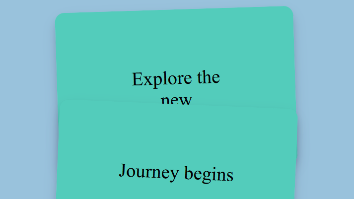
<div class="card">Explore the new</div>
<div class="card">Journey begins</div>
<div class="card">Unveil the secrets</div>
<div class="card">Discover your path</div>
<div class="card">Celebrate the moments</div>
<div class="card">Unlock the potential</div>
<div class="card">Embrace the adventure</div>
</div>
</main>
Step2: Styling for Scrolling Stack Card Effect
This CSS code creates a visually dynamic and interactive card layout within a central grid on a webpage, utilizing properties like position: sticky, variable-based transformations, and conditional styling to achieve a visually engaging and responsive stack of cards that vary in rotation and position as they are interacted with.
* { margin: 0; font: inherit }
body {
background: #2980b57a !important;
text-align: center;
}
main {
--tilt-angle: 3deg;
position: relative;
display: grid;
grid-template-rows: 1fr max-content;
height: 100vh;
width: 30rem;
margin: auto;
font-size: 2.4rem;
top: 10vh;
}
.card {
position: sticky;
top: calc(var(--top) * 1px);
box-shadow: rgba(50, 50, 93, 0.25) 0px 13px 27px -5px, rgba(0, 0, 0, 0.3) 0px 8px 16px -8px;
background-color: #53ccbb;
border-radius: 0.5em;
padding: 3em;
margin-bottom: 2em;
transform: rotate(calc(var(--tilt-angle) * (2 * (var(--r) - 0.5))));
transition: * 0.3s ease;
}
.card.stuck {
box-shadow: 0 1px 2px rgba(0, 0, 0, 0.1); /* Add a box shadow effect */
background-color: red;
}
.card:nth-child(4n) {
--r: 0.7;
--top: 0;
}
.card:nth-child(4n + 1) {
--r: 0.2;
--top: 50;
}
.card:nth-child(4n + 2) {
--r: 0.9;
--top: 100;
}
.card:nth-child(4n + 3) {
--r: 0.4;
--top: 150;
}
Animate Your Website: Build a Scrolling Stack Card Effect With Pure CSS Demo
And that’s it! You’ve now created a visually engaging card stack with a scrolling effect using CSS. This effect can significantly enhance the user experience on your website, making it more interactive and appealing.