Are you ready to transform your web development projects with stunning and interactive buttons? Welcome to the world of Bootstrap 5 Buttons with Icons.
In this comprehensive showcase, we unveil a plethora of button examples that blend the power of Bootstrap 5 with captivating icons to elevate your user interface to new heights. These buttons go beyond mere aesthetics; they enhance user experience, simplify navigation, and add functionality to your web applications.
Whether you’re seeking buttons for success messages, warnings, navigation, or user actions like signing in or purchasing, our Bootstrap 5 Buttons with Icons have you covered.
Explore the possibilities, customize the styles, and effortlessly integrate these button examples into your projects. Get ready to craft visually appealing and highly functional interfaces that engage and delight users.
So, let’s start with HTML coding.
Step 1: Include Required Libraries
Begin by including the necessary libraries in your HTML file. In this example, we’ll use Bootstrap 5 and Font Awesome icons for the buttons. Please include these CDNs into the <head> tag
 <!-- Include Bootstrap CSS -->

<link rel="stylesheet" href="https://cdn.jsdelivr.net/npm/[email protected]/dist/css/bootstrap.min.css">

<!-- Include Font Awesome CSS -->

<link rel="stylesheet" href="https://cdnjs.cloudflare.com/ajax/libs/font-awesome/6.3.0/css/all.min.css">
Step 2: Create HTML Buttons with Icons and Text
Now, let’s create a variety of buttons with icons and text. We’ll use Bootstrap 5’s button classes along with Font Awesome icons for different button styles.
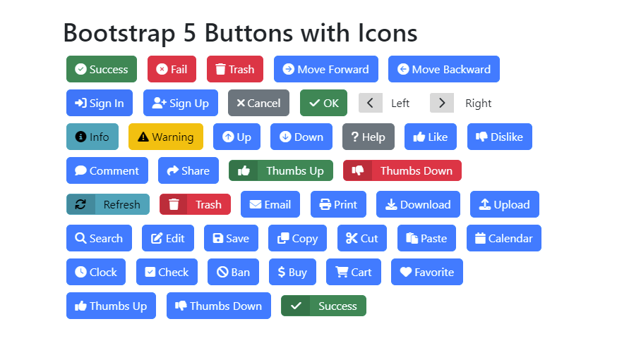
<div class="container mt-5">
<h1>Bootstrap 5 Buttons with Icons</h1>

<!-- Success Button -->
<button class="btn btn-success"><i class="fas fa-check-circle"></i> Success</button>

<!-- Danger/Fail Button -->
<button class="btn btn-danger"><i class="fas fa-times-circle"></i> Fail</button>

<!-- Trash Button -->
<button class="btn btn-danger"><i class="fas fa-trash"></i> Trash</button>

<!-- Move Forward Button -->
<button class="btn btn-primary"><i class="fas fa-arrow-circle-right"></i> Move Forward</button>

<!-- Move Backward Button -->
<button class="btn btn-primary"><i class="fas fa-arrow-circle-left"></i> Move Backward</button>

<!-- Sign In Button -->
<button class="btn btn-primary"><i class="fas fa-sign-in-alt"></i> Sign In</button>

<!-- Sign Up Button -->
<button class="btn btn-primary"><i class="fas fa-user-plus"></i> Sign Up</button>

<!-- Cancel Button -->
<button class="btn btn-secondary"><i class="fas fa-times"></i> Cancel</button>

<!-- OK/Confirm Button -->
<button class="btn btn-success"><i class="fas fa-check"></i> OK</button>

<!-- Add more buttons as needed -->
<button type="button" class="btn btn-labeled btn-default">
<span class="btn-label"><i class="fa fa-chevron-left"></i></span>Left</button>
<button type="button" class="btn btn-labeled btn-default">
<span class="btn-label"><i class="fa fa-chevron-right"></i></span>
Right</button>
<!-- Custom Buttons with Icons -->
<button class="btn btn-info"><i class="fas fa-info-circle"></i> Info</button>
<button class="btn btn-warning"><i class="fas fa-exclamation-triangle"></i> Warning</button>
<button class="btn btn-primary"><i class="fas fa-arrow-circle-up"></i> Up</button>
<button class="btn btn-primary"><i class="fas fa-arrow-circle-down"></i> Down</button>
<button class="btn btn-secondary"><i class="fas fa-question"></i> Help</button>
<button class="btn btn-primary"><i class="fas fa-thumbs-up"></i> Like</button>
<button class="btn btn-primary"><i class="fas fa-thumbs-down"></i> Dislike</button>
<button class="btn btn-primary"><i class="fas fa-comment"></i> Comment</button>
<button class="btn btn-primary"><i class="fas fa-share"></i> Share</button>
<button type="button" class="btn btn-labeled btn-success">
<span class="btn-label"><i class="fa fa-thumbs-up"></i></span>Thumbs
Up</button>
<button type="button" class="btn btn-labeled btn-danger">
<span class="btn-label"><i class="fa fa-thumbs-down"></i></span>Thumbs
Down</button>
<br>
<button type="button" class="btn btn-labeled btn-info">
<span class="btn-label"><i class="fa fa-refresh"></i></span>Refresh</button>
<button type="button" class="btn btn-labeled btn-danger">
<span class="btn-label"><i class="fa fa-trash"></i></span>Trash</button>
<button class="btn btn-primary"><i class="fas fa-envelope"></i> Email</button>
<button class="btn btn-primary"><i class="fas fa-print"></i> Print</button>
<button class="btn btn-primary"><i class="fas fa-download"></i> Download</button>
<button class="btn btn-primary"><i class="fas fa-upload"></i> Upload</button>
<button class="btn btn-primary"><i class="fas fa-search"></i> Search</button>
<button class="btn btn-primary"><i class="fas fa-edit"></i> Edit</button>
<button class="btn btn-primary"><i class="fas fa-save"></i> Save</button>
<button class="btn btn-primary"><i class="fas fa-copy"></i> Copy</button>
<button class="btn btn-primary"><i class="fas fa-cut"></i> Cut</button>
<button class="btn btn-primary"><i class="fas fa-paste"></i> Paste</button>
<button class="btn btn-primary"><i class="fas fa-calendar"></i> Calendar</button>
<button class="btn btn-primary"><i class="fas fa-clock"></i> Clock</button>
<button class="btn btn-primary"><i class="fas fa-check-square"></i> Check</button>
<button class="btn btn-primary"><i class="fas fa-ban"></i> Ban</button>
<button class="btn btn-primary"><i class="fas fa-dollar-sign"></i> Buy</button>
<button class="btn btn-primary"><i class="fas fa-shopping-cart"></i> Cart</button>
<button class="btn btn-primary"><i class="fas fa-heart"></i> Favorite</button>
<button class="btn btn-primary"><i class="fas fa-thumbs-up"></i> Thumbs Up</button>
<button class="btn btn-primary"><i class="fas fa-thumbs-down"></i> Thumbs Down</button>
<button type="button" class="btn btn-labeled btn-success">
<span class="btn-label"><i class="fa fa-check"></i></span>Success</button>
</div>
Step 3: Customize Button Styles
You can further customize button styles by applying Bootstrap’s contextual classes like btn-primary, btn-warning, btn-info, etc., and adjust colors as needed. We have used basic styles for these buttons, you can use anything according to your need.
.btn {
margin: 5px;
font-size: 16px;
}

.btn-danger {
background-color: #dc3545;
border-color: #dc3545;
}

.btn-primary {
background-color: #007bff;
border-color: #007bff;
}

.btn-secondary {
background-color: #6c757d;
border-color: #6c757d;
}

.btn-info {
background-color: #17a2b8;
border-color: #17a2b8;
}

.btn-warning {
background-color: #ffc107;
border-color: #ffc107;
}

.btn-label {
position: relative;
left: -12px;
display: inline-block;
padding: 6px 12px;
background: rgba(0, 0, 0, 0.15);
border-radius: 3px 0 0 3px;
}
.btn-labeled {
padding-top: 0;
padding-bottom: 0;
}
Creating Bootstrap 5 Buttons with Icons and Text adds a visually appealing and functional element to your web application. Whether it’s for indicating success, failure, navigation, or user actions like signing in or signing up, these buttons can enhance the user experience and make your application more interactive.
By following this step-by-step guide, you can easily implement various button styles and icons to match your project’s requirements. Explore and unleash your creativity with these versatile Bootstrap buttons.