Creating a CSS button with a waving text effect can add a playful and engaging element to your website. This type of effect can make your calls-to-action stand out, encouraging users to interact more with your content. In this blog post, we’re going to walk through the process of creating such a button, step by step.
Step1: HTML Structure For Button
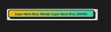
This code snippet crafts a button designed for both visual appeal and accessibility; it features a layered structure for aesthetic elements like outlines and shadows, while incorporating a hidden accessible text label for screen readers, alongside a container for visually-styled text characters.
<button class="button" type="button">
<span class="button-outline">
<span class="button-shadow">
<span class="button-inside">
<span class="button-text visually-hidden">Super Mario Bros. Wonder</span>
<span class="button-text-characters-container" aria-hidden="true"></span>
</span>
</span>
</span>
</button>
Step2: Styling With CSS
This CSS code styles a button to create dynamic visual effects, including a beveled outline, shadow layer, and an interactive inner layer that changes upon hover or focus, alongside a background animation and character jump animations for engaging user interaction.
@font-face {
src: url("https://assets.codepen.io/4175254/DIN2014-DemiBold.ttf") format("truetype");
font-family: 'DIN 2014';
font-weight: 600;
}
body {
display: flex;
justify-content: center;
align-items: center;
min-height: 100vh;
min-height: 100dvh;
background-color: #1c1c1c !important;
}

.button {
--bevel: 3px;
--border-width: 3px;
font-family: 'DIN 2014';
font-weight: 600;
color: #1d2119;
filter: drop-shadow(1px 1px 1px rgba(0, 0, 0, 0.95));
min-width: 10em;
}

.button-outline {
--bevel-1: calc((var(--bevel) + (var(--border-width)) * 2) - ((var(--border-width) * 0.41421)) * 2);
--bevel-2: calc(var(--bevel-1) + var(--border-width));
--bevel-3: calc(var(--bevel-2) + var(--border-width));
display: block;
margin-top: calc(var(--border-width) * -1);
margin-left: calc(var(--border-width) * -1);
padding: var(--border-width);
background-color: #fff;
clip-path: polygon(var(--bevel-2) var(--border-width), calc(100% - var(--bevel-2)) var(--border-width), 100% var(--bevel-3), 100% calc(100% - var(--bevel-1)), calc(100% - var(--bevel-1)) 100%, var(--bevel-3) 100%, var(--border-width) calc(100% - var(--bevel-2)), var(--border-width) var(--bevel-2));
transition-property: clip-path;
transition-duration: .2s;
}
.button:hover:not(:active) .button-outline, .button:focus-visible:not(:active) .button-outline {
clip-path: polygon(var(--bevel-1) 0, calc(100% - var(--bevel-3)) 0, 100% var(--bevel-3), 100% calc(100% - var(--bevel-1)), calc(100% - var(--bevel-1)) 100%, var(--bevel-3) 100%, 0 calc(100% - var(--bevel-3)), 0 var(--bevel-1));
}

.button-shadow {
--padding: calc(var(--border-width) * 2);
--bevel-1: calc((var(--bevel) + var(--border-width)) - (var(--border-width) * 0.41421));
--bevel-2: calc(var(--bevel-1) + var(--border-width));
--bevel-3: calc(var(--bevel-2) + var(--border-width));
display: block;
padding: calc(var(--border-width) * 2) var(--padding) var(--padding) calc(var(--border-width) * 2);
background-color: #1d2119;
clip-path: polygon(var(--bevel-2) var(--border-width), calc(100% - var(--bevel-2)) var(--border-width), 100% var(--bevel-3), 100% calc(100% - var(--bevel-1)), calc(100% - var(--bevel-1)) 100%, var(--bevel-3) 100%, var(--border-width) calc(100% - var(--bevel-2)), var(--border-width) var(--bevel-2));
transition-property: clip-path;
transition-duration: .2s;
}
.button:hover:not(:active) .button-shadow, .button:focus-visible:not(:active) .button-shadow {
clip-path: polygon(var(--bevel-1) 0, calc(100% - var(--bevel-3)) 0, 100% var(--bevel-3), 100% calc(100% - var(--bevel-1)), calc(100% - var(--bevel-1)) 100%, var(--bevel-3) 100%, 0 calc(100% - var(--bevel-3)), 0 var(--bevel-1));
}

.button-inside {
--padding-vertical: 6px;
display: block;
padding: var(--padding-vertical) 24px calc(var(--padding-vertical) - .125em);
background-color: #fff;
clip-path: polygon(var(--bevel) 0, calc(100% - var(--bevel)) 0, 100% var(--bevel), 100% calc(100% - var(--bevel)), calc(100% - var(--bevel)) 100%, var(--bevel) 100%, 0 calc(100% - var(--bevel)), 0 var(--bevel));
text-align: center;
transition-property: transform;
transition-duration: .2s;
}
.button:hover:not(:active) .button-inside, .button:focus-visible:not(:active) .button-inside {
transform: translate(calc(var(--border-width) * -1), calc(var(--border-width) * -1));
}
.button:hover .button-inside, .button:focus-visible .button-inside {
background-color: #fcd200;
background-image:linear-gradient(to right, rgba(0, 0, 0, 0), rgba(36, 208, 192, 0.88)), radial-gradient(#9d7474 1px, rgba(0, 0, 0, 0) 0%), radial-gradient(#4b5dbd 1px, rgba(0, 0, 0, 0) 0%);
background-size: auto, 6px 6px, 6px 6px;
background-position: 0 0, 0 0, 3px 3px;
animation: scroll-background 1s linear infinite;
}

@keyframes scroll-background {
to {
background-position-x: 0, -6px, -3px;
}
}
.button-text-characters-container {
display: inline-block;
transform: skewX(-6deg);
}

.button-text-character {
display: inline-block;
}
.button:hover:not(:active) .button-text-character, .button:focus-visible:not(:active) .button-text-character {
animation: jump 4s cubic-bezier(0.75, 0.25, 1, 2) var(--delay) infinite;
}

@keyframes jump {
5% {
transform: translateY(-0.125em);
}
10% {
transform: translateY(0);
}
}
Step3: Text Animation for a Button
This JavaScript code splits the button’s text content into individual characters, wraps each non-whitespace character in a span with a unique animation delay, and then appends these spans to create a visually engaging animated text effect within the button.
const buttonText = document.querySelector('.button-text');
const buttonTextCharactersContainer = document.querySelector('.button-text-characters-container');
const buttonTextCharacters = buttonText.textContent.split('');
const characterCountWithoutWhitespaces = buttonTextCharacters.filter(character => character => !/\s/.test(character)).length;
const buttonTextCharactersFragment = document.createDocumentFragment();
let characterIndex = 1;
buttonTextCharacters.forEach(character => {
const span = document.createElement('span');
span.textContent = character;
if (!/\s/.test(character)) {
span.classList.add('button-text-character');
const delay = `calc(2s / ${characterCountWithoutWhitespaces} * ${characterIndex} + 1s)`;
span.style.setProperty('--delay', delay);
characterIndex++;
}
buttonTextCharactersFragment.appendChild(span);
});
buttonTextCharactersContainer.appendChild(buttonTextCharactersFragment);
Waving Text Buttons: A Simple CSS Animation Tutorial Demo
Adding a waving text effect to a button with CSS is a fun way to enhance the visual appeal of your website and make your buttons more engaging. By following these steps, you can easily incorporate this effect into your own projects.