The login page is a crucial component of any website that requires user authentication. It serves as the entry point for users to access their personal accounts or gain access to restricted content. The design of the login page should be user-friendly, visually appealing, and secure.
Are you looking for a quick and easy way to create Login Page in HTML with CSS Code for your web project? Look no further than this collection of hand-picked login page designs. With live previews and downloadable HTML and CSS code, you can easily integrate these templates into your project, saving you time and effort.
Whether you’re looking for a simple login form or a more advanced login page with additional features, this collection has you covered. Each login page design is unique, with its own set of functions and features, so you can find the perfect match for your project.
With the option to preview each login page design before downloading the HTML and CSS code, you can make sure it fits your needs before committing to it. So why waste time and effort creating a login page from scratch when you can easily use one of these ready-to-use login page templates?
Flat HTML5/CSS3 Login Form
A flat HTML5/CSS3 login form is a modern and minimalist design that offers a streamlined approach to user authentication. It includes a simple username and password input field, submit button, and sometimes additional features such as remember me checkboxes or social login options. The responsive design ensures the login form functions seamlessly across all devices.
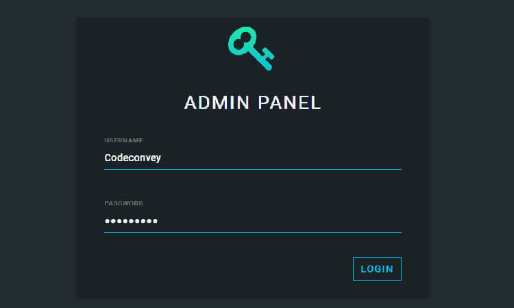
Admin Panel CSS Login Page
The Admin panel HTML Login Form in the provided link features a simple and minimalist design with a focus on functionality and usability. The design uses a clean and modern color scheme with a combination of blue and white, giving it a professional appearance. Additionally, the form is responsive and can adapt to different screen sizes, ensuring it works seamlessly on all devices.
Bootstrap HTML /CSS Login Page
This Bootstrap Login page is a modern and visually appealing interface. The login form includes two input fields for the username and password, a “remember me” checkbox, and a submit button. The design uses a combination of blue and white, with a gradient background and subtle shadows to give it depth and dimension. Additionally, the form is responsive, meaning it adapts to different screen sizes and devices. The design is simple, elegant, and user-friendly, making it an excellent choice for web developers looking to create a login page that is both functional and visually appealing.
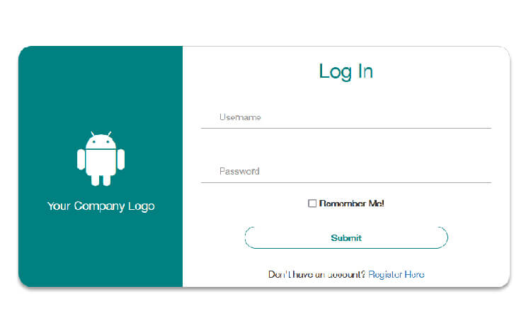
Login Materialize Form in HTML
It is a stylish and modern login form that features a unique and eye-catching background color. The login form includes input fields for the username and password, a “forgot password” link, and a submit button. Additionally, the form is responsive, meaning it adapts to different screen sizes and devices. The design is both functional and visually appealing, making it an excellent choice for web developers looking to create a login form that stands out from the crowd.
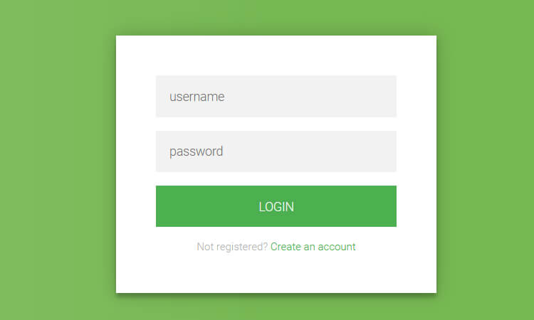
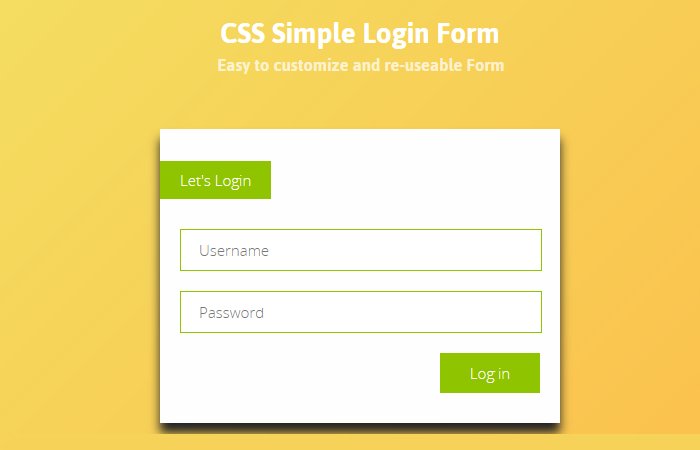
Simple Login Page in HTML
This login form template offers a clean and user-friendly interface for logging in. With a simple yet effective design, it includes a title, email and password input fields, a link to reset forgotten passwords, and two buttons for registering and signing in. The template’s color scheme is inspired by Material Design and features a sleek and modern look, which can be easily customized to match your specific needs. Whether you are looking for a quick and easy login solution or want to create a simple login form in html with a personalized user experience, this login form template is a great choice.
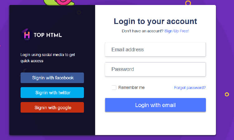
Login Page with Anime.js Background
looking for something amzing? This login page is design very well and provide awesome design. The form have email address and password field with login button. It also have social login button on the left side that look attractive.The design uses a gradient background and a sans-serif font for the text, giving it a modern and stylish look. The animated background adds a touch of creativity and uniqueness to the design, making it stand out from other login forms. Overall, the design is both functional and visually appealing, making it an excellent choice for web developers looking to create a login form that is both engaging and user-friendly.
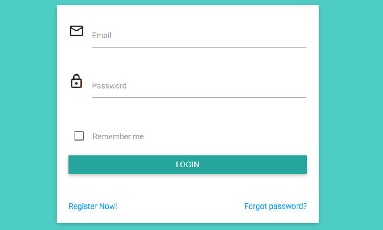
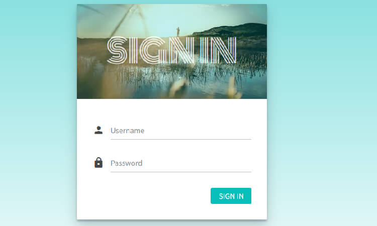
SignIn Page with Username and Password
The design of the form is simple and straightforward. The form has a white background with niche looking header. The header contains the text “Sign In” with backgorund image. The form has two input fields, one for the username and one for the password. Each field have icon to indicate the fied.
UI Login Form in HTML with CSS
The following login form is UI design with nice and clean interface. The design have light color tone which is perfect for UI websites. You can use this form on any small web projects and mobile apps.
I love this blog. Thanks for sharing this design of Login Form.
Thanks for appreciation, keep visiting us for more awesome code snippets.