Styling radio buttons with CSS is a popular technique among web developers. Radio buttons are used to allow users to make a single selection from a group of options. By default, radio buttons are often plain and unappealing, but with CSS, you can give them a more visually appealing design that matches the look and feel of your website.
In this tutorial, we will be discussing how to style radio buttons with CSS, including how to change the appearance of the button itself, as well as the label text and other associated elements.
We will also explore some common design patterns and best practices for styling radio buttons. Whether you’re a beginner or an experienced developer, this tutorial will provide you with the knowledge and skills you need to create custom, stylish radio buttons for your website.
Radio Button HTML
A radio button is an HTML element that allows the user to select one option from a group of options. It is represented by the <input> tag with the type attribute set to “radio”. The name attribute is used to group radio buttons together so that only one option can be selected at a time.
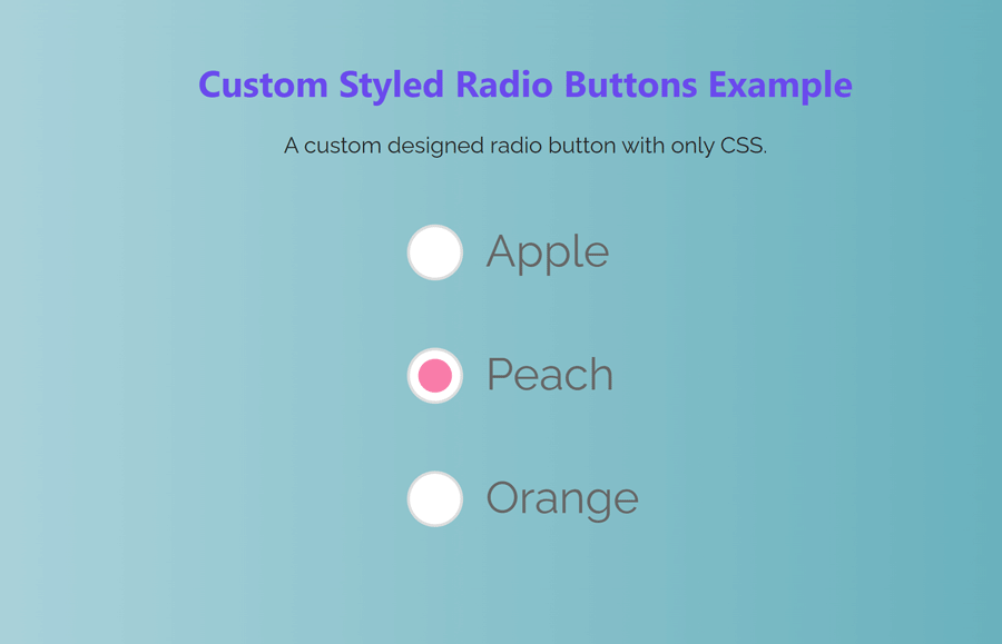
Here’s an example of how to create a radio button in HTML:
<form action="#">
  <p>
    <input type="radio" id="test1" name="radio-group" checked>
    <label for="test1">Apple</label>
  </p>
  <p>
    <input type="radio" id="test2" name="radio-group">
    <label for="test2">Peach</label>
  </p>
  <p>
    <input type="radio" id="test3" name="radio-group">
    <label for="test3">Orange</label>
  </p>
</form>
Styling Radio Button with CSS
Let’s start with defining the width and margin for <form> so it aligns with the center of the webpage.
form{
    max-width: 640px;
    margin: 10px auto;
}
It’s also possible to hide the default radio button and replace it with a custom image or color using the ::before and content properties. So here we simply hide it using the position property.
[type="radio"]:checked,
[type="radio"]:not(:checked) {
    position: absolute;
    left: -9999px;
}
Now we will change the appearance of the label text associated with the radio button by setting properties such as color, display, and cursor.
[type="radio"]:checked + label,
[type="radio"]:not(:checked) + label
{
    position: relative;
    padding-left: 28px;
    cursor: pointer;
    line-height: 20px;
    display: inline-block;
    color: #666;
}
Here is how we can set the ::before label property.
[type="radio"]:checked + label:before,
[type="radio"]:not(:checked) + label:before {
    content: '';
    position: absolute;
    left: 0;
    top: 0;
    width: 18px;
    height: 18px;
    border: 1px solid #ddd;
    border-radius: 100%;
    background: #fff;
}
Here we will style the radio button by using the ::after properties. We will set properties such as color, font-size, and font-weight.
[type="radio"]:checked + label:after,
[type="radio"]:not(:checked) + label:after {
    content: '';
    width: 12px;
    height: 12px;
    background: #F87DA9;
    position: absolute;
    top: 4px;
    left: 4px;
    border-radius: 100%;
    -webkit-transition: all 0.2s ease;
    transition: all 0.2s ease;
}
Finally, we will design the not checked behavior of the radio buttons.
[type="radio"]:not(:checked) + label:after {
    opacity: 0;
    -webkit-transform: scale(0);
    transform: scale(0);
}
[type="radio"]:checked + label:after {
    opacity: 1;
    -webkit-transform: scale(1);
    transform: scale(1);
}
Conclusion
In conclusion, styling radio buttons with CSS allows you to change the appearance of the radio buttons and associated elements to match the look and feel of your website. By targeting the <input> element and its associated <label>, you can change the appearance of the radio button itself, as well as the label text. You can also hide the default radio button and replace it with a custom image or icon.
It’s important to test your styling in different browsers to ensure compatibility and may require additional workarounds. Remember that radio buttons should always be used in groups so that only one option can be selected at a time. With this knowledge, you can now create custom, stylish radio buttons for your website.