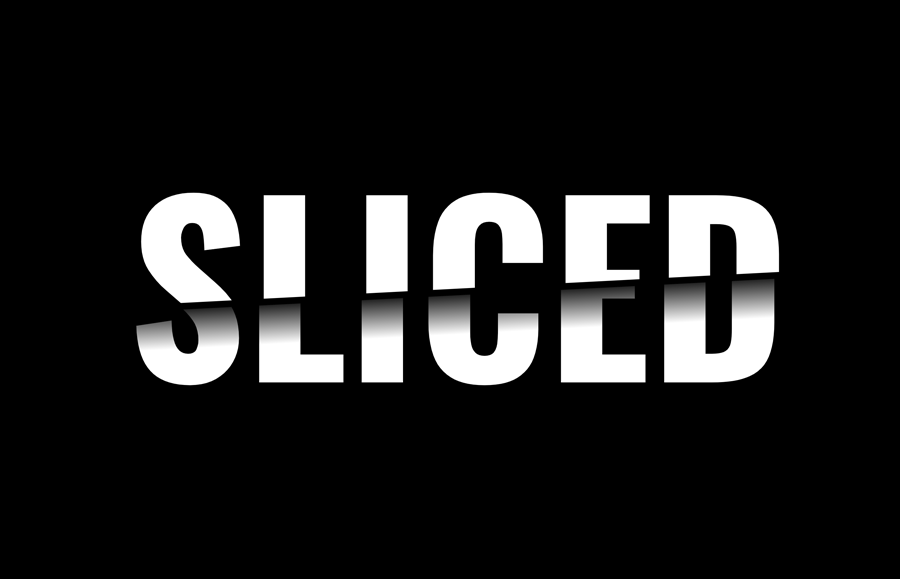
A sliced text effect is one of the creative text arts in which a word is cut in half to appear as a slice. It is mostly used to display creative work in the hero section of a web page or in the header of a slider. It is also useful for brand logos and special text on a website. In this tutorial, we’ll create a slice text effect using pure CSS.
The coding concept is based on a simple idea in which we’ll create two div elements with the same text. Then using the CSS clip-path and background-clip property to cut the text in half to make a slicing effect. So, without going deeper, let’s get started with HTML to make it happen.
The HTML Structure
In order to slice the text, we need to create two div elements with the class names "top" and "bottom" respectively. We place the same text inside both divs, whereas we’ll define an aria-hidden attribute for the bottom text to exclude it from the accessibility tree. So, create these div elements, place your text, wrap both divs into a section tag and define its class name "wrapper".
<section class="wrapper">
  <div class="top">Sliced</div>
  <div class="bottom" aria-hidden="true">Sliced</div>
</section>
You can use the above HTML structure for the words or logo text. You just need to place the same word inside these divs. Otherwise, it will not properly display the sliced text.
The CSS Styles for Slice Text Effect
Before making a sliced text, let’s specify some basic CSS styles to get things ready. So, select each DOM element using the asterisk symbol (*) in CSS and define the box-sizing property with the "border-box" value to calculate the padding of elements in the dimension.
Use the :root pseudo-class to define CSS variables for background color and text color. The use of these variables will make it easy for you to instantly customize the sliced text. Similarly, select the body element and define 0 value for the margin property in order to remove spacing around the webpage.
* {
  box-sizing: border-box;
}
:root {
  --background-color: black;
  --text-color: hsl(0, 0%, 100%);
}
body {
  margin: 0;
}
After that, select the "wrapper" class and display it as the grid. Use the CSS place-content property with the center value to align the grid item to the center of the page. Likewise, define background-color property and set color var. Define 100vh min-height, font family, font size, text-transform, and color values as follows:
Basically, you can set the custom values for the fonts in order to customize the sliced text according to your needs. However, I used the CSS clamp() function for the font size to depend on the base font of the page, and the size of the viewport. You can set the custom size for the font in px, rem, or percentage as per your needs.
.wrapper {
  display: grid;
  place-content: center;
  background-color: var(--background-color);
  min-height: 100vh;
  font-family: "Oswald", sans-serif;
  font-size: clamp(1.5rem, 1rem + 18vw, 15rem);
  font-weight: 700;
  text-transform: uppercase;
  color: var(--text-color);
}
Now, target both div of the wrapper using the greater than symbol (>) and define the grid area as 1/1/-1/-1 to specify the size and location of the grid.
.wrapper > div {
  grid-area: 1/1/-1/-1;
}
Select the "top" class and define the clip-path property with polygon shape values as described below to show the specific area of the text.
.top {
  clip-path: polygon(0% 0%, 100% 0%, 100% 48%, 0% 58%);
}
In the same way, select the "bottom" class and define the polygon shape values along with transparent color, linear-gradient background, and set the "text" value for the background-clip property. Also, use -webkit prefix for the cross-browser support for the background clip. Use the CSS transform property with translateX value to move the clipped text a little bit to the left. Thus, it will make the realistic sliced text effect.
.bottom {
  clip-path: polygon(0% 60%, 100% 50%, 100% 100%, 0% 100%);
  color: transparent;
  background: -webkit-linear-gradient(177deg, black 53%, var(--text-color) 65%);
  background: linear-gradient(177deg, black 53%, var(--text-color) 65%);
  background-clip: text;
  -webkit-background-clip: text;
  transform: translateX(-0.02em);
}
That’s all! I hope you have successfully created a sliced text effect using pure CSS. If you have any questions or suggestions, let me know by comment below.