Do you want to create a fixed sidebar when scrolling content using CSS? well! this tutorial explains how you can do it with only CSS or jQuery. Basically, you can make your sidebar sticky with pure CSS. But in this tutorial, we’ll cover both pure CSS and jQuery methods to make the sidebar fixed when scrolling down.
Besides this, we’ll also create a basic page layout with scroll-to-content navigation. You can use this navigation as a table of content that comes with a smooth scroll-down effect. Before going further, I would suggest checking the demo page to test the fixed sidebar and table of content functionality in action.
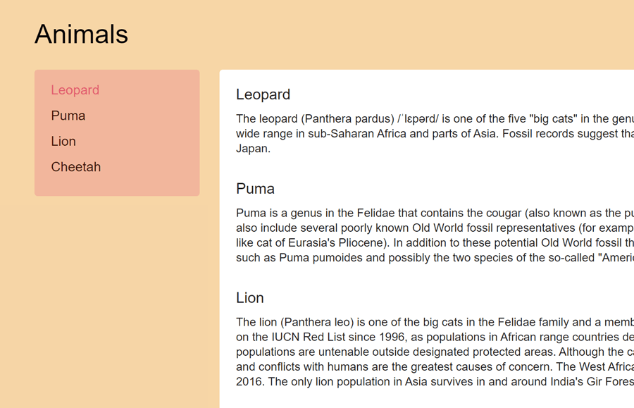
Fixed Sidebar when Scrolling Down in CSS Preview
HTML Structure for Sidebar and Content
In the very first step, you need to create a content section and a sidebar. So, create a div element with a class name "content" and another div element with a class name "article-sidebar". Place your content in the first div and sidebar content inside the other.
If you have already a page layout, you definitely don’t need to create the following HTML structure from scratch. Therefore, you only need to place the class name "article-sidebar" in your existing sidebar that you wanted to keep fixed on scroll.
<div class="content">
  <div class="content-title">Animals</div>

  <div class="article js-sidebar-holder">
    <div class="article-content-holder">
      <div class="article-content">
        <div class="article-section" id="leopard">
          <span class="article-title">Leopard</span>
          <span class="article-text">
           Your content goes here...
          </span>
        </div>
        <div class="article-section" id="puma">
          <span class="article-title">Puma</span>
          <span class="article-text">
           Your content goes here...
          </span>
        </div>
        <div class="article-section" id="lion">
          <span class="article-title">Lion</span>
          <span class="article-text">
           Your content goes here...
          </span>
        </div>
        <div class="article-section" id="cheetah">
          <span class="article-title">Cheetah</span>
          <span class="article-text">
           Your content goes here...
          </span>
        </div>
      </div>
    </div>

    <div class="article-sidebar js-sidebar-menu">
      <div class="article-sidebar-menu js-navigation-list">
        <a href="#leopard" class="article-sidebar-menu-text js-navigation-item active">Leopard</a>
        <a href="#puma" class="article-sidebar-menu-text js-navigation-item">Puma</a>
        <a href="#lion" class="article-sidebar-menu-text js-navigation-item">Lion</a>
        <a href="#cheetah" class="article-sidebar-menu-text js-navigation-item">Cheetah</a>
      </div>
    </div>
  </div>
</div>
You can keep the above HTML structure as it is if you wanted to create a table of content with a fixed sidebar as shown on the demo page. On the other hand, if you wanted to make your existing sidebar fixed on the scroll. Then you just need to define the following CSS property for "article-sidebar" class (for your sidebar class).
.article-sidebar{
   position: sticky;
   top: 0;
}
The CSS Styles
Basically, you don’t need to define further CSS styles if you decided to make your pre-created sidebar fixed. Anyhow, you can use the following CSS to styles the content area:
.content {
  display: block;
  margin: 20px 10px;
  box-sizing: border-box;
}

.content-title {
  display: block;
  margin-bottom: 26px;
  font-size: 32px;
  line-height: 34px;
  color: #000;
  font-family: Helvetica, sans-serif;
}
Similarly, define the CSS styles for the article’s content holder as follows:
.article {
  position: relative;
  display: block;
  width: 100%;
}
.article:after {
  content: "";
  display: table;
  clear: both;
}

.article-content-holder {
  float: right;
  width: calc(100% - 200px);
  padding-left: 24px;
  box-sizing: border-box;
}

.article-content {
  display: block;
  padding: 20px;
  border-radius: 4px;
  background-color: white;
  box-sizing: border-box;
}
Now, define the basic styles for typography. You can set the custom values for the article section, title, and text.
.article-section {
  display: block;
  margin-bottom: 30px;
}

.article-title {
  display: block;
  margin-bottom: 10px;
  font-size: 18px;
  line-height: 20px;
  font-family: Helvetica, sans-serif;
}

.article-text {
  display: block;
  font-size: 14px;
  line-height: 18px;
  font-family: Helvetica, sans-serif;
}
As we added the "article-sidebar" class to the sidebar, define its fixed width as 200px, and use the CSS float property to float it to the left (or right) of the page.
.article-sidebar {
  float: left;
  width: 200px;
  padding: 15px 25px 14px 20px;
  border-radius: 4px;
  background-color: #F9B69C;
  box-sizing: border-box;
}
Similarly, target the "article-sidebar-title" class and define the style for the sidebar title. You can set the custom value for color, font size, and line height in order to customize it.
.article-sidebar-title {
  display: block;
  margin-bottom: 17px;
  font-size: 18px;
  line-height: 24px;
  font-family: Helvetica, sans-serif;
  color: #191c20;
}
Add the following CSS snippet for the sidebar menu that contains navigation links. If you don’t want to create navigation inside the sidebar, you can skip this step.
.article-sidebar-menu {
  display: block;
}

.article-sidebar-menu-text {
  display: block;
  margin-bottom: 11px;
  line-height: 20px;
  font-family: Helvetica, sans-serif;
  color: #44120C;
  text-decoration: none;
}
.article-sidebar-menu-text:hover {
  color: #000;
}
.article-sidebar-menu-text.active {
  color: #E25D6E;
}
Sidebar Fixed when Scrolling Down Function
After creating the basic page layout, now it’s time to make the sidebar fixed on scroll. For this purpose, we’ll use the jQuery “Scroll to Fixed” plugin. So, load the jQuery JavaScript library and plugin file by adding the following CDN links to your webpage.
<!-- jQuery -->
<script src='https://cdnjs.cloudflare.com/ajax/libs/jquery/3.2.1/jquery.min.js'></script>
<!-- Scroll to Fixed JS -->
<script src='https://cdnjs.cloudflare.com/ajax/libs/ScrollToFixed/1.0.8/jquery-scrolltofixed-min.js'></script>
Finally, initialize the plugin in jQuery document ready function and done. You can set the custom value for marginTop option (that is 20) that will leave space above the sidebar.
<script>
$(document).ready(function () {

  $('.js-sidebar-menu').scrollToFixed({
      marginTop: 20,
      limit: $('.js-sidebar-holder').outerHeight() + 90 - $('.js-sidebar-menu').outerHeight()
    });

  $('.js-navigation-item').bind('click', function (e) {
    e.preventDefault();

    var target = $(this).attr("href");

    if (target.length > 1) {
        $('html, body').stop().animate({
          scrollTop: $(target).offset().top
        }, 600, function () {
          location.hash = target;
        });
    }

    return false;
  });
});

$(window).scroll(function () {
  var scrollDistance = $(window).scrollTop();

  $('.article-section').each(function (i) {
    if ($(this).position().top - 2 <= scrollDistance) {
      $('.js-navigation-list .js-navigation-item.active').removeClass('active');
      $('.js-navigation-list .js-navigation-item').eq(i).addClass('active');
    }
  });
}).scroll();
</script>
That’s all! Hopefully, you found this tutorial helpful to create a fixed sidebar on scroll. If you have any questions or suggestions, let me know by comment below.