Sometimes, we need to display multiple columns in a table to represent a large amount of data. Obviously, the table will be large and may overflow over the other content of the page. Anyhow, using the CSS overflow property we can overcome this situation by making it scrollable. But while scrolling we may lose focus on the data in regards to considering where this row relates to. In this case, we need a fixed first column while the other columns of the table remain scrollable.
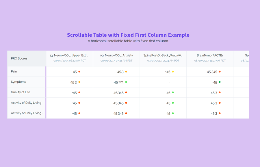
So, in this tutorial, we are going to create an HTML table with a fixed first column. As you have seen in the above preview, there is a table showing some data that is related to both row headings and the first column. The first column is fixed whereas the other columns are horizontal scrollable. You can explore it on the demo page to see it in action.
The coding concept is that we’ll create two table elements and wrap them into a wrapper (div element). We’ll arrange these tables side by side, define the fixed layout for the first table but make the second table scrollable. Similarly, we’ll define some styles for the table and make it responsive. So, let’s get started with HTML to create a table with the first fixed column.
The HTML Structure
In HTML, create a div element with a class name "wrapper" and place two table elements inside it. The first one is the fixed table and the other is horizontally scrollable. In the first table, you can place one or two columns according to your needs. Inside the second table, you can place any data that matched with the first table’s column.
<div class="wrapper">
   <table class="table-scores">
      <thead>
         <tr>
            <th>
               <div class="label">PRO Scores</div>
            </th>
         </tr>
      </thead>
      <tbody>
         <tr>
            <td>
               <div class="label">Pain</div>
            </td>
         </tr>
         <tr>
            <td>
               <div class="label">Symptoms</div>
            </td>
         </tr>
         <tr>
            <td>
               <div class="label">Quality of Life</div>
            </td>
         </tr>
         <tr>
            <td>
               <div class="label">Activity of Daily Living</div>
            </td>
         </tr>
         <tr>
            <td>
               <div class="label">Activity of Daily Living Activity of Daily Living</div>
            </td>
         </tr>
      </tbody>
   </table>
   <div class="table-data-wrapper">
      <table class="table-data">
         <thead>
            <tr>
               <th>
                  <div class="label">13. Neuro-QOL: Upper Extremity Function (Fine Motor, ADL)</div>
                  <div class="date">09/05/2017, 06:42 AM PDT</div>
               </th>
               <th>
                  <div class="label">09. Neuro-QOL: Anxiety</div>
                  <div class="date">09/01/2017, 07:34 AM PDT</div>
               </th>
               <th>
                  <div class="label">SpinePostOpBack_WallaWalla_V4</div>
                  <div class="date">09/01/2017, 05:24 AM PDT</div>
               </th>
               <th>
                  <div class="label">BrainTumorFACTBr</div>
                  <div class="date">08/10/2017, 11:59 AM PDT</div>
               </th>
               <th>
                  <div class="label">SpinePreOp_V4_</div>
                  <div class="date">08/10/2017, 10:54 AM PDT</div>
               </th>
               <th>
                  <div class="label">Post-Op HOOS Survey</div>
                  <div class="date">07/26/2017, 07:32 AM PDT</div>
               </th>
               <th>
                  <div class="label">Post-Op KOOS Survey</div>
                  <div class="date">01/25/2017, 11:22 PM PST</div>
               </th>
            </tr>
         </thead>
         <tbody>
            <tr>
               <td>
                  <div class="score-value score-value--very-bad">45</div>
               </td>
               <td>
                  <div class="score-value score-value--bad">45.3</div>
               </td>
               <td>
                  <div class="score-value score-value--normal">-45</div>
               </td>
               <td>
                  <div class="score-value score-value--very-bad">45.345</div>
               </td>
               <td>
                  <div class="score-value score-value--very-good">-245.45</div>
               </td>
               <td>
                  <div class="score-value score-value--good">-45.221</div>
               </td>
               <td>
                  <div class="score-value">-</div>
               </td>
            </tr>
            <tr>
               <td>
                  <div class="score-value score-value--bad">45.3</div>
               </td>
               <td>
                  <div class="score-value score-value--good">-45.221</div>
               </td>
               <td>
                  <div class="score-value">-</div>
               </td>
               <td>
                  <div class="score-value score-value--very-good">-45</div>
               </td>
               <td>
                  <div class="score-value score-value--normal">45.345</div>
               </td>
               <td>
                  <div class="score-value score-value--bad">45</div>
               </td>
               <td>
                  <div class="score-value score-value--very-good">-245.45</div>
               </td>
            </tr>
            <tr>
               <td>
                  <div class="score-value score-value--very-bad">-45</div>
               </td>
               <td>
                  <div class="score-value score-value--very-bad">45.345</div>
               </td>
               <td>
                  <div class="score-value score-value--good">45</div>
               </td>
               <td>
                  <div class="score-value score-value--very-bad">45.3</div>
               </td>
               <td>
                  <div class="score-value">-</div>
               </td>
               <td>
                  <div class="score-value score-value--very-bad">-245.45</div>
               </td>
               <td>
                  <div class="score-value score-value--normal">-45.221</div>
               </td>
            </tr>
         </tbody>
      </table>
   </div>
</div>
In the above HTML code, the first table contains a class name "table-scores" and the second table contains the class name "table-data". Basically, we’ll use these classes to style the tables. So, you are required to add these classes to your tables and wrap these tables inside a wrapper element.
CSS Style for Scrollable Table with Fixed First Column
In CSS, select the "wrapper" element and define a solid border that covers both tables inside it. Likewise, select the table element define a background color, and collapse its border using CSS border-collapse property.
.wrapper {
  border: 1px solid #e6eaf0;
}

table {
  border-collapse: collapse;
  background: #fff;
}
The "table-scores" class makes the first column of the table fixed. Use the table-layout property and define its fixed position. In order to display both tables side by side, we need to set its display property as inline-block along with a fixed width. So, define 175px width (or according to the content of your first column) and display it as inline-block. You can set a custom background as you required.
.table-scores {
  table-layout: fixed;
  width: 175px;
  display: inline-block;
  background: #f9fafc;
  border-right: 1px solid #e6eaf0;
  vertical-align: top;
}
.table-scores td, .table-scores th {
  max-width: 179px;
}
.table-scores th {
  background: #eff1f4;
  text-align: left;
}
The "table-data-wrapper" is the class name for the second table. You also need to display it as an inline-block. The data table may contain multiple columns. So, there should be enough space to display all the columns. For this purpose, define the 100% width and minus the first table width using the CSS calc function. To forbade the overlapping of the table width over the other content we will make it horizontally scrollable. Therefore, define the overflow-x property and set its value "scroll". Thus, it will make the table scrollable whereas the first column (of the first table) will remain fixed.
.table-data-wrapper {
  display: inline-block;
  overflow-x: scroll;
  vertical-align: top;
  width: calc(100% - 175px);
}
.table-data-wrapper table {
  border-left: 0;
}
.table-data-wrapper td, .table-data-wrapper th {
  width: calc((100vw - 2 * 40px - 180px) / 5);
}
Now, specify the basic styles for the th, td, tr and thead element. Basically, these styles are optional but you can define custom values for these elements as per your requirements.
.table-data-wrapper td:not(:last-child), .table-data-wrapper th:not(:last-child) {
  border-right: 1px solid #e6eaf0;
}

th {
  height: 72px;
}

th, td {
  padding: 0 16px;
}

thead {
  background: #f9fafc;
}

td {
  height: 48px;
}

thead tr,
tbody tr:not(:last-child) {
  border-bottom: 1px solid #e6eaf0;
}
Finally, define CSS media rules and define the min and max width of the table headings in order to make the table responsive. The width values are already calculated according to screen sizes, you just need to add the following snippet into your project.
@media (min-width: 900px) {
  .table-data-wrapper td, .table-data-wrapper th {
    min-width: calc((100vw - 2 * 40px - 180px) / 5);
    max-width: calc((100vw - 2 * 40px - 180px) / 5);
  }
}
@media (max-width: 1023px) {
  .table-data-wrapper td, .table-data-wrapper th {
    min-width: calc((100vw - 2 * 40px - 180px) / 3);
    max-width: calc((100vw - 2 * 40px - 180px) / 3);
  }
}
That’s all! I hope, you have successfully integrated this table into your project. If you have any questions or suggestions, let me know by comment below.