In HTML, image mapping is a technique to highlight certain image areas and make them clickable. This method can be used to create clickable hotspots over images. In this tutorial, we are going to create a responsive image map with tooltips on hover.
As shown in the above preview, we placed different markers that indicating countries over the image. Basically, you can mention anything on any image and make them clickable. So, the main purpose of this tutorial is to create an image map with tooltips containing additional information about the area.
The coding concept is that we’ll create a div element and place an image inside it. Similarly, we’ll place tooltips content inside it, set different positions for marker & tooltip, and toggle it on hover event. Before starting with coding, explore the demo page to see the image map with a tooltip on hover.
HTML Structure for Responsive Image Map
First of all, create a div element with an id "image-map" and place your image inside it. Similarly, create another div element (for tooltip content) with a class name “pin” just after the image. Store the value of the x-axis and y-axis inside data-xpos and data-ypos respectively. We’ll use these values in jQuery to set the position of the marker over the image.
<div id="image-map">
<img width="611" height="438" src="https://i.imgur.com/VlW9u1t.png" alt="Our Locations">
<div class="pin pin-down" data-xpos="115" data-ypos="125">
<h2>Willowbrook Place</h2>
<ul>
<li><strong>123 Street Address</strong></li>
<li>City, ST, 12345</li>
<li><strong>(555) 555-5555</strong></li>
<li><a href="#" target="_blank">Website</a></li>
<li>Coming in Spring 2015</li>
</ul>
</div>
<div class="pin pin-down" data-xpos="215" data-ypos="175">
<h2>Ambergrove Place</h2>
<ul>
<li><strong>123 Street Address</strong></li>
<li>City, ST, 12345</li>
<li><strong>(555) 555-5555</strong></li>
<li><a href="#" target="_blank">Website</a></li>
<li>Coming in Spring 2015</li>
</ul>
</div>
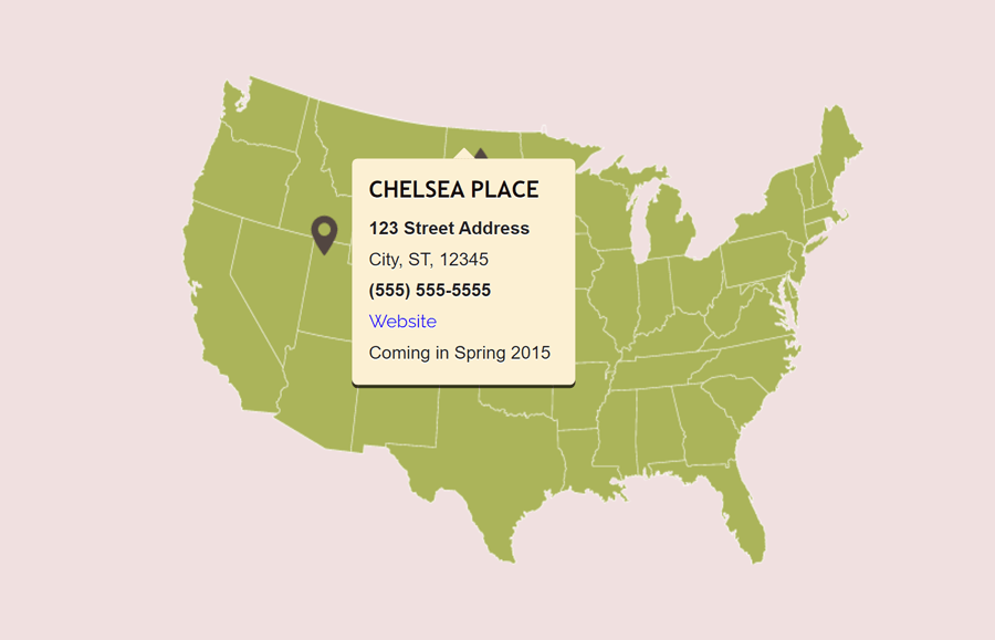
<div class="pin" data-xpos="255" data-ypos="65">
<h2>Chelsea Place</h2>
<ul>
<li><strong>123 Street Address</strong></li>
<li>City, ST, 12345</li>
<li><strong>(555) 555-5555</strong></li>
<li><a href="#" target="_blank">Website</a></li>
<li>Coming in Spring 2015</li>
</ul>
</div>
</div>
Repeat the same method for multiple hotspots with different x and y coordinates. Likewise, you can place anything inside the “pin” div that will be shown inside the tooltip.
The CSS Styles
The "#image-map" id is the container of the image map. As we are going to absolutely float tooltip inside this container, we need to set its relative position. In order to align the map to the center of the page, use the margin property with "auto" value for the left and right.
#image-map {
    position: relative;
    margin: 150px auto 20px auto;
}
As we mentioned earlier, the "pin" class contains the content of the tooltip. The tooltip will be shown on the hover event. So, it should be hidden in normal condition. Therefore, use the display none property to hide the tooltip by default.
.pin {
    display: none;
}
Now, target both the "tooltip-up" and “tooltip-down" class with a comma separator and set its absolute position. These classes contain the pin icon for indicating a specific area on the image map. Define the background image (with Imgur URL of location pin image), specify width and height as 25px and 37px respectively. Moreover, change the background-position for the tooltip-down class.
.tooltip-up, .tooltip-down {
    position: absolute;
    background: url(https://i.imgur.com/13rZbuk.png);
    width: 25px;
    height: 37px;
}
.tooltip-down {
    background-position: 0 -37px;
}
After that, target the tooltip class with the :after pseudo-selector to and define the following style for pointing arrow. In order to make the pointing arrow for the tooltip, we’ll use the CSS border property. Here is the complete tutorial to create a message box with a border arrow, you can explore it to customize the tooltip box.
.tooltip::after {
    content: '';
    position: absolute;
    top: -10px;
    left: 50%;
    margin-left: -10px;
    border-bottom: 10px solid #fff1d3;
    border-left: 10px solid transparent;
    border-right : 10px solid transparent;
}
At last, define some basic typography styles for tooltip content. You can place any HTML element inside the tooltip container (e.g images, headings, and paragraphs, etc). So, specify CSS styles for tooltip headings, paragraphs, and lists as follows:
.tooltip-down .tooltip {
    bottom: 12px;
    top: auto;
}

.tooltip-down .tooltip::after {
    bottom: -10px;
    top: auto;
    border-bottom: 0;
    border-top: 10px solid #ffdb90;
}

.tooltip h2 {
    font: bold 1.3em 'Trebuchet MS', Tahoma, Arial;
    margin: 0 0 10px;
}

.tooltip ul {
    margin: 0;
    padding: 0;
    list-style: none;
}
Image Map jQuery Function
In order to set the position and toggle the tooltip on the hover event, we’ll use jQuery. So, load the jQuery library by adding the following CDN link into the head tag of your HTML page.
<!-- jQuery -->
<script src='https://cdnjs.cloudflare.com/ajax/libs/jquery/2.1.3/jquery.min.js'></script>
Finally, add the following function that sets the map dimension according to the image, append the tooltip and toggle it on hover event.
$(document).ready(function(){

    // set the image-map width and height to match the img size
    $('#image-map').css({'width':$('#image-map img').width(),
                      'height':$('#image-map img').height()
    })

    //tooltip direction
    var tooltipDirection;

    for (i=0; i<$(".pin").length; i++)
    {
        // set tooltip direction type - up or down
        if ($(".pin").eq(i).hasClass('pin-down')) {
            tooltipDirection = 'tooltip-down';
        } else {
            tooltipDirection = 'tooltip-up';
            }

        // append the tooltip
        $("#image-map").append("<div style='left:"+$(".pin").eq(i).data('xpos')+"px;top:"+$(".pin").eq(i).data('ypos')+"px' class='" + tooltipDirection +"'>\
                                            <div class='tooltip'>" + $(".pin").eq(i).html() + "</div>\
                                    </div>");
    }

    // show/hide the tooltip
    $('.tooltip-up, .tooltip-down').mouseenter(function(){
                $(this).children('.tooltip').fadeIn(100);
            }).mouseleave(function(){
                $(this).children('.tooltip').fadeOut(100);
            })
});
That’s all! I hope you have successfully created a responsive image map with the hover tooltip with the help of this tutorial. If you have any questions or suggestions, let me know by comment below.
Thank you for the tutorial however I get the error “fadein is not a function” when I try to run it.
After a bit of googling it looks like the basic bootstrap js does not include this function.
Would you be able to provide a fix for this please?
Thanks!
Jux.
Ah, it looks like I already had the slim version of the js library loaded beforehand!
Now I don’t get the error but I also don’t get the popup so I’ll try to figure that out next.
Hi Jux!
Please make sure you have loaded jQuery (JavaScript library) into your project. You can load jQuery by adding the following CDN link into the head tag of your HTML document.