A tree menu is a useful element to present hierarchical data in the visual interface of a website. It is most commonly used in file management systems to allow users to explore the folder and files. Basically, a simple tree-view navigation can be created using HTML nested lists. But in order to make each list collapsible, we need a JavaScript function to toggle the height of the list. Luckily, we can also make them collapsible using the HTML checkbox element and CSS. Well, in this tutorial, we are going to create a collapsible tree menu using pure CSS.
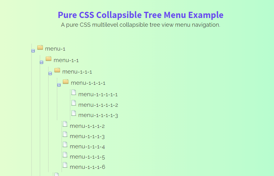
As you have seen in the above preview, a multilevel nested list is presenting hierarchical data. You can check it on the demo page to toggle the list/menu items with smooth collapse animation.
Generally, it’s a simple CSS-based tree menu navigation that doesn’t require any JavaScript function to work. But, it’s highly customizable with additional CSS and you are also free to attach any JS function to it.
The HTML Structure
The HTML structure for the tree menu consisted of only two parts, a container, and a nested list. Each list item contains a checkbox with a unique ID and labels tag. The label element presents a folder (the main element that contains the sublist) and an order list represents files/links that are placed just after it. Similarly, the list can be nested using the same method to make a multilevel tree menu.
OK! now let’s write HTML for the tree menu. In the very first step, create a div element with a class name "tree-menu" and place and order-list (ol element) with a class name "tree". Likewise, create the HTML input checkbox inside the list-item and place label and sublist inside it as follows:
<div class="tree-menu">
<ol class="tree">
  <li>
    <label for="menu-1">menu-1</label>
    <input type="checkbox" checked id="menu-1" />
    <ol>
      <li>
        <label for="menu-1-1">menu-1-1</label>
        <input type="checkbox" id="menu-1-1" />
        <ol>
          <li>
            <label for="menu-1-1-1">menu-1-1-1</label>
            <input type="checkbox" id="menu-1-1-1" />
            <ol>
              <li>
                <label for="menu-1-1-1-1">menu-1-1-1-1</label>
                <input type="checkbox" id="menu-1-1-1-1" />
                <ol>
                  <li class="file"><a href="">menu-1-1-1-1-1</a></li>
                  <li class="file"><a href="">menu-1-1-1-1-2</a></li>
                  <li class="file"><a href="">menu-1-1-1-1-3</a></li>
                </ol>
              </li>
              <li class="file"><a href="">menu-1-1-1-2</a></li>
              <li class="file"><a href="">menu-1-1-1-3</a></li>
              <li class="file"><a href="">menu-1-1-1-4</a></li>
              <li class="file"><a href="">menu-1-1-1-5</a></li>
              <li class="file"><a href="">menu-1-1-1-6</a></li>
            </ol>
          </li>
          <li class="file"><a href="">menu-1-1-2</a></li>
          <li class="file"><a href="">menu-1-1-3</a></li>
          <li class="file"><a href="">menu-1-1-4</a></li>
        </ol>
      </li>
      <li class="file"><a href="">menu-1-2</a></li>
      <li class="file"><a href="">menu-1-3</a></li>
    </ol>
  </li>

  <li>
    <label for="menu-2">menu-2</label>
    <input type="checkbox" id="menu-2" />
    <ol>
      <li>
        <label for="menu-2-1">menu-2-1</label>
        <input type="checkbox" id="menu-2-1" />
        <ol>
          <li>
            <label for="menu-2-1-1">menu-2-1-1</label>
            <input type="checkbox" id="menu-2-1-1" />
            <ol>
              <li class="file"><a href="">menu-2-1-1-1</a></li>
              <li class="file"><a href="">menu-2-1-1-2</a></li>
              <li class="file"><a href="">menu-2-1-1-3</a></li>
              <li class="file"><a href="">menu-2-1-1-4</a></li>
              <li class="file"><a href="">menu-2-1-1-5</a></li>
            </ol>
          </li>
          <li class="file"><a href="">menu-2-1-2</a></li>
          <li class="file"><a href="">menu-2-1-3</a></li>
          <li class="file"><a href="">menu-2-1-4</a></li>
        </ol>
      </li>
      <li class="file"><a href="">menu-2-2</a></li>
      <li class="file"><a href="">menu-2-3</a></li>
    </ol>
  </li>
</ol>
</div>
You can nest a list to the multiple levels with the same method as described above. Similarly, you can also wrap the above tree menu to any other HTML element.
CSS Styles for Collapsible Tree Menu
After creating the HTML structure for the tree menu, now it’s time to style it using CSS. So, target the body element and define the following gradient background. Basically, the style for the body is optional, you can skip this step if you don’t want to make the gradient background as shown on the demo page.
body {
    padding: 100px;
    background: #A1FFCE;  /* fallback for old browsers */
    background: -webkit-linear-gradient(to right, #FAFFD1, #A1FFCE);  /* Chrome 10-25, Safari 5.1-6 */
    background: linear-gradient(to right, #FAFFD1, #A1FFCE); /* W3C, IE 10+/ Edge, Firefox 16+, Chrome 26+, Opera 12+, Safari 7+ */
    font-size: 100%;
    font-family: "Arial";
}
Select the “tree-menu” class that is the main container for the menu. Define its max-width as 640px and margin property with 10px auto value to align it to the center.
.tree-menu{
    max-width: 640px;
    margin: 10px auto;
}
Define the 1em font size for the input that contains the plus/minus toggle icon.
.tree-menu input {
	font-size: 1em;
}
Now, target the order list that has "tree" class inside the "tree-menu" class. Define the padding-left property with 30px value for this element to leave some space from the left side.
.tree-menu ol.tree {
	padding-left: 30px;
}
After that, select the list items (the li element) of the tree-menu class. Use the CSS list-style-type property with none value to hide the default numbering for the list. Similarly, use the user-select with none value to forbade text selection while clicking on the folder name. Specify its relative position and define a color, margin-left, border-left property with the following values:
.tree-menu li {
	list-style-type: none;
        user-select: none;
	color: #313131;
	position: relative;
	margin-left: -15px;
       border-left: 1px dotted #aaa;
}
Likewise, target the label element and specify padding-left as 37px and display it as a block element. We are going to make this label as a folder, for this purpose we’ll use the folder icon (PNG icons are placed inside the demo project files). So, use the "folder-horizontal.png" background image with the no-repeat value.
.tree-menu li label {
	padding-left: 37px;
	cursor: pointer;
	background: url("img/folder-horizontal.png") no-repeat 15px 2px;
	display: block;
}
Target the input element (that inside the li) and define the following styles in order to make the collapsible toggle icon with a plus/minus icon.
.tree-menu li input {
	width: 1em;
	height: 1em;
	position: absolute;
	left: -0.5em;
	top: 0;
	opacity: 0;
	cursor: pointer;
}

.tree-menu li input+ol {
	height: 1em;
	margin: -16px 0 0 -44px;
	background: url("img/toggle-small-expand.png") no-repeat 40px 0;
}

.tree-menu li input+ol>li {
	display: none;
	margin-left: -14px !important;
	padding-left: 1px
}

.tree-menu li.file {
	margin-left: -1px !important;
}
Select the anchor element that has a class name "file" to style the tree menu links. Define the color, padding-left, and use the "document.png" background image for the icon.
.tree-menu li.file a {
	display: inline-block;
	padding-left: 21px;
	color: #313131;
	text-decoration: none;
	background: url("img/document.png") no-repeat 0 0;
}
Finally, select the "ol" element when the input checked pseudo-selector and define auto value for the height in order to make it visible. Similarly, change the background image, margin, and padding values as follows:
.tree-menu li input:checked+ol {
	height: auto;
	margin: -21px 0 0 -44px;
	padding: 25px 0 0 80px;
	background: url("img/toggle-small.png") no-repeat 40px 5px;
}

.tree-menu li input:checked+ol>li {
	display: block;
	margin: 0 0 0.063em;
}

.tree-menu li input:checked+ol>li:first-child {
	margin: 0 0 0.125em;
}
You have done it! Hopefully, you have successfully created a collapsible tree menu using pure CSS. If you have any questions or suggestions, let me know by comment.