The pulsating circle is a useful visual component to show attention to a specific element on a webpage. You may have seen that animation on the Messanger’s camera icon while chatting with friends. On the other hand, the pulsating circle is also used in page preloading animation. Similarly, this animation can be used for various purposes on the webpage like it can be released on the hover event. But how you can make a pulsating circle animation using CSS? well, you’ll come to know in this step-by-step guide.
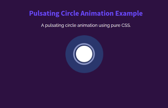
Before getting started with coding, I would suggest checking out the pulsating circle animation on the demo page. There you can see how the circle pulsing and producing waves. The page background and circle color can be customized according to your project’s template where you want to implement it.
The coding idea is that we’ll create a div element and style it as a circle using CSS. Likewise, we’ll create waves using the same div’s before & after pseudo-classes. In the final step, we’ll create CSS3 keyframes for the pulsating circle animation. So, let’s get started with HTML to make this animation.
Animation Container
In the first step, we need a container in which the circle animation will be played. So, create a div element with a class name "pulsating-circle" that we’ll style as a circle. You can put this anywhere in your HTML where you want to place this animation.
<div class="pulsating-circle"></div>
Generally, you are not limited to use the above HTML as it is. You can also wrap any other element around it for further customization. Similarly, you can also place text, icon, or image inside the circle element.
CSS Styles for Pulsating Circle Animation
In CSS, select the "pulsating-circle" class and define its absolute position. Likewise, define the 30px value for both width and height property. In order to align the circle to the center of its relative parent element, specify 50% value for the left and top property along with the -50% translateX and translateY transformation.
.pulsating-circle {
  position: absolute;
  left: 50%;
  top: 50%;
  transform: translateX(-50%) translateY(-50%);
  width: 30px;
  height: 30px;
}
Now, target the before pseudo-selector to style the wave effect. To do so, define the relative position along with 300% width and height. Likewise, define the 45px value for the border-radius property and set a background color according to your requirements.
Specify animation-name "pulse-ring" with duration and iteration-count value. So, the following is the complete snippet for the wave effect:
.pulsating-circle:before {
  content: "";
  position: relative;
  display: block;
  width: 300%;
  height: 300%;
  box-sizing: border-box;
  margin-left: -100%;
  margin-top: -100%;
  border-radius: 45px;
  background-color: #01a4e9;
  -webkit-animation: pulse-ring 1.25s cubic-bezier(0.215, 0.61, 0.355, 1) infinite;
          animation: pulse-ring 1.25s cubic-bezier(0.215, 0.61, 0.355, 1) infinite;
}
Similarly, target the after pseudo-selector to design the pulsing circle. Keep its absolute position along with 0 value for both top and left property. Define 100% value for the width and height and set a background color according to your needs. Also, specify "pulse-dot" animation and define duration and iteration count.
.pulsating-circle:after {
  content: "";
  position: absolute;
  left: 0;
  top: 0;
  display: block;
  width: 100%;
  height: 100%;
  background-color: white;
  border-radius: 15px;
  box-shadow: 0 0 8px rgba(0, 0, 0, 0.3);
  -webkit-animation: pulse-dot 1.25s cubic-bezier(0.455, 0.03, 0.515, 0.955) -0.4s infinite;
          animation: pulse-dot 1.25s cubic-bezier(0.455, 0.03, 0.515, 0.955) -0.4s infinite;
}
Finally, define the CSS keyframes for the "pulse-ring" and "pulse-dot" animation as described below and done.
@-webkit-keyframes pulse-ring {
  0% {
    transform: scale(0.33);
  }
  80%, 100% {
    opacity: 0;
  }
}

@keyframes pulse-ring {
  0% {
    transform: scale(0.33);
  }
  80%, 100% {
    opacity: 0;
  }
}
@-webkit-keyframes pulse-dot {
  0% {
    transform: scale(0.8);
  }
  50% {
    transform: scale(1);
  }
  100% {
    transform: scale(0.8);
  }
}
@keyframes pulse-dot {
  0% {
    transform: scale(0.8);
  }
  50% {
    transform: scale(1);
  }
  100% {
    transform: scale(0.8);
  }
}
That’s all! I hope you have successfully created pulsating circle animation. If you have any questions or suggestions, let me know by comment below.