The advanced creative hover and the animation effect is a great way to add visual interest and interactivity to a website. In this tutorial, we will share next level CSS Creative Hover & Animation Effects free download that you can on your website background to stand out the website layout. These effects are developed with CSS animation, transition, and transform properties which are easy to use.
You may notice amazing web animation on a different website like Codepen and you think it’s really awesome but I can’t make but, right? If so then don’t worry, we will share how you can create such animation yourself and also provide you with a demo so you can quickly implement it on your website.
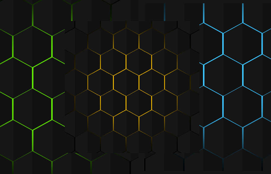
Next Level CSS Creative Hover & Animation Effects
There are 7 different background animation effects that we included in our demo and download file but here I will explain the Hexagon Border hover effect. Rest of the effects you can download them for free and use anyone which you like. Following are the effect included in the demo.
- Hexagon Border hover
- Hexagon With clip Path
- Rain Effect
- Scrolling Text
- Wavy Cycles Loading
- Cube hover Animation
- Fluid Simulation
Start with HTML
First, we will create the main container that will hold the different rows and divs. We need to place 14 rows and each row will contain the 20 hexagon div for each. Let’s take a look at the example code below:
<main class="container">
    <div class="row">
      <div class="hexagon"></div>
      <div class="hexagon"></div>
      <div class="hexagon"></div>
	  ..........
    </div>
    <div class="row">
      <div class="hexagon"></div>
      <div class="hexagon"></div>
      <div class="hexagon"></div>
	  ..........
    </div>
</main>
Styling Next Level Hover & Animation
Before creating the next-level animation, we need to apply some basic CSS styles so the webpage is ready to show the effect. Hence, we will select each DOM element using the asterisk symbol (*) and define the box-sizing to calculate the padding of the elements.
As we will show the animation on the full page so we will set the min-height to 100vh to take all of the webpage space. We will also use the default background and set overflow hidden so no scroll bar is shown.
* {
  margin: 0;
  padding: 0;
  box-sizing: border-box;
}

body{
  min-height: 100vh;
  background-color: #000;
  overflow: hidden;
}
Now we will style both container and Row. We will set the container height to full by using the vh CSS element and make overflow hidden so no scroll is shown.
.container {
  position: relative;
  height: 100vh;
  overflow: hidden;
  z-index: 2;
}
.row {
  display: inline-flex;
  margin-top: -32px;
  margin-left: -50px;
}
/* :nth-child(even) => Estudar Depois */
.row:nth-child(even) {
  margin-left: 1px;
}
It’s time to create the hexagon all over the page so we will start it by setting the position, width, height, background color, and little margin for spaces between the hexagon boxes.
To give different unique colors and hover effects, we will use the :before CSS property where we will set the position, width, height, and background color.
.hexagon {
  position: relative;
  width: 100px;
  height: 110px;
  background-color: #111;
  margin: 2px;

  /* Create a hexagon */
  clip-path: polygon(50% 0%, 100% 25%, 100% 75%, 50% 100%, 0% 75%, 0% 25%);

  transition: 2s;
}
.hexagon::before {
  content: '';
  position: absolute;
  top: 0;
  left: 0;
  width: 50%;
  height: 100%;
  pointer-events: none;
  background-color: rgba(255,255,255,0.02);
  z-index: 1000;
}
Our effects work with the cursor so we will style the area where the cursor move. Here will apply the width and height along with transform and animation property as well. For animation, we will use keyframes.
#cursor {
  position: absolute;
  top: 0;
  left: 0;
  width: 400px;
  height: 400px;
  background-color: #0f0;
  border-radius: 50%;
  transform: translate(-50%, -50%);
  animation: cursor-animation 4s linear infinite;
  z-index: 1;
}

@keyframes cursor-animation {
  0% {
    filter: hue-rotate(0deg) blur(50px);
  }
  100% {
    filter: hue-rotate(360deg) blur(50px);
  }
}
Handle Cursor Javascript
The following small javascript function will help us to handle the cursor moving functionality. Here we will simply select the cursor ID the change the Position of the element at X and Y axes.
const cursor = document.querySelector('#cursor');

const onMouseChangePosition = (event) => {
  cursor.style.left = event.clientX + 'px';
  cursor.style.top = event.clientY + 'px';
};

onmousemove = onMouseChangePosition
Conclusion
Yah! We are done with amazing hexagon Next Level CSS Hover Animation Effects. Now you can use this animation on your webpage to make it stand out. You can easily customize the background color as well as the hover hexagon color.