Adding a black image overlay with CSS transparency is a great way to make your images more visually appealing and enhance the overall aesthetics of your website.
This technique involves placing a black layer on top of an image, which reduces its brightness and contrast while adding a layer of transparency to create a subtle visual effect.
In this tutorial, we will guide you step-by-step on how to add a black image overlay with CSS transparency to your images, allowing you to create a more engaging and immersive user experience for your website visitors.
How to Add Image Overlay CSS Transparency
We will use separate image elements and positioning techniques where we will have two elements. One will be the main container holding the image. The second one is the child element that will handle the rest of the HTML elements and content, etc.
In case you want to keep the image as a background through CSS then check out our article Transparent Overlay Background Image.
Start with Building the HTML
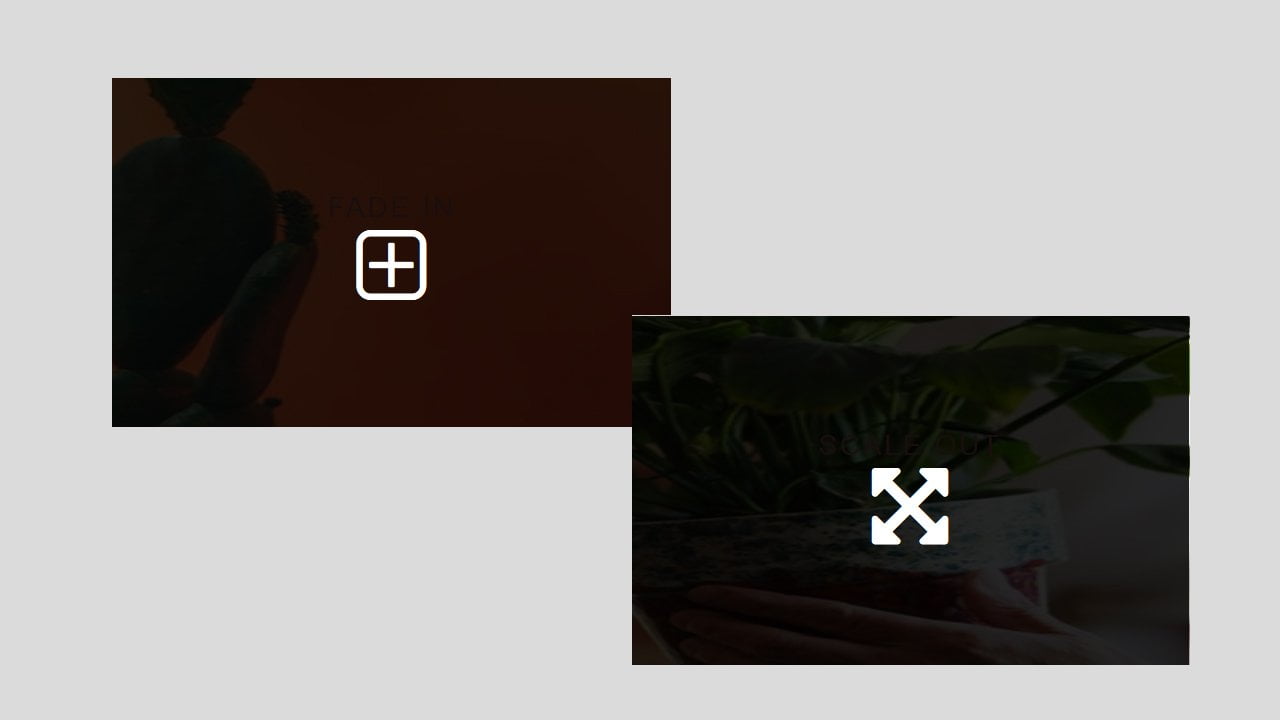
I create two effects with the same color but just the animation is different. Here is the first one that has a container defined with the “resource” class and contains an image with a source link to an external image.
Following the image, there is another div with an ID of “overlay5”, which is used to add the overlay effect. The overlay div includes a heading element with a class of “img-title” and a paragraph element with a class of “img-icon“.
These elements can be used to display additional information or buttons over the image, depending on the desired effect.
<div class="resource">
<img src="https://static1.squarespace.com/static/55ac6d80e4b0a964784b2f80/t/5703eb2e746fb98cc2510ebd/1459874606989/PsZyN43.png" />
<div id="overlay5">
  <h2 class="img-title">fade in</h2>
  <p class="fa fa-plus-square-o fa-4x img-icon"></p>
</div>
</div>
Adding General Image Overlay CSS Transparency Styling
This CSS code defines the style for a web page, including the background color, font family, and text alignment. It also defines the style of an image container, including its dimensions, margins, and position. Additionally, it defines a hover effect for the image, which scales it up when the mouse hovers over it.
Overall, this code provides a basic style structure that can be customized further using additional CSS styles to create a visually appealing webpage.
body {
  background: #dbdbdb;
  color: #16a085;
  font-family: 'Oxygen', Arial;
  text-align: center;
}
#title,
#subtitle {
  font-size: 2.5em;
  letter-spacing: .3em;
  color: #16a085;
  margin: 0;
  text-transform: uppercase;
  font-family: 'Bungee', Arial;
}
.container {
  margin: 20px auto;
  display: flex;
  align-items: center;
  flex-direction: column;
}
.resource {
	color: white;
    display: inline-block;
    height: 250px;
    margin: 1em;
    overflow: hidden;
    position: relative;
    width: 400px;
}
.resource img {
  width: 100%;
  height: 100%;
}
.img-title {
  font-weight: 300;
  font-size: 20px;
  text-transform: uppercase;
  letter-spacing: 2px;
}
.img-title,
.img-icon {
  margin: 0;
}
.resource:hover img {
  transform: scale(2);
  transition: transform 0.5s;
}
Implement Overlay Style
This CSS code defines two image overlays with similar styles. Both overlays have a black background and are initially hidden. When the user hovers over the image, the overlay becomes visible. Overlay #overlay8 scales up while fading in, while the overlay #overlay5 fades in without scaling.
Overall, these CSS styles create a simple and elegant effect that can be further customized to fit the website’s design.
#overlay5 {
  cursor: pointer;
  display: flex;
  align-items: center;
  justify-content: center;
  flex-direction: column;
  background: rgba(0, 0, 0, 0.85);
  width: 100%;
  height: 100%;
  position: absolute;
  top: auto;
  bottom: 0;
  opacity: 0;
  transition: opacity 0.5s ease;
}

#overlay8 {
  cursor: pointer;
  display: flex;
  align-items: center;
  justify-content: center;
  flex-direction: column;
  background: rgba(0, 0, 0, 0.85);
  width: 100%;
  height: 100%;
  position: absolute;
  top: auto;
  bottom: 0;
  opacity: 0;
  transform: scale(0);
  transition: transform 0.5s ease, opacity 0.5s ease;
}

.resource:hover #overlay5 {
  opacity: 1;
}
.resource:hover #overlay8 {
  opacity: 1;
  transform: scale(1);
}
Conclusion
In summary, we looked at some CSS styles used for creating image overlays on a web page. These styles added visual appeal and interactivity to the page by making certain elements visible when the user interacts with them. CSS styles can help enhance the user experience of a website by improving its appearance and usability.