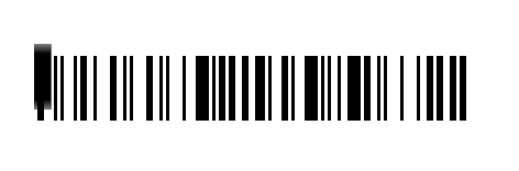
Step 1:Animated Barcode Effect with CSS
This CSS code utilizes keyframe animations to create a dynamic barcode effect. The BarcodeRevealing animation gradually changes the opacity of the barcode, simulating its appearance and disappearance during scanning. Meanwhile, the BarcodeOverlay animation animates a black overlay moving across the barcode, enhancing the scanning illusion by revealing and covering parts of it in a smooth, continuous motion.
Together, these animations combine to produce an engaging and visually appealing barcode scanning effect on the webpage.Here is the code example:
html, body {
font-family: 'Libre Barcode 128', cursive;
font-size: 100px;
}

.BarcodeContainer {
position: absolute;
left: 50%;
top: 50%;
transform: translate(-50%, -50%);
text-align: center;
}

.Barcode {
position: relative;
animation: 3.4s BarcodeRevealing infinite;
}

.BarcodeCover {
position: absolute;
left: -3px;
top: 0;
height: 60px;
width: 100%;
background: black;
border-radius: 6px;
animation: 1.7s BarcodeOverlay forwards infinite;
animation-timing-function: ease-out;
}

@keyframes BarcodeOverlay {
0% {
transform: scaleX(0);
transform-origin: left;
}

50% {
transform: scaleX(1);
transform-origin: left;
}

51% {
transform-origin: right;
}

100% {
transform: scaleX(0);
transform-origin: right;
}
}

@keyframes BarcodeRevealing {
0% {
opacity: 0;
}

25% {
opacity: 0;
}
26% {
opacity: 1;
}
75% {
opacity: 1;
}
76% {
opacity: 0;
}
100% {
opacity: 0;
}
}
How to Design Animated Barcode Using Only CSS Demo
And there you have it! You’ve successfully created a barcode animation using only CSS. With a little creativity and experimentation, you can take your barcode animation to the next level and impress your audience with engaging visual effects on your website.